WORK
Initial Onboarding
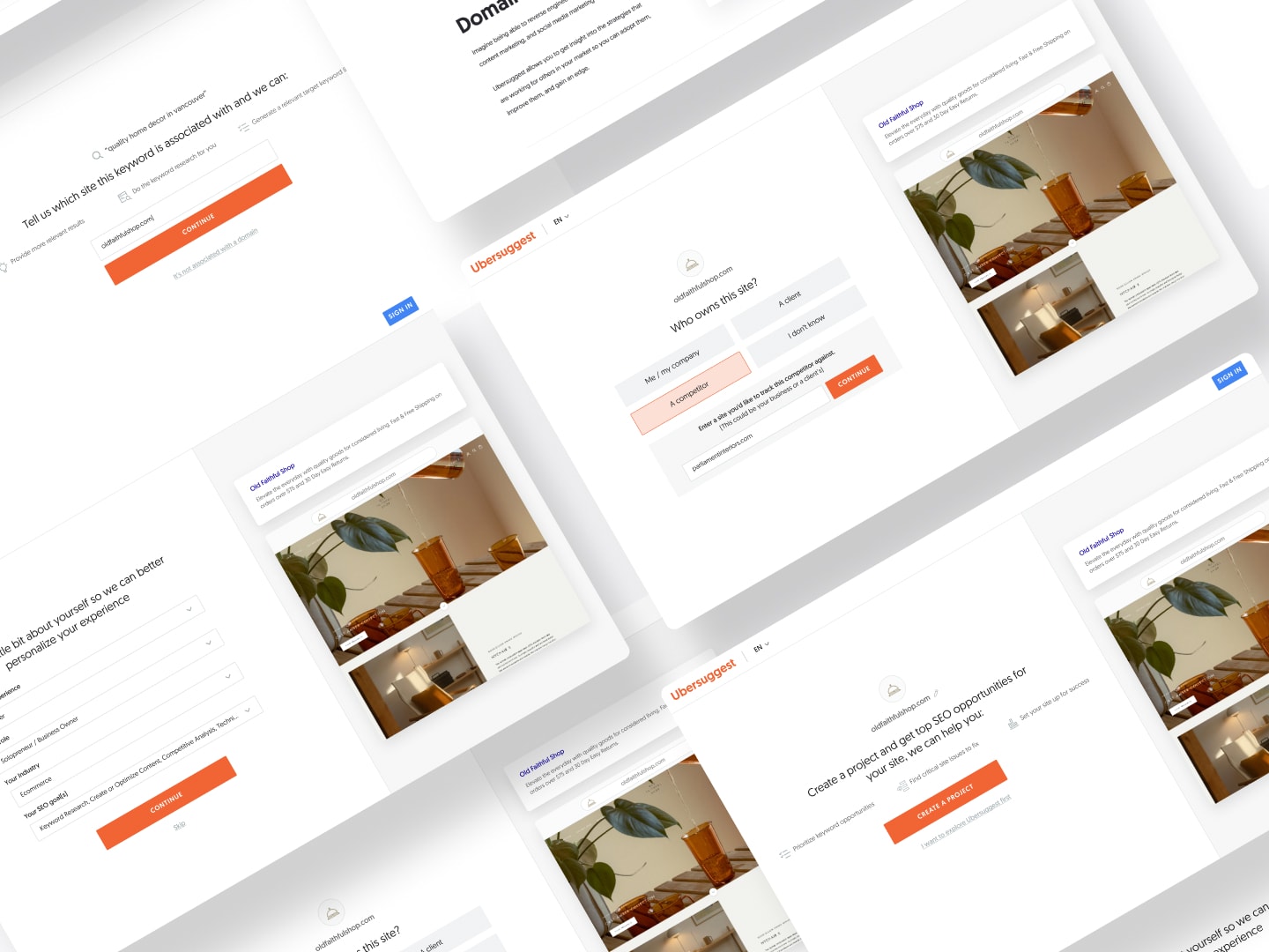
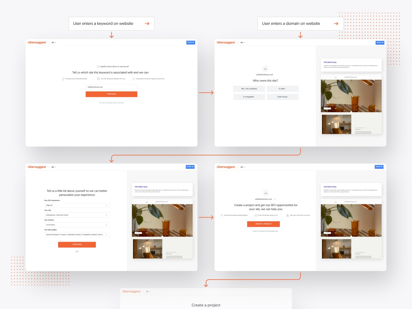
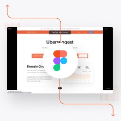
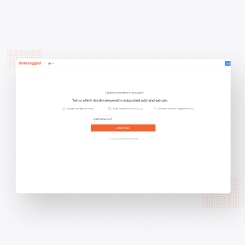
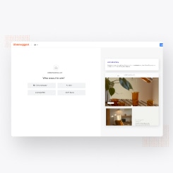
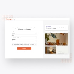
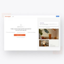
Ubersuggest Webapp Initial Onboarding Flow
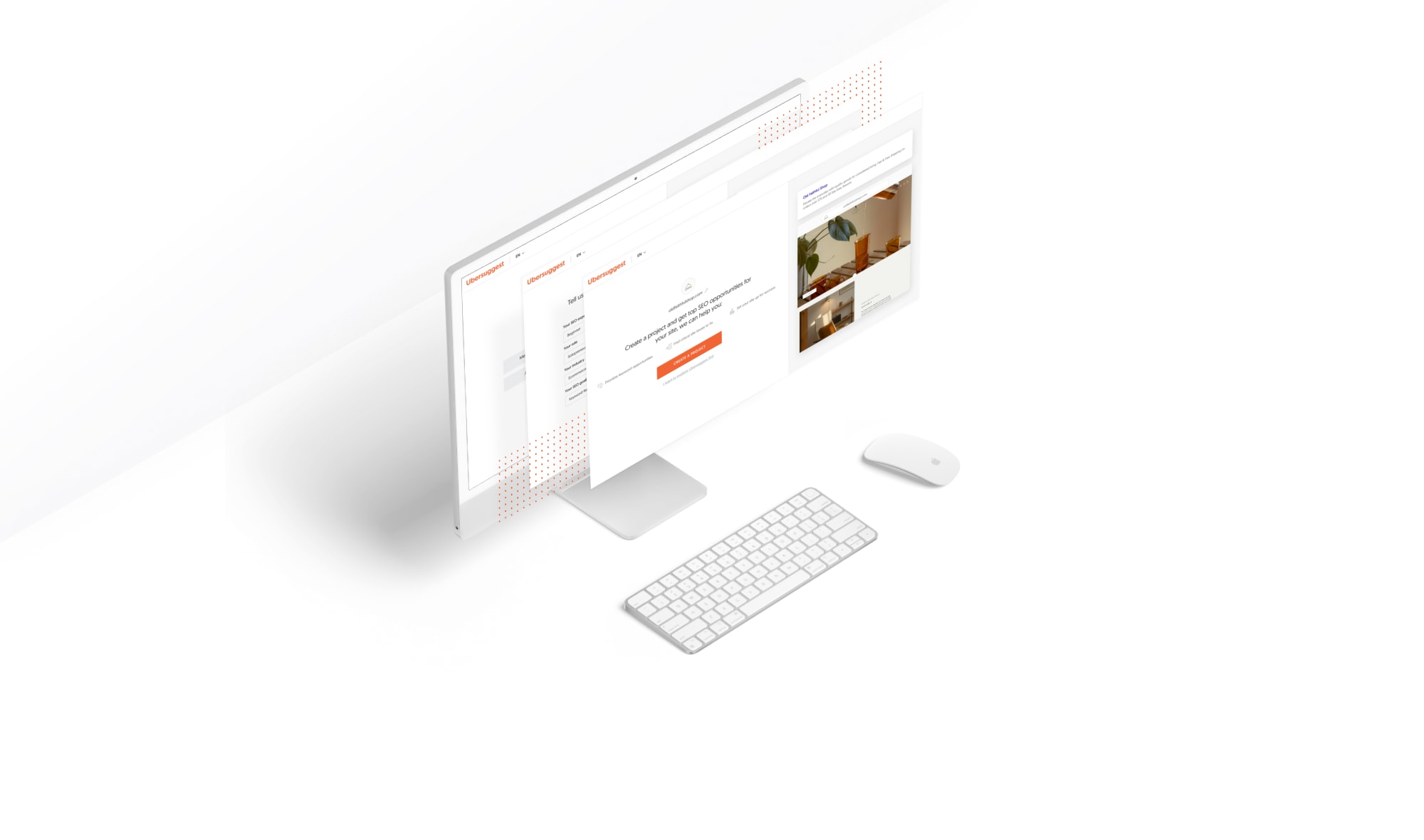
MEDIUM
UX, UI
DELIVERABLES
Product Onboarding
PROJECT ROLE
Product Designer
Project overview:
Product onboarding is an important part of the customer journey, especially for a complex app. Ubersuggest is an SEO tool with a freemium model that has a high volume of traffic entering the web app via the website every day. The majority of users coming in are beginners or not knowledgeable in SEO. These users were often lost and unsure of what to do once they were dropped into the app. We saw a huge opportunity in converting these users down the funnel and eventually turning them into paying customers. We had a successful experiment in the past by directing users to a getting started guide right away. We later followed up with it and designed a more scalable place we called the “Playbook”, for it to live but discovered the adoption rate was low. Therefore, we changed the strategy and prioritized user onboarding in the product roadmap. This version of onboarding was a growth hacking experiment that directly impacted the initial stage of the customer journey. The main idea for this was to help users realize value before they got to the app so we could increase the number of signups and projects created.
Problem Space:
Users had trouble navigating, finding value, and keeping focus.
- It was very common for new users to lose the context of what they were doing in the app and easily became lost.
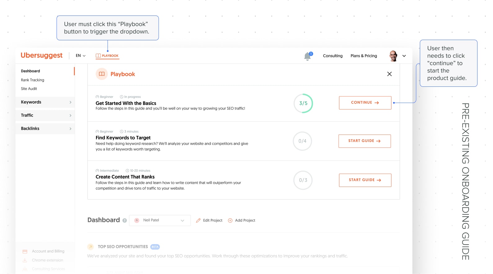
- Users couldn’t find the pre-existing onboarding content, the Getting Started Guide in the Playbook, after registering and being dropped directly to the app, so they didn’t end up receiving any in-app onboarding assistance.
- A majority of users didn’t enter their domain as part of the Getting Started Guide, but they were more likely to complete it once they did.
“I don’t know what my next step or task should be”
“I don’t know how to take any action based on this data”
- Ubersuggest today is primarily used as a research tool. However, our less sophisticated and less SEO-experienced SMB users struggled with using the tool as a way to drive meaningful action or to understand what their highest value “job to be done” was at any given time.
- New users specifically to the product had a difficult time intuitively using the tool and finding value due to the lack of any onboarding or assistance in completing key actions.
How might we give users a way to monitor their SEO progress over time so they make better-informed decisions on what to do next?
Hypothesis:
By guiding our less experienced SMB customers to the project creation and SEO opportunities that surfaced in the dashboard, we can increase the number of users that find repeated and consistent value in the product early on, leading to an increase in 1X and 2X paid conversion rates and the number of unauthenticated users that sign up for a free account in order to take advantage of a project.
Objectives/KPIs:
- Objectives:
- User realizes value in Ubersuggest up front so they feel confident in creating a project and an account.
- Segment our users to better understand them and provide a personalized experience for them.
- KPIs:
- Increase the number of registrations/sign ups by 25%
- Increase the number of projects created by 25%
Design process:
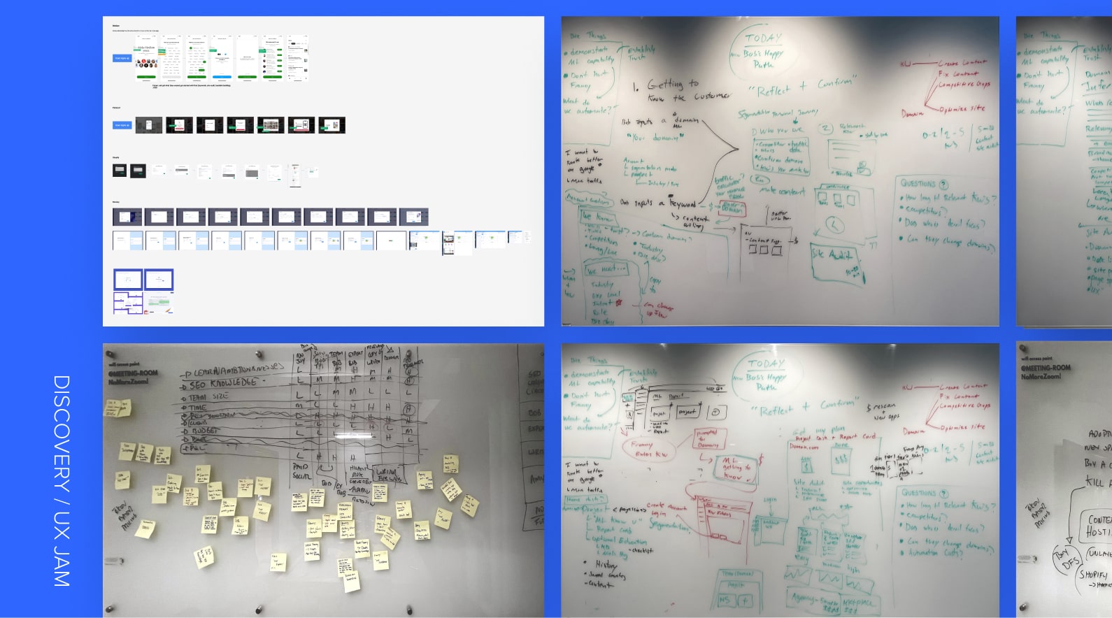
Discovery / Product & UX Jam
Reference Research & Whiteboarding
The product/UX team had a whiteboarding session discussing high-level product strategy and how we could provide a better experience for our target segments. As a follow-up, the UX team jammed out on some customer journey work by diving deeper into what that looks like at each stage. As we were whiteboarding, we listed some questions we had and potential risks for engineering and stakeholders. We then did some individual market research as part of discovery in preparation for the next step when we regroup.
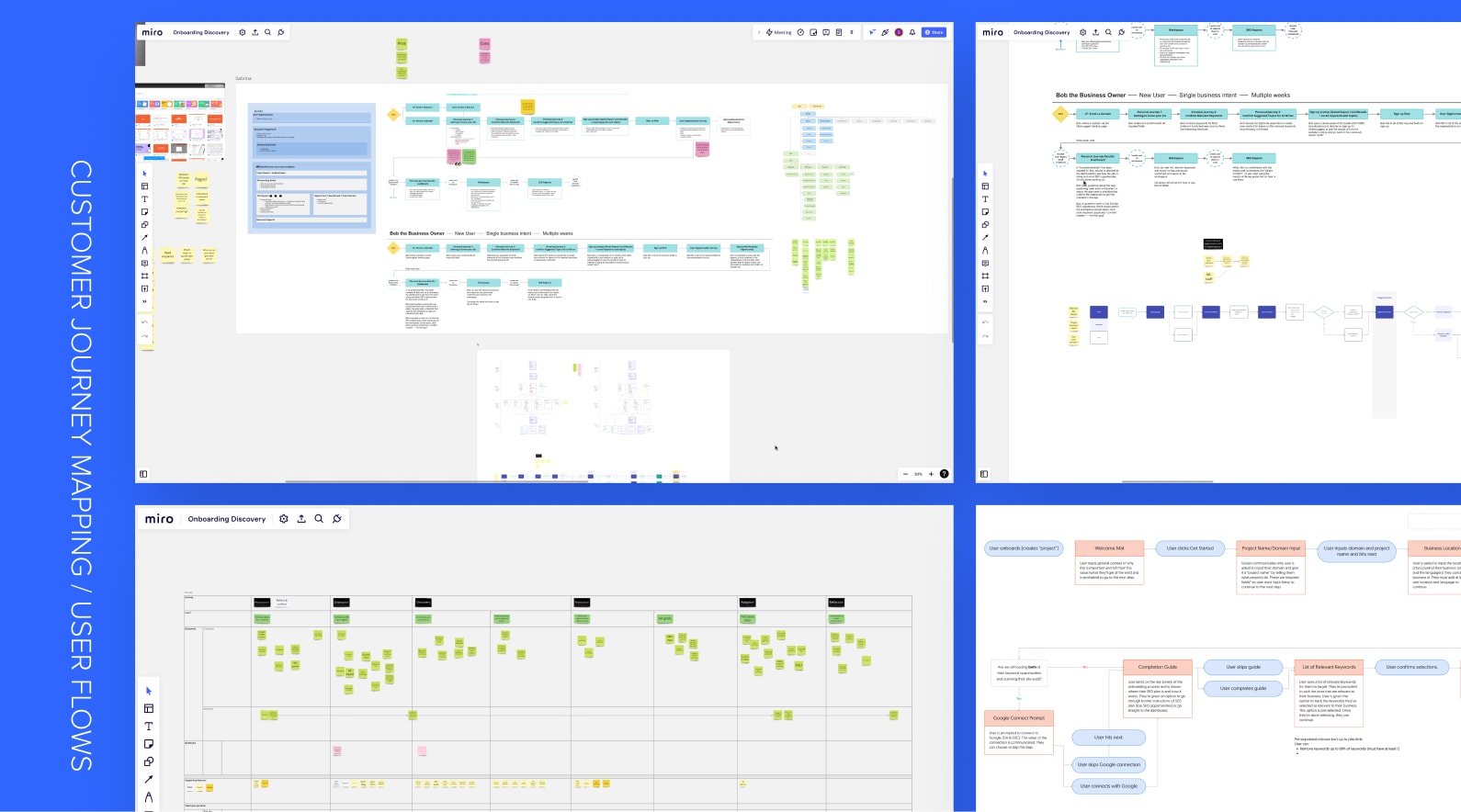
Customer Journey Mapping / User Flows
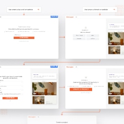
When we regrouped as a UX team, we mapped out customer and business outcomes against the customer journey. Each of us then created user flows for what we thought the ideal flow would be when a user first enters the app in order to retain them. We consolidated our flows into one and presented the flow to the product team and stakeholders. We finalized the flows and were ready for the next stage.
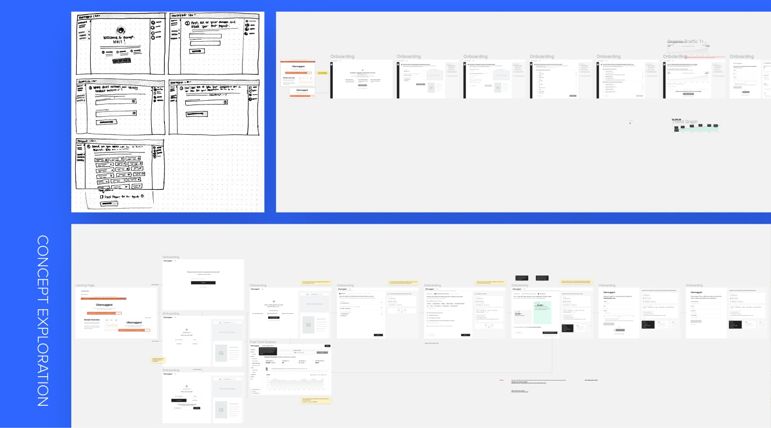
Concept Exploration
The UX started exploring the flow and we each designed our own versions. We explored various concepts and designed the screens as wireframes. When we were ready, we presented each of our designs to the product team and stakeholders. The team provided us with their feedback so we took their input into consideration and consolidated the designs into a version that incorporated the best components from each version. After finalizing the consolidated designs, we presented them to the larger group, including the engineering team. The engineering team gave us their input so we could get a better sense of feasibility. They also provided story points for each screen so we could better scope out the product roadmap. In the end, we decided to prioritize the initial touchpoints of the customer journey, which were the onboarding and project creation flow. My team was responsible for onboarding so I was the lead designer for that initiative.
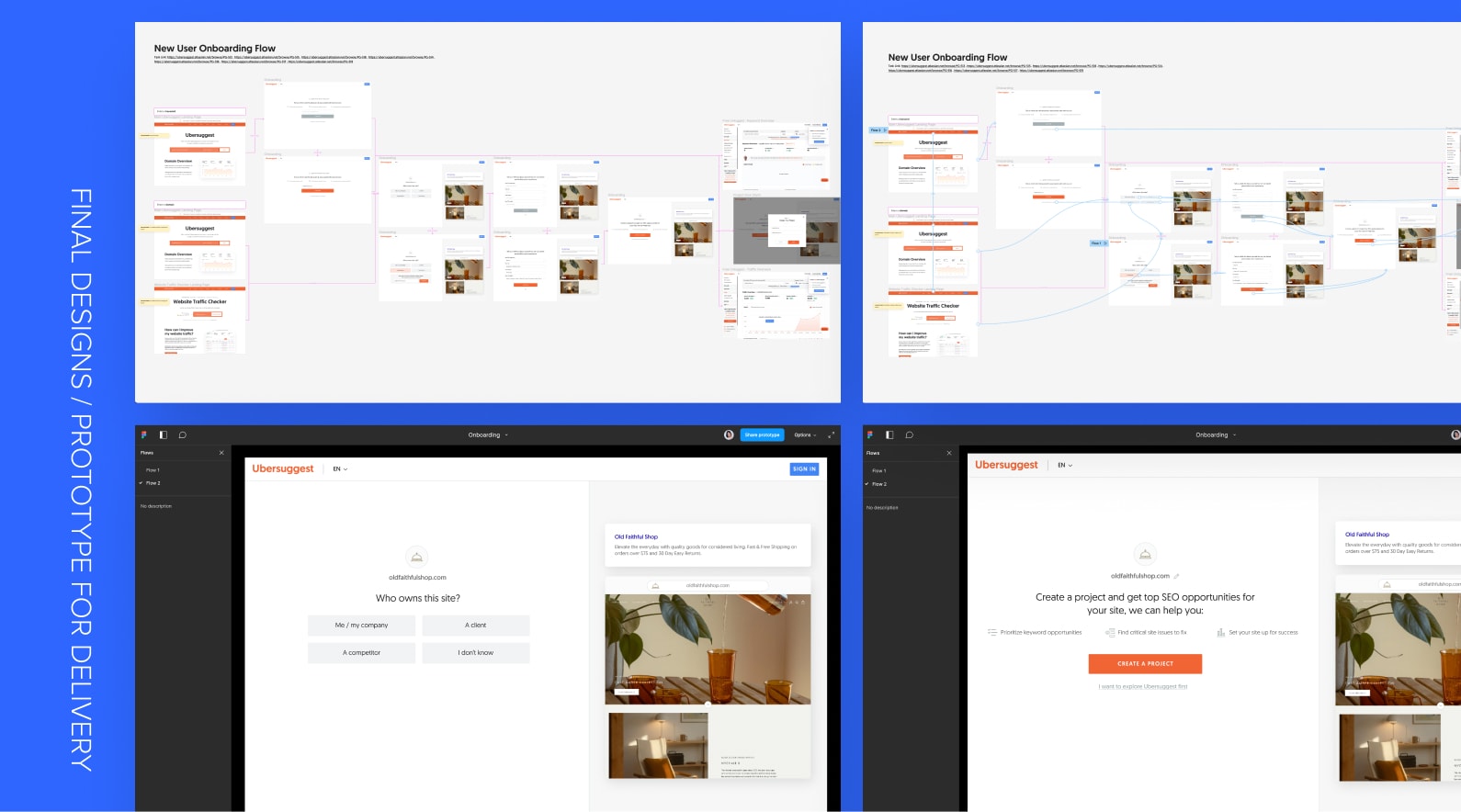
Final Designs / Prototyping for Delivery
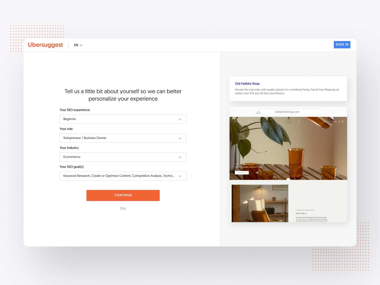
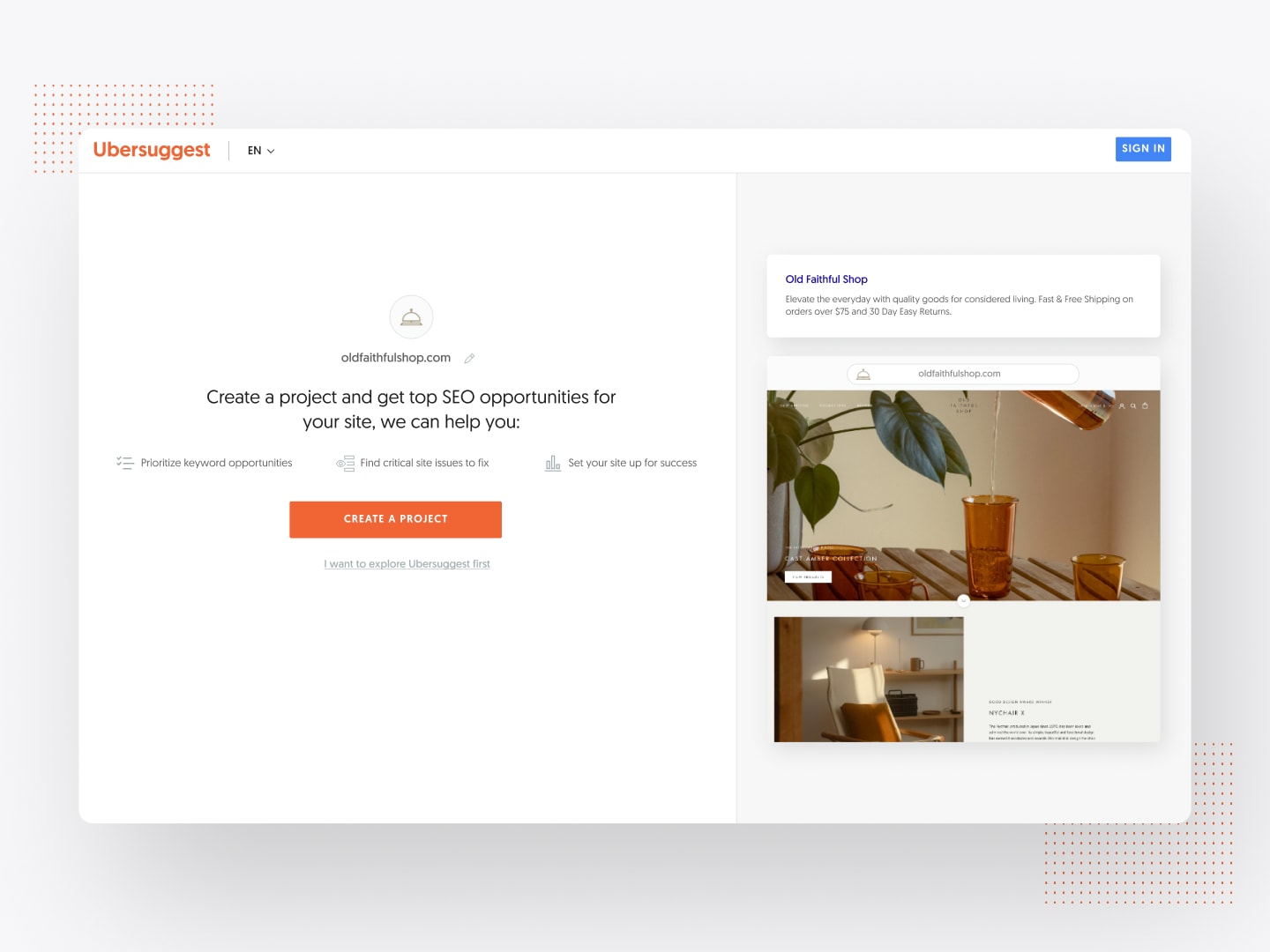
I worked with the product manager to refine the brief for the initial onboarding initiative. He provided me with the problem space, additional supporting data, as well as the KPIs and user behaviours we’d want to drive. We formed our hypothesis and I started designing the screens for delivery. I started with the ideal version of what it could become and worked with the PM and engineering team to scope down the design to an MVP version during backlog refinement so we could ship it within one sprint. Once the designs were finalized, I prototyped them and prepared the file for engineers with developer notes.
Outcome:
Result & Performance Metrics
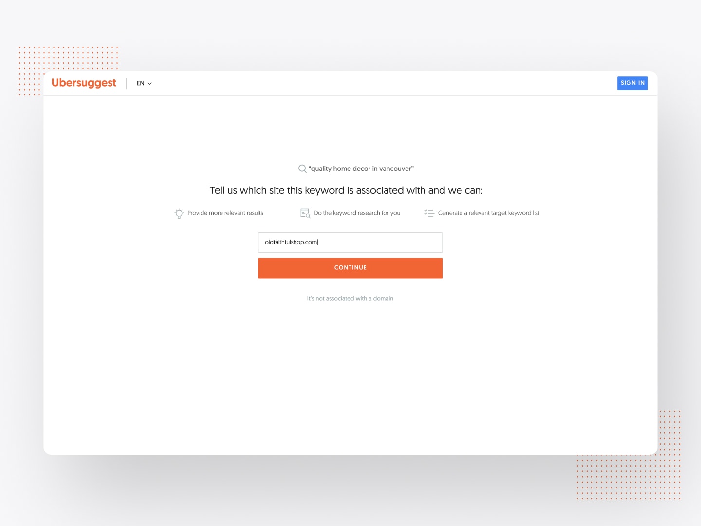
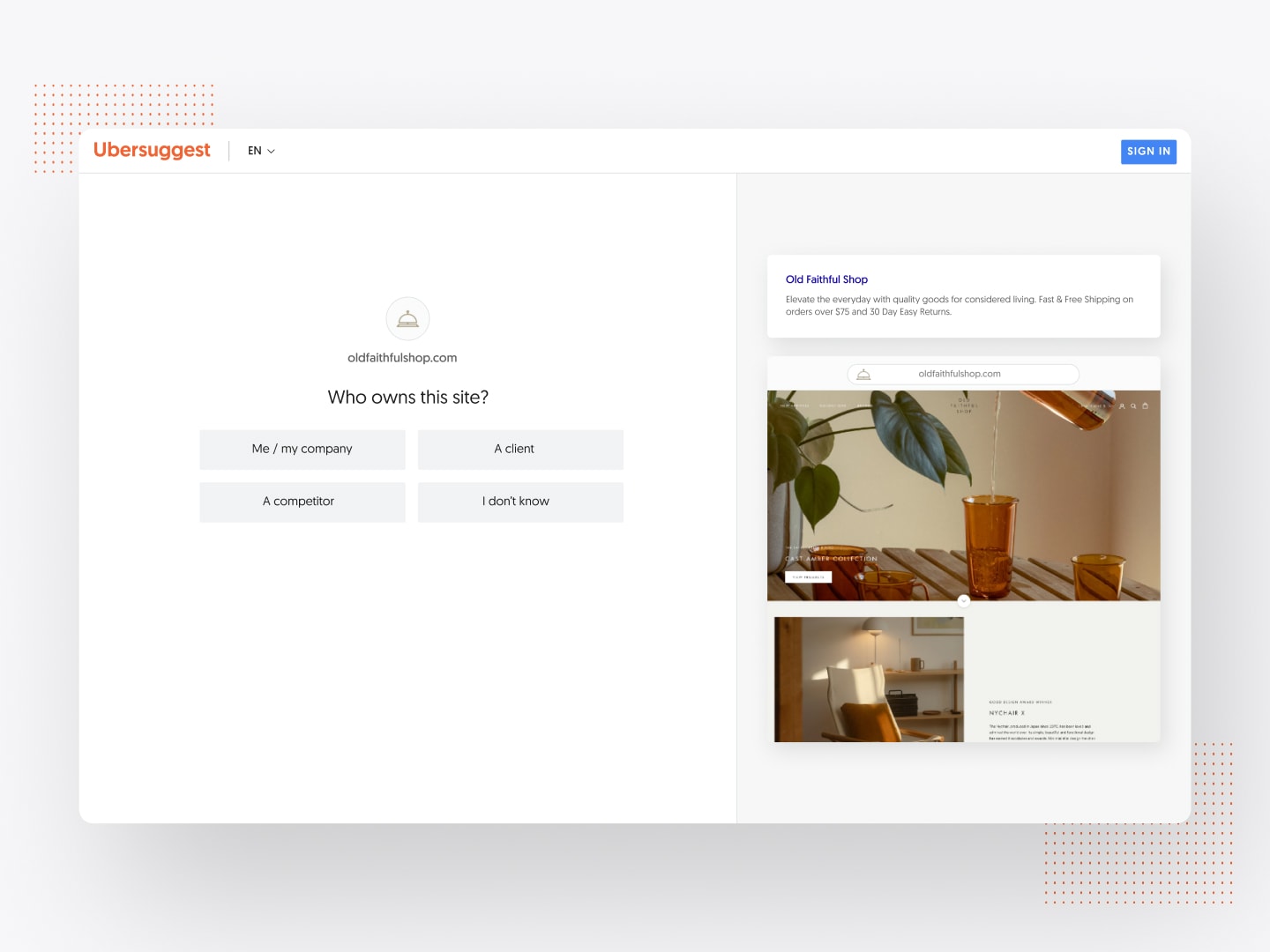
This was overall a very successful experiment. The domain path had a significantly higher completion rate compared to the keyword path. The hypothesis was that the user intent when entering a domain was more aligned with the value prop presented in the flow, while users who came for keyword research wanted to see a keyword report related to their initial input right away.
Main Learning Goal: Will guiding more users to create a project and act on an SEO opportunity correlate to an increase in overall signups and ultimately more revenue from upgrades to paid?
Metrics comparing the month before and a month after release:
75-78%
Increase in registration
1100
More registrations / day
22-25%
Increase in project creation
Key takeaways:
Running small experiments can lead to significant growth.
Many cool ideas and solutions could arise during discovery and concept exploration. But in order to be agile and work in a growth hacking mindset, we released this onboarding flow as an MVP within one sprint that would still solve the core problem without having to implement super complex technical solutions. The PM and I worked together with the engineering team to make sure the proposed designs were feasible. Based on the discussion, we made the necessary changes to the designs and scoped it down to one sprint worth of work. When we released it, we saw huge lifts in the metrics we were tracking, where the number of registrations surpassed the set target. Without investing lots of time and budget on this, we were able to learn quickly through the positive signals. It validated our hypothesis and gave us confidence in further developing it.
Learn quickly, reiterate, and continue learning.
While we received positive outcomes for this experiment, there was still a huge opportunity to improve it even more. Because we were able to learn so fast, we were able to move to the next step quickly. By looking at the funnel reports of each step, we were able to find that the completion rate for the keyword path was less successful, as well as where the biggest dropoff was. With the data, we determined what to solve as a fast-follow.
Credits:
Lead Product Designer: Sabrina Chan (Product Designer)
Lead Product Manager: Robert Cameron (Senior Product Manager)
Lead Backend Developer: Yaroslav Oliinyk (Python Developer)
Lead Frontend Developer: Nakamoto Hideyoshi (Frontend Developer)
QA Lead: Diogo Puiatti (QA Engineer, Technical Lead)
Scrum Master: Illia Smirnov (Scrum Master)
