WORK
Pricing Section
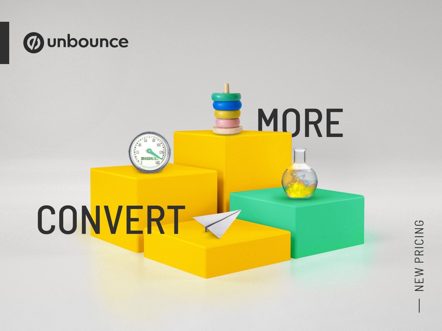
Unbounce.com

MEDIUM
Website
DELIVERABLES
UX, UI
PROJECT ROLE
Lead Designer
Project overview:
In June 2020, Unbounce launched a new pricing model. The previous price point was too expensive for our target market. The way the plans were tiered was not really what people wanted most from the Unbounce platform. What people wanted was conversions. So, Unbounce introduced value-based pricing (price is determined by the number of conversions the customer get), which was a unique selling point in our market and more closely aligned our business with the value that we delivered to our customers.
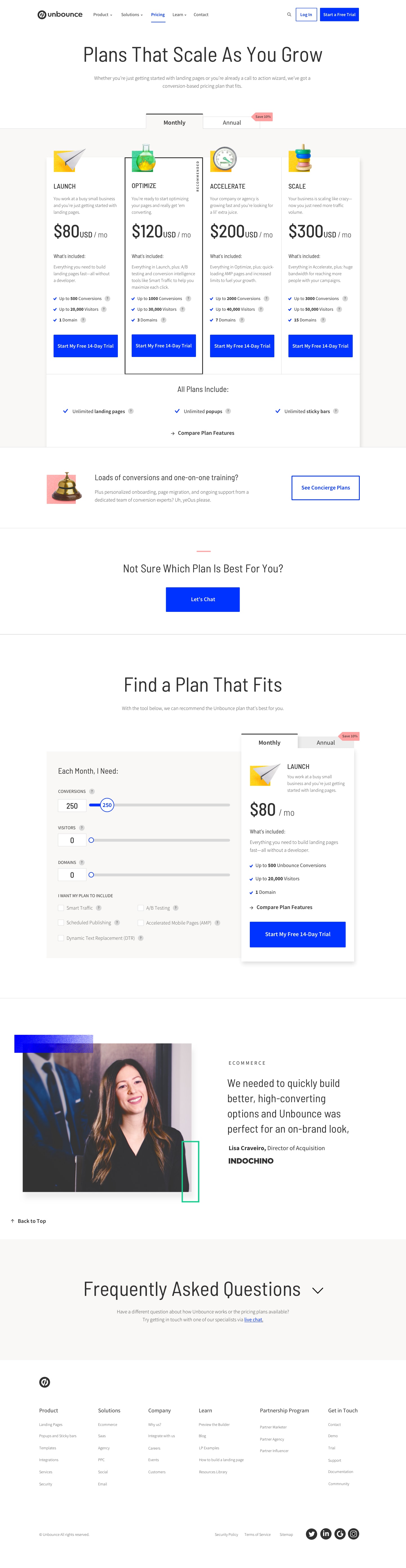
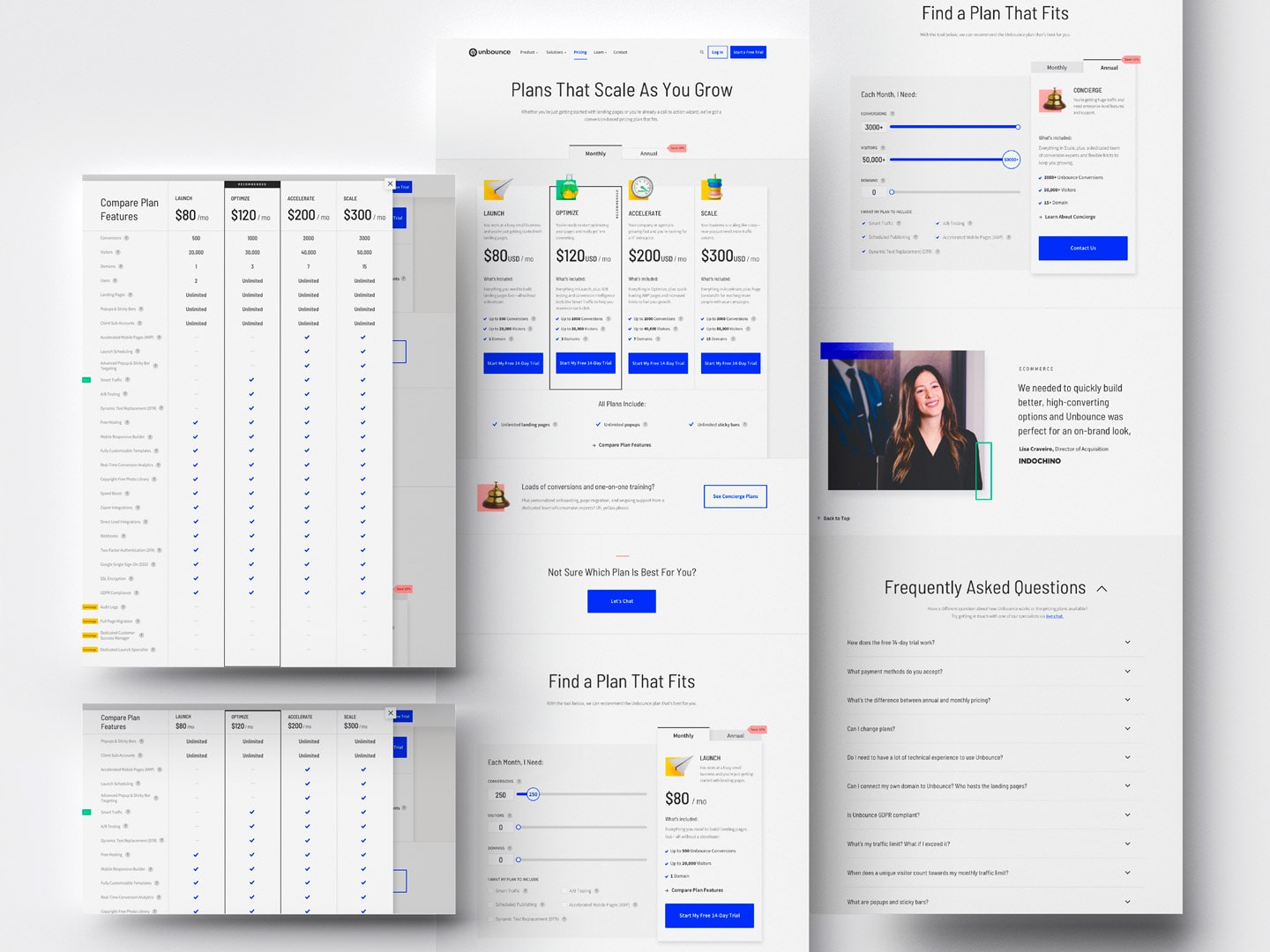
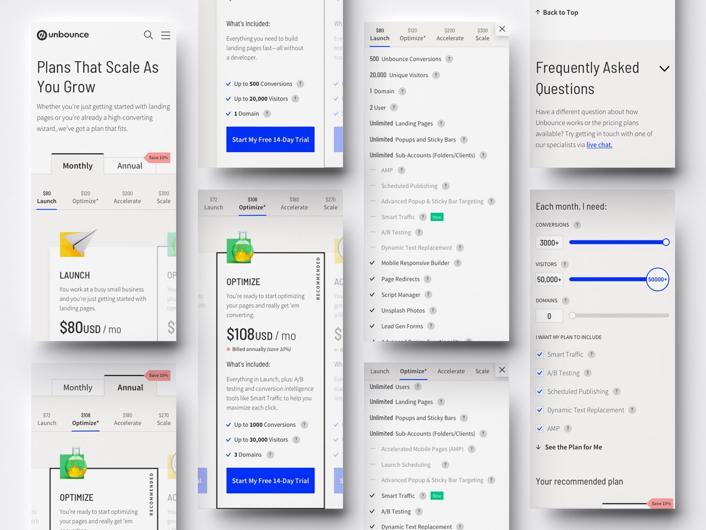
With the pricing model change, we had to update the pricing page on Unbounce.com. The main mandatory changes were adding another column to the pricing grid from three to four plans and rewriting the info displayed under each plan. Since the pricing and plans were changing, we had the opportunity to completely overhaul the pricing page.
Project Goals
- Communicate the new pricing to align with Unbounce’s business strategy and better accommodate our target market and their needs
- Improve the overall experience on the pricing page to push more prospects down the funnel
Design process:
Before we began to work on the project, we needed as much information and context as possible to understand what this project was and why we were doing it. The team involved had a kick-off meeting to go through the brief, where we discussed what the new pricing model was, the RACI (who were responsible, accountable, consulted, and informed), the goals, and what we needed to do to achieve those goals. I was assigned as the lead designer on the project, and my main responsibility was to redesign the pricing page, along with a couple of other tasks to design campaign assets, such as landing pages, social media assets, email banners, blog images, etc.
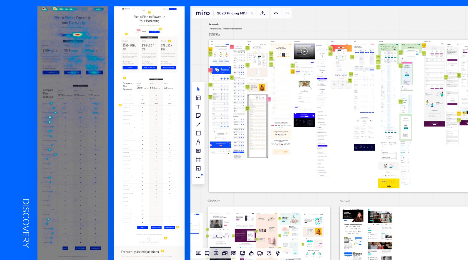
Discovery
Heatmap Data & Reference Research
The core team, which included the lead copywriter, web strategist, and me, was provided with product positioning resources and some criteria for the new pricing model. After reviewing them, we pulled heatmap data of the previous pricing page to learn how visitors were interacting with it. Based on the insights, we identified any improvement opportunities on the page. We then put together some references of existing pricing pages and added them onto a Miroboard. Each of us looked for pricing pages from Saas businesses similar to Unbounce. We marked the elements that we liked and thought could solve the issues on the previous pricing page, as well as elements that we disliked on each reference to prepare for the sketching session.
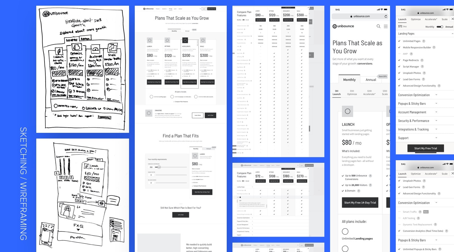
Sketching & Wireframing
With the research in place, the three of us sketched out ideas for the new pricing page on a whiteboard. We sketched out the page in both desktop and mobile formats, with the consideration of the flow, content hierarchy, layout, and areas with interactions that would enhance the user experience. Once we were happy with what we had, we were ready to move forward with designing a high fidelity wireframe.
I designed the high fidelity wireframe, which had a couple of iterations through design and stakeholder feedback. Once the wireframes were ready, I created an Invision prototype with them to prepare for usability testing.
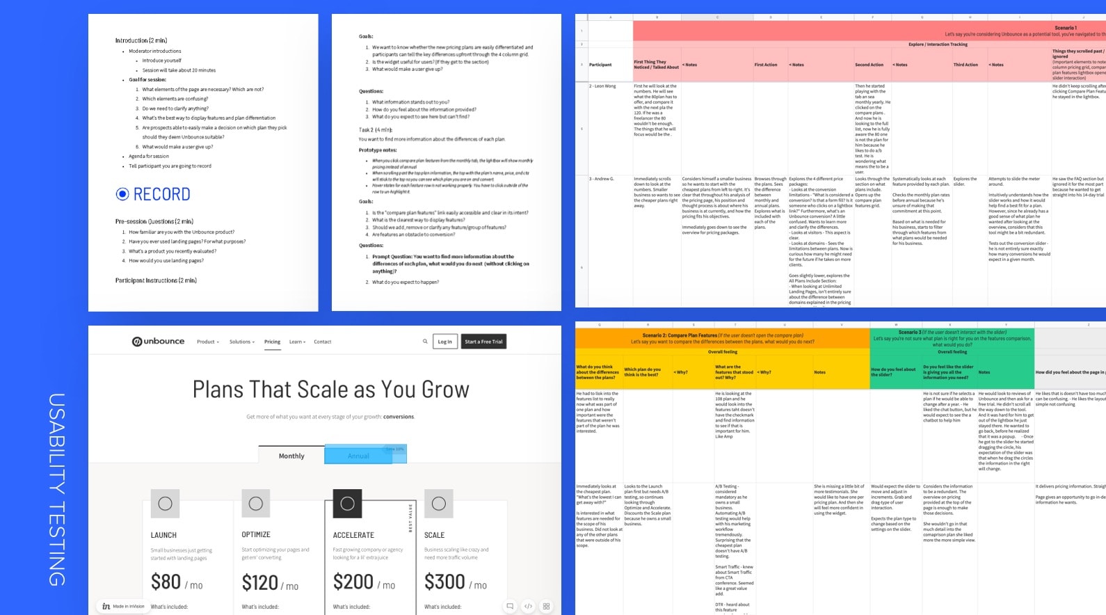
Usability Test
We wanted to gather qualitative data from our potential market to test the usability of the new pricing page. We decided to conduct a usability test before moving onto the mockup stage to learn whether the flow and functionalities we incorporated made sense.
As I created a prototype of the pricing page on Invision, the web strategist and I worked together to prepare a session guide for the test, along with a note-taking template.
The web strategist scheduled usability test sessions with participants, who were potential prospects of our platform. Before the actual sessions with external people, we ran a couple of dry-runs with internal employees that didn’t know much about the pricing changes.
The team conducted the user research sessions and gathered all of the insights and documented them. We then put together some recommendations on what to change based on the insights.
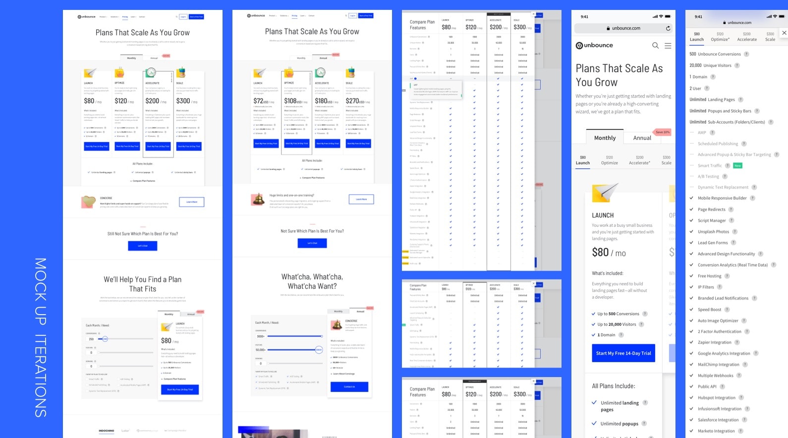
Mockup
The usability test insights helped informed the changes to be made on the pricing page mockups. There were a couple of elements in the prototype that distracted the participants or caused confusion, so it was simply removing those extra elements, keeping the design straightforward. I updated the wireframes into mocks, applying UI elements to the screens, and made changes to the design based on the recommendations the team agreed on. While I designed the mockups, the copywriter updated the copy.
Once the mockups were completed, we presented them to stakeholders along with the research findings to support all of our design decision. The review went smoothly because we were able to validate our work through testing with external participants. We only received a few minor feedback from the group, which was easily implemented after. After getting the green light, I imported the final mocks into Zeplin and made notes to areas with interactions to pass to the developer. The developer created a staging environment for the page and we went through a few rounds of QA before launch.
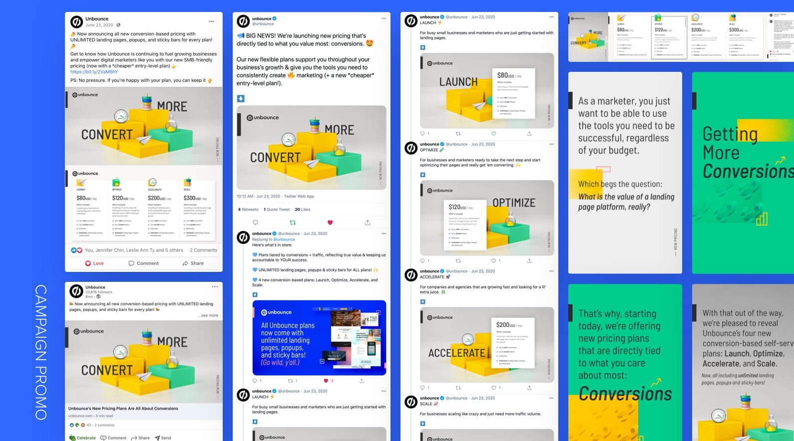
Launch Campaign
Since the update on the pricing model was a fairly big change, we had to advertise it to the market and inform our customers about it. For the campaign, we decided to promote the changes on various platforms (blog, social media, email, etc.) with the narrative of not only telling the market that our price had changed, but also how it would impact their growth. As for customers, we just wanted to inform them that our plans and pricing were updated and they were welcome to change their current plan if they wanted to.


Key takeaways:
Alignment with everyone involved in the strategy and goals from the beginning will streamline the process and avoid confusion.
Overcommunicating is always better. We all know this, but it’s not an easy thing to do most of the time. Like the game of telephone, what the first person says will mostly be completely different when it reaches the last person. Similarly, side conversations and having discussions with various people at different times can become chaotic. Everyone comes out with a different idea in their head because people interpret things differently and tell another person their perspective of the story, or in this case—the plan of the project. After a full circle of individual communication, everyone is confused because they are hearing different things. Yes, everyone can realign in the end, but time has been wasted and this could’ve been avoided if everyone involved sat down in the same room from the very beginning to discuss the full strategy and align on the goals of the project.
Credits:
Lead Copywriter: Garrett Hughes
Web Strategist: Simon Mathonnet
Project Lead: Rachel Scott
Project Manager: Leslie Ty