WORK
Dashboard Progress Tracking
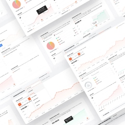
Ubersuggest Webapp Dashboard Historical Data
MEDIUM
UX, UI
DELIVERABLES
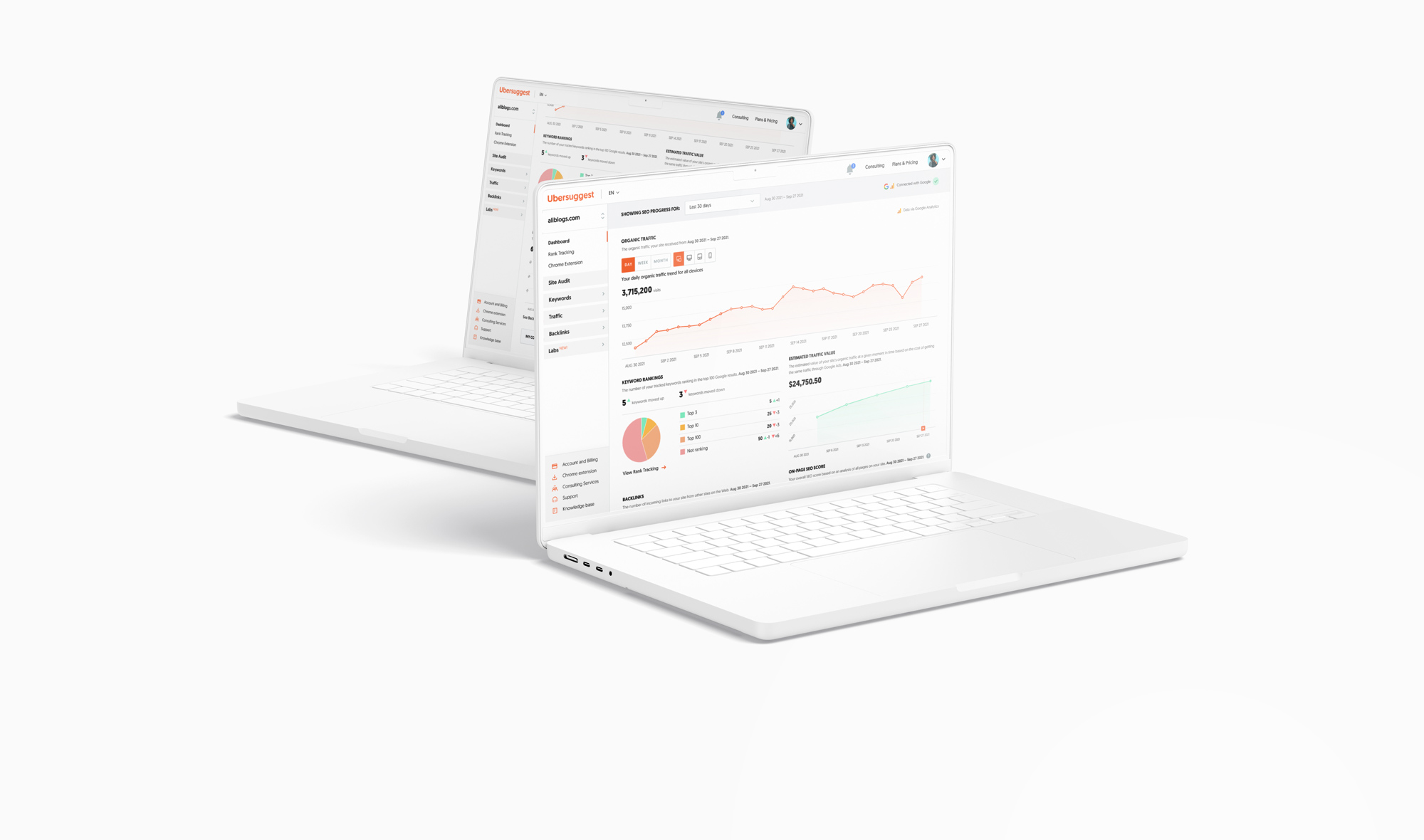
Webapp Dashboard
PROJECT ROLE
Product Designer
Project overview:
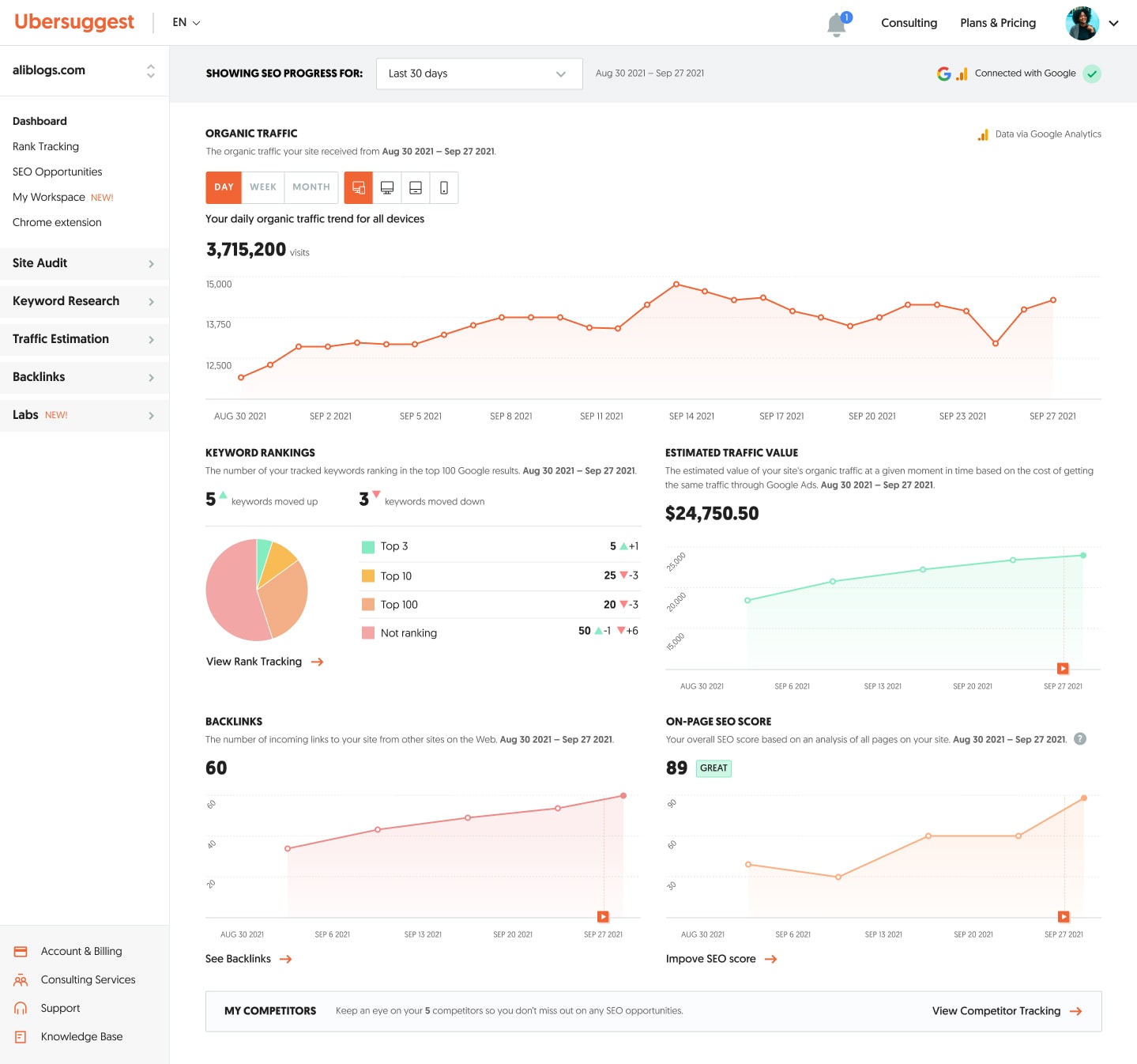
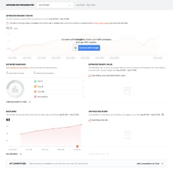
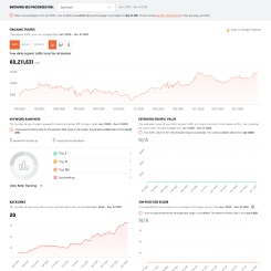
A project in Ubersuggest is for users to manage their website’s SEO. One of the features that a project provides is showing users their site SEO progress on the project dashboard. For this initiative, we did an iterative approach to improving data monitoring and progress tracking on the dashboard. To create a more seamless and consistent experience, we implemented a global timeframe control that would modify all of the different metrics. However, this solution came with some challenges and complexities for us due to various technical limitations that were later discovered when working with engineers.
Problem Space:
“I don’t know what my key SEO metrics were like when I started so I don’t know how much progress I’ve made in my SEO up until today.”
“I don’t know which direction my key SEO metrics are trending.”
Opportunities & Improvement:
- How might we give users a way to monitor their SEO progress over time so they make better-informed decisions on what to do next?
- How might we provide a more seamless and simpler experience for users who are SEO beginners to easily track how their website is doing in a given timeframe?
- Objectives:
- Help users learn which data is important to their business.
- Improve the experience of the project dashboard for users to realize the value of having projects.
- The initiative was part of the following quarterly KPI goals:
- Reduce voluntary churn by 4%
- Increase paid subscribers by 5%
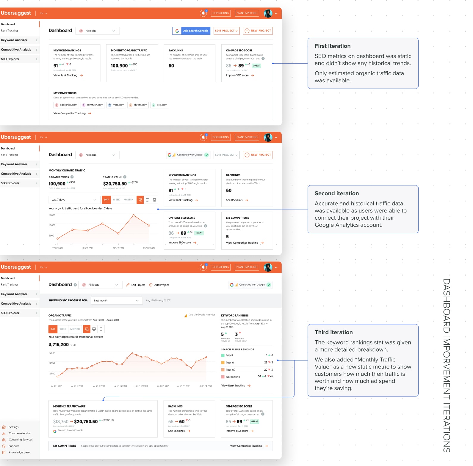
We made various iterations to improve the data viewing experience to help users better track their SEO progress over time.
Hypothesis:
By giving users a way to monitor their project’s metrics and track how their site is doing over time, they will find value in having a project, increasing the repeat usage of projects and ultimately improving customer tenure.
Objectives/KPIs:
Design process:
As this initiative was an iterative process, it was already a part of the roadmap. The Product Manager presented the problem space and opportunity to kick it off. We discussed it and I had the opportunity to ask the PM questions to get more context about the problems, as well as any signals or data that supported the initiative. We bounced a few ideas off of each other. I started doing discovery once I had everything I needed to begin. While I was working on the discovery process, the backend team had a spike for this in the sprint.
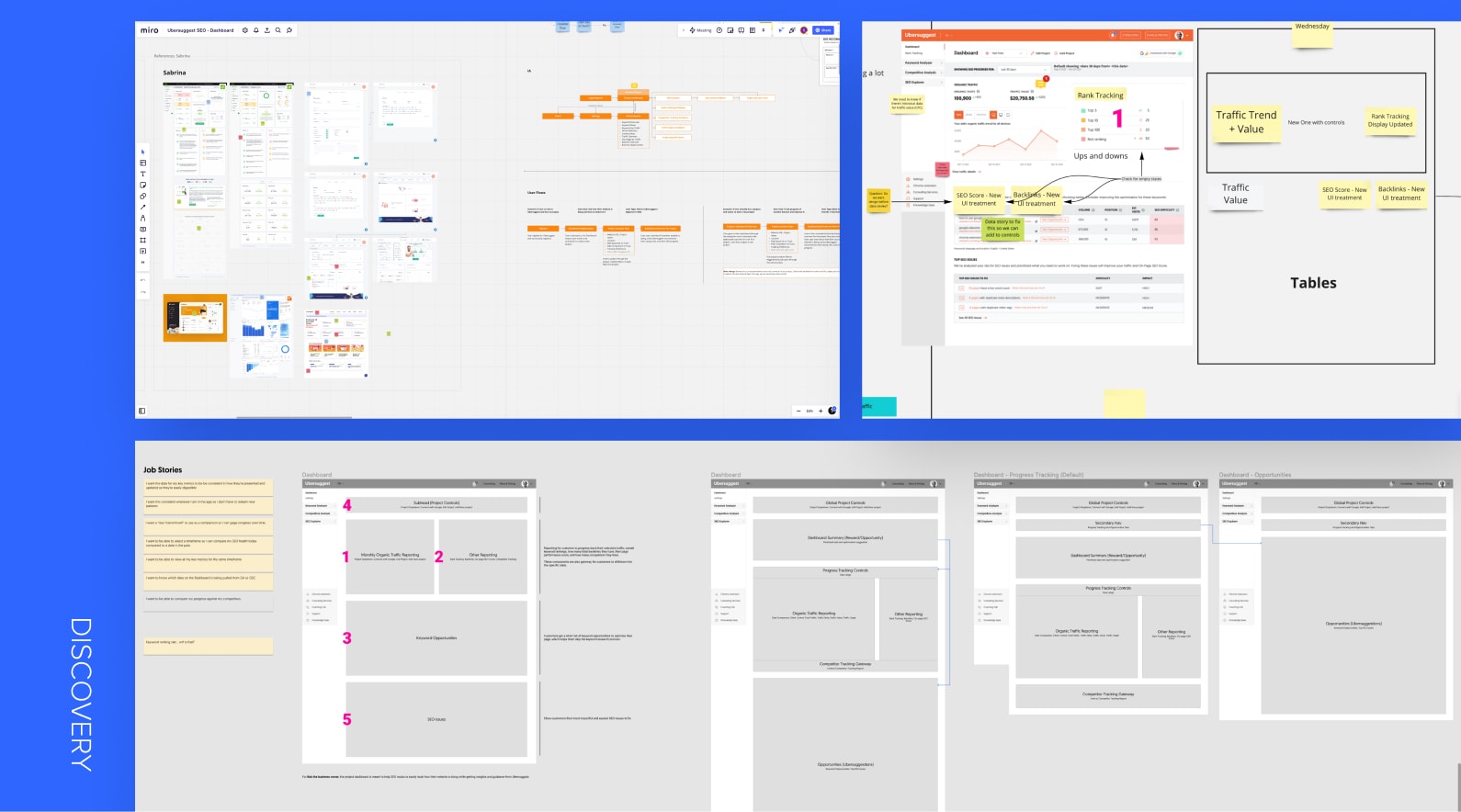
Discovery
Market Research, Competitive Analysis, Information Hierarchy
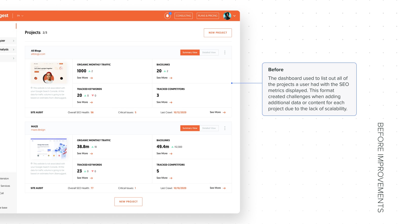
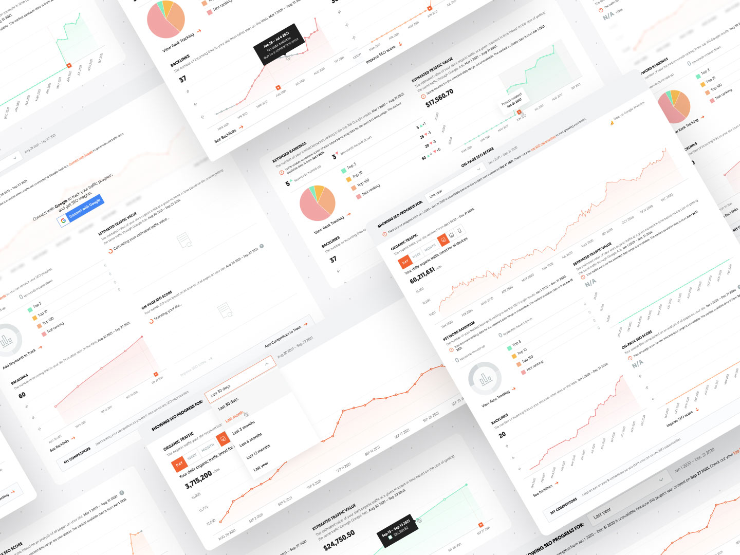
During discovery, I did an audit of the existing dashboard and identified any improvement opportunities. I conducted market research to get inspiration from other tools with a dashboard that displayed multiple metrics over time with a timeframe control. I also performed a competitive analysis on how competitors displayed SEO data and whether they had a global timeframe control. Through the research, we discovered that it wasn’t common for SEO tools to let users modify all of the different SEO metrics within a single timeframe. Instead, each metric had its own timeframe control. From there, we saw an opportunity to introduce less friction for the end-user when tracking their SEO progress.
Because we were adding new functionality on the dashboard with a global control, the information hierarchy was impacted, which introduced a level of complexity. Before diving deeper into the details of the content, I categorized the different types of content into blocks. I organized the blocks in the order that made sense with the global timeframe control to view it in a high level perspective. Once the blocks have been determined, I was ready for the next step of the design process—sketching.
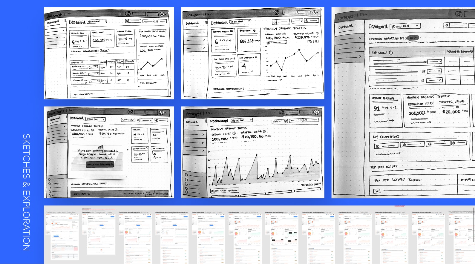
Sketches & Exploration
I made some low-fidelity sketches to explore how the SEO metrics could be displayed. Once I was done with the sketches, I showed them to the Product Manager and discussed them. The PM provided his feedback and any additional information that may had been previously missed, as we discover new learnings every step of the way.
After doing the sketches and jamming with the PM, I started exploring some higher-fidelity designs to reflect the sketches and identified various states and edge cases. As I was designing, I discovered it was more complex than expected due to all of the state changes there could be when changing the timeframe of the metrics globally. I designed a first-pass version in preparation for the technical breakout call to show engineers how we envision this initiative.
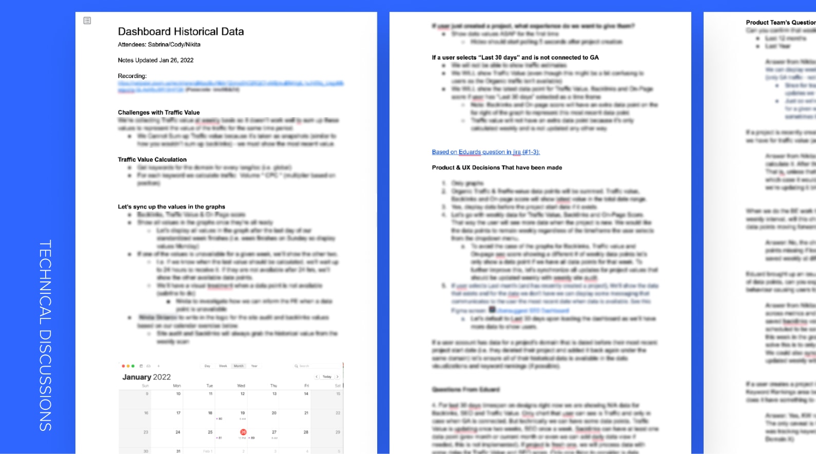
Technical Discussion
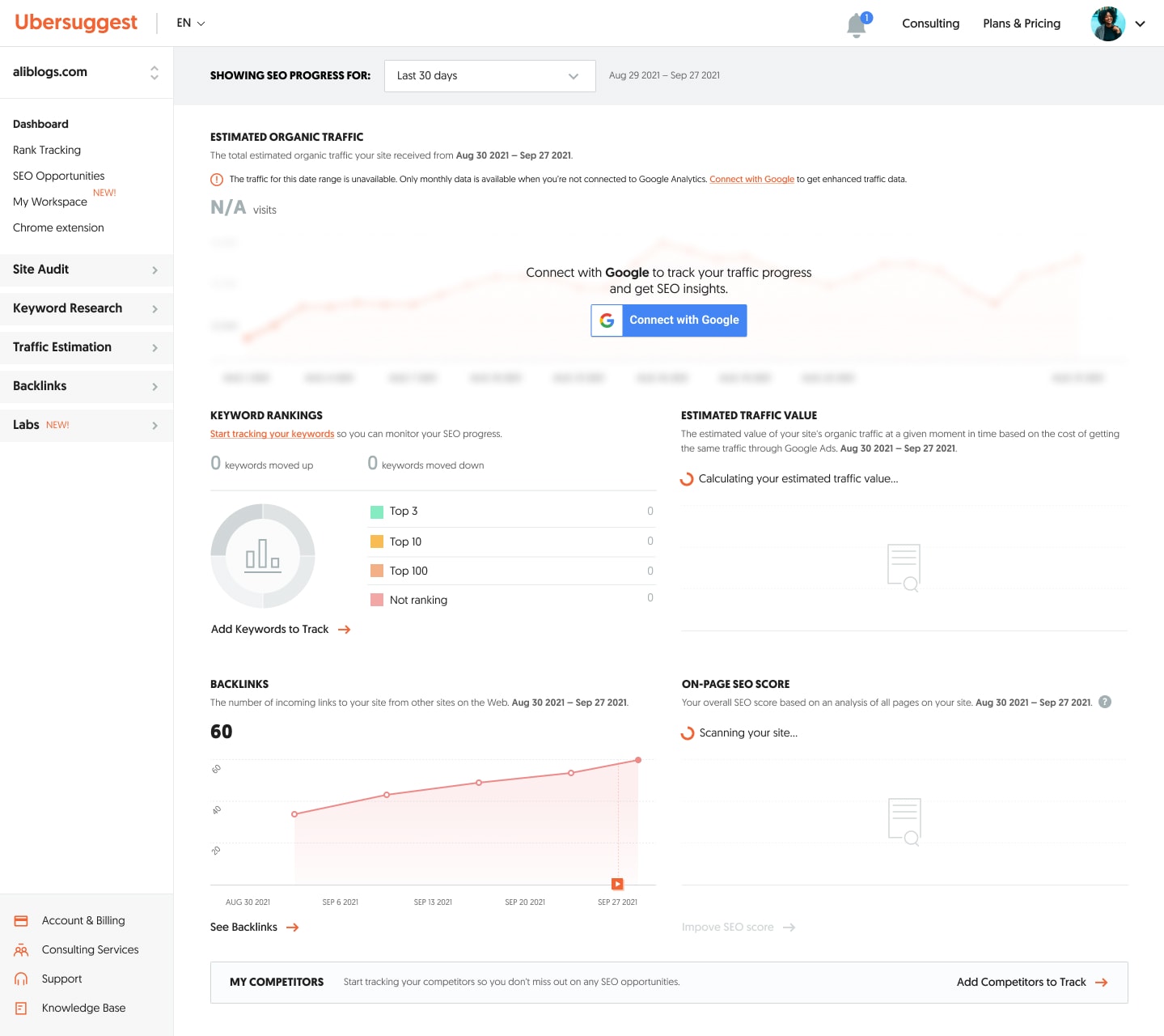
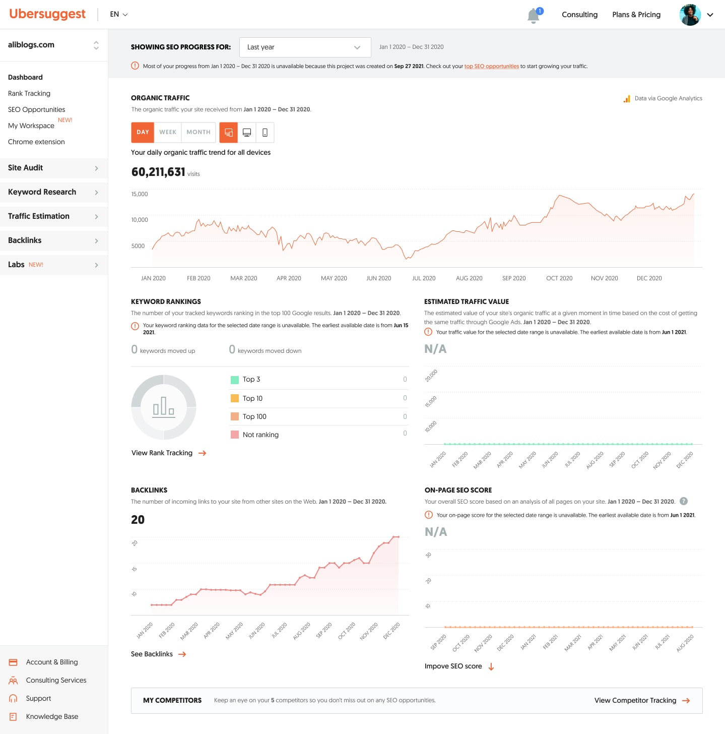
We scheduled a breakout call with the engineering and data team to chat about the technical feasibility of what I designed. After presenting the designs to the team, they asked questions and highlighted issues that would introduce a lot of complexities and challenges. Some of the SEO metrics were from different data providers and their data were stored differently. Because we wanted to add a global control that would modify the timeframe for all of the SEO metrics, showing results for all metrics in various timeframe options would be impossible. Certain timeframes required the time increment on the graph to be in days, but we had been storing the data only for months prior to that. For users to track performance over time, they needed to see the historical data of each metric. However, not every metric had historical data stored in the backend. The team also pointed out various edge cases that were missed, which I noted down and had to solve for in the design by adding more state changes.
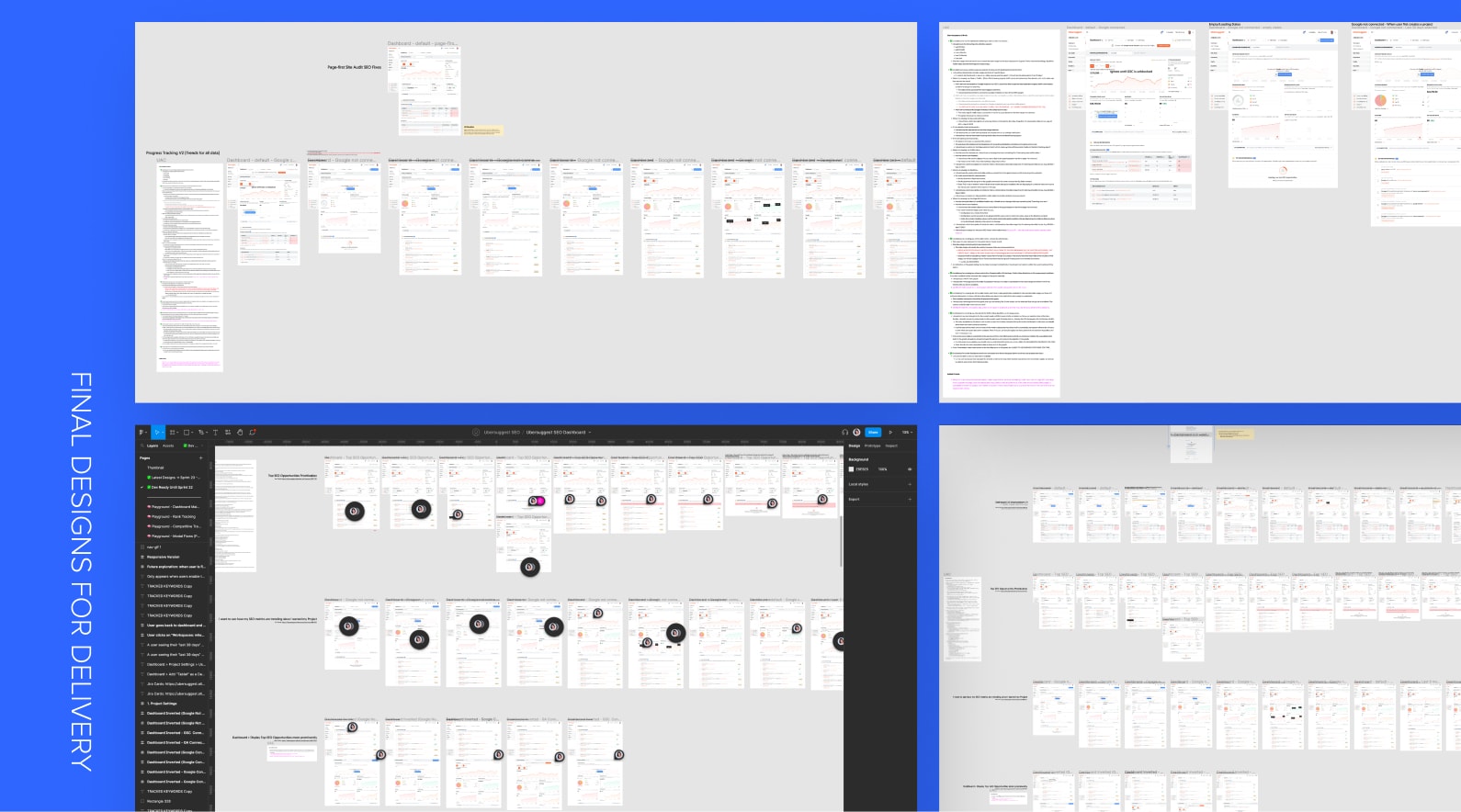
Final Designs for Delivery
After the technical discussion and getting more clarity on feasibility and scope, I finalized the designs and prepared them for delivery. I worked with the PM to ensure every user acceptance criteria was identified. To confirm that nothing was missing in the designs, I pasted the acceptance criteria on the Figma canvas and cross-referenced it with the design. I also added developer notes on the design for engineers to refer to.
Outcome:
Result & Performance Metrics
This initiative to improve the dashboard experience contributed to the quarterly goals of reducing voluntary churn by 4% and increasing pay subscriptions by 5%. We surpassed the churn reduction goal by 1.28% and the paid subscription goal by 3.27%. This validated that continuously improving the user experience of the app will directly reduce churn (and not necessarily constant feature development), which gave us more confidence in further going down that route.
Reduced Voluntary Churn by
5.28%
Increased Paid Subscribers by
8.27%
Key takeaways:
Introducing an initiative idea to engineers as early as possible can steer the initiative into a simpler direction with less challenges.
The process of developing this initiative underwent many challenges due to technical limitations with the different API’s and data storage. The main cause of the trickiness was the global timeframe control for different SEO metrics. While this was believed to be a better experience for users, it opened Pandora’s box because it introduced so many edge cases, resulting in multiple sprint roll-overs. A huge learning was that collaborating with engineering earlier on could help us better scope this from the beginning. While improving the dashboard was already an iterative approach, this could have been avoided if it was further broken down into several sprints.
Credits:
Lead Product Designer: Sabrina Chan (Product Designer)
Lead Product Manager: Cody Campbell (Product Manager)
Lead Backend Developer: Nikita Skliarov (Backend Developer)
Lead Frontend Developer: Hideo Kojima (Frontend Lead)
QA Lead: Gilberto Morais (QA Engineer)
Scrum Master: Kate Mishchenko (Scrum Master)