WORK
Unbounce Brand Rollout
The Launch of Unbounce's Newly Evolved Brand
MEDIUM
Art Direction
DELIVERABLES
Internal & External Campaign
PROJECT ROLE
Lead Designer
Project overview:
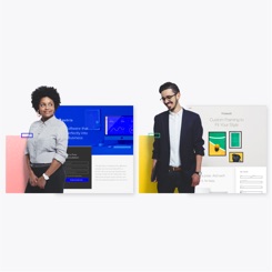
On the 18th of June 2019, Unbounce finally launched its newly evolved brand. Just to reiterate, we didn’t “rebrand”. It was—I will say it again—a “brand evolution”. Not only did we just have a new look, but also a new strategy and positioning. But for this case study, I will focus more on the internal and external brand rollout. If you’d like to see more on the process that went behind how we approached the brand refresh (from brand audit, making a business case, to establishing the brand strategy, and to defining the visual standards), check out this blogpost.
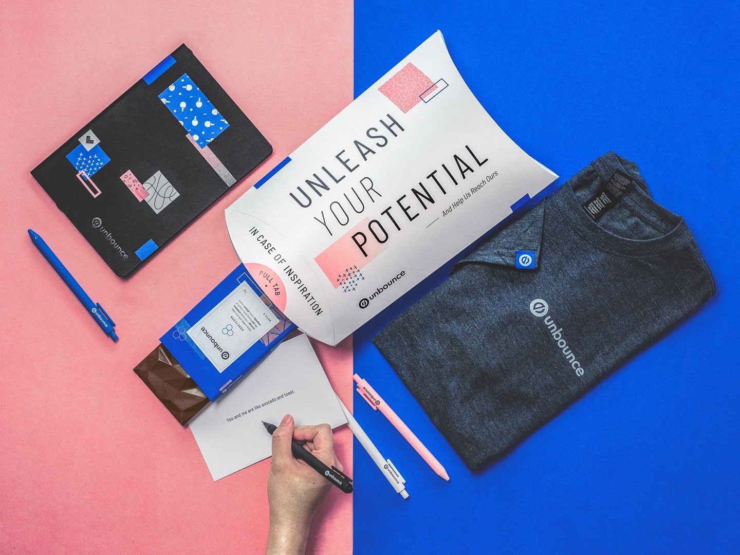
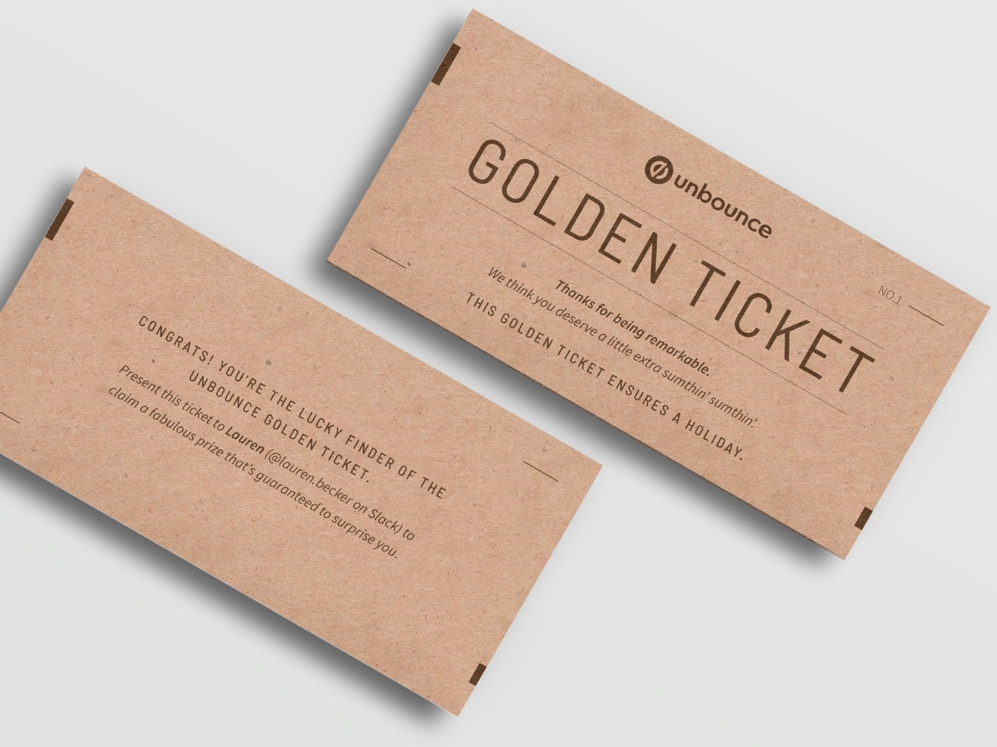
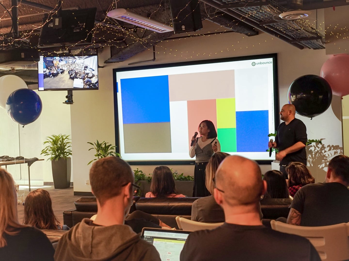
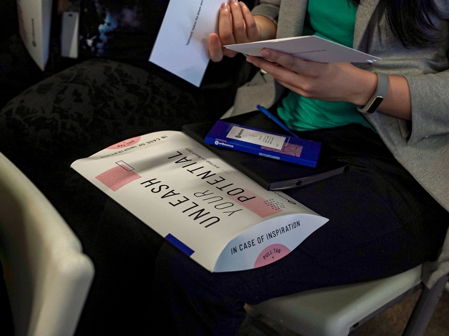
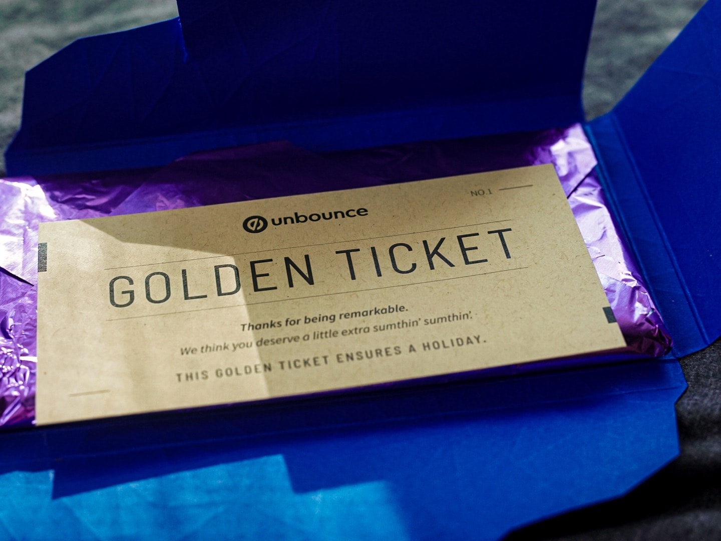
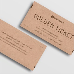
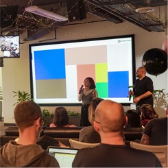
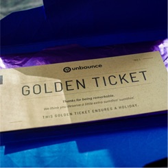
Once we developed and documented all of our standards in early February, we planned our rollout. When we pitched our visual standards, we gave rollout recommendations based on this article on how to execute a “disaster-free rollout”. We did a big internal brand reveal during our town hall in April 2019. Town halls happen once every quarter, and we made this one special, which involved a huge beautiful charcuterie board. Our president spoke about our new business strategy and what it meant for our culture, then our UX Principal and I presented the new brand standards, including the brand strategy, personality, voice and tone, and visual standards. Towards the end, we did a bit of a surprise “Oprah moment”. By that, I meant having boxes of swag handed out to the audience and announcing that they all get a box. I literally pointed at people and yelled, “YOU GET A BOX”, multiple times. There were a few swag items in it, but the grand prize was a “Charlie and the Chocolate Factory” inspired golden ticket hidden in the chocolate bar in two of the boxes. They granted plane tickets to Berlin from Vancouver with a plus one. By rolling out the brand internally with a big event, not only were employees super hyped, but it also made the new brand more memorable and resonate with everyone. They would also be more keen to update existing things into the new brand and apply it. Of course, we also wanted to make it easy and accessible for everyone, so we created many different templates and internal resources for employees. The resources include a master slide template, landing page template using our own product (landing page builder), online documented style guide (brand strategy, design, and writing guidelines), a drive with all of our resources and assets (logos, fonts, photos, colours, etc), and business cards.
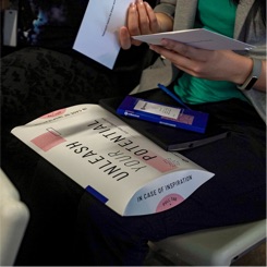
Once we had all of our internal rollout materials prepared, we started working on the external launch. For that, we decided to do a campaign around it, because we’re extra. We didn’t just launch a new website, which is a must-have, and create a few materials, like a blog and social post, to announce our new look. We also created a brand awareness campaign with a messaging that delineated how our brand promise would help and what it meant to our target audiences, marketers, and the marketing world. “Make extra your new normal” was the concept of our campaign. The idea around this was based on our customer-centric and people-first focus. At Unbounce, we’ve always gone the extra mile for everything we do. Whether it’s producing a marketing campaign or going out of our way to delight a prospect or customer, like the time our team mailed a prospect her favourite brand of coffee because she praised the great customer service we provided during a sales outreach on social media, we would go above and beyond to ensure we are giving people the best experience in our ability. With that being our nature and a big part of our brand, we wanted to invite marketers out there to do the same, to make extra our new normal together, and we would be here to support them along the way. The external rollout included our new website, blog posts on the new look and the campaign messaging, various social posts, customer and prospect emails, media placements, and an interactive social media sub-campaign, “#ChooseExtra”. This sub-campaign encouraged people to shoutout extraordinary marketers, where each shoutout contributed five minutes of Unbounce’s volunteer time to non-profit organization, PeaceGeeks.
To see more about the process behind the brand evolution before the rollout, check out this blogpost.
Project Goals
- External: Make a splash in the market about our new brand and increase awareness, which would be measured through the number of traffic on the website and blog posts, brand mentions, social and customer engagement, and secured media placements.
- Internal: Get Unbouncers excited about and make them proud of the new evolution of Unbounce, this would be measured based on the number of social shares and engagements they contribute, as well as positive sentiment we receive from a survey.
Design process:
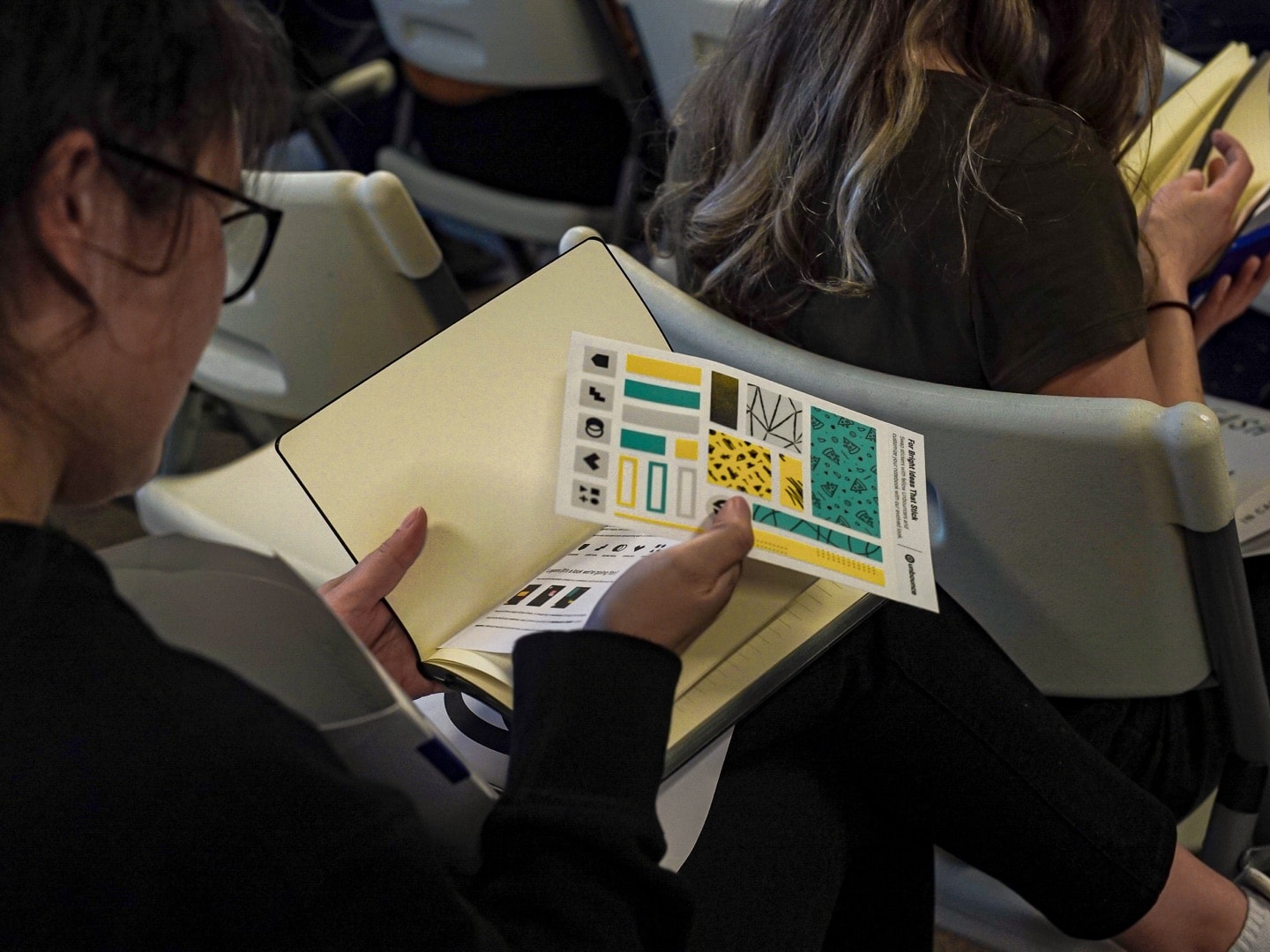
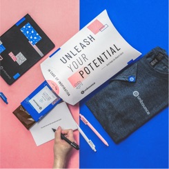
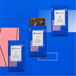
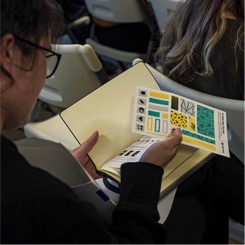
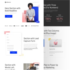
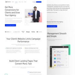
In the first few months of 2019, we had to prepare for the internal launch since our town hall was set in mid-April. The biggest thing we had to prioritize was the swag items, mainly because of the strict print deadlines. We designed a series of swag, including t-shirt, chocolate bar packaging, golden ticket for the chocolate bar, notebook, pens, and core value postcards. All of these swag items were given in a pillow-shaped gift box, which also required design. Along with the physical swag items, we also created some digital resources for internal use, which incorporated a master slide deck template, landing page template, Slack colour themes, and wallpapers. I created a theme on Google Slides for the master slide deck and included basic layouts. Making sure the slide deck was useful, I consulted with a representative from each business unit (product, revenue, and operations) about what kind of layouts would be most helpful to the org. I took their recommendations and updated the deck accordingly. As for the landing page template, I designed each section in a different layout, following our website’s UI components.
Concept Brainstorm
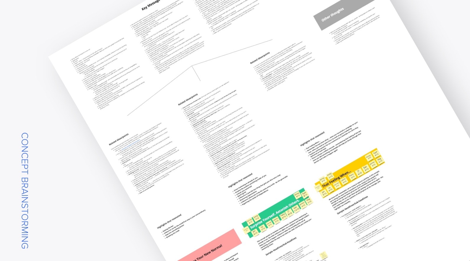
We used our brand pyramid, the core of our brand strategy, and positioning as a foundation of our campaign concept and messaging. We had to think of a tagline and slogan to drive the campaign. At Unbounce, we’ve always been about providing a delightful experience for our customers, which aligns with our brand strategy, especially our people-first attribute. The team invited Unbouncers with customer-facing roles to an initial brainstorm for the campaign key messaging. It started with sharing experiences of times we had delighted our customers. Based on all of the insights, the second part was for the team to throw ideas and bounce them off of each other. They were then grouped into buckets on the board.
Our art director, content manager, and campaign strategy manager were responsible for pitching three campaign key messages (tagline and slogan), to the group. They gathered all the ideas, organized them and ideated three concepts based on the initial brainstorm. They presented the three key messages on a Miroboard. Each concept was supported by a list of ideas from the first brainstorm, a brief explanation of the concept, various headline and subhead options, and a test to see whether the concept aligned with the brand strategy. The group had some time to discuss the presented options, and everyone was given a chance to vote for their favourite concept. The winning concept was “make extra your new normal”.
Art Direction Development
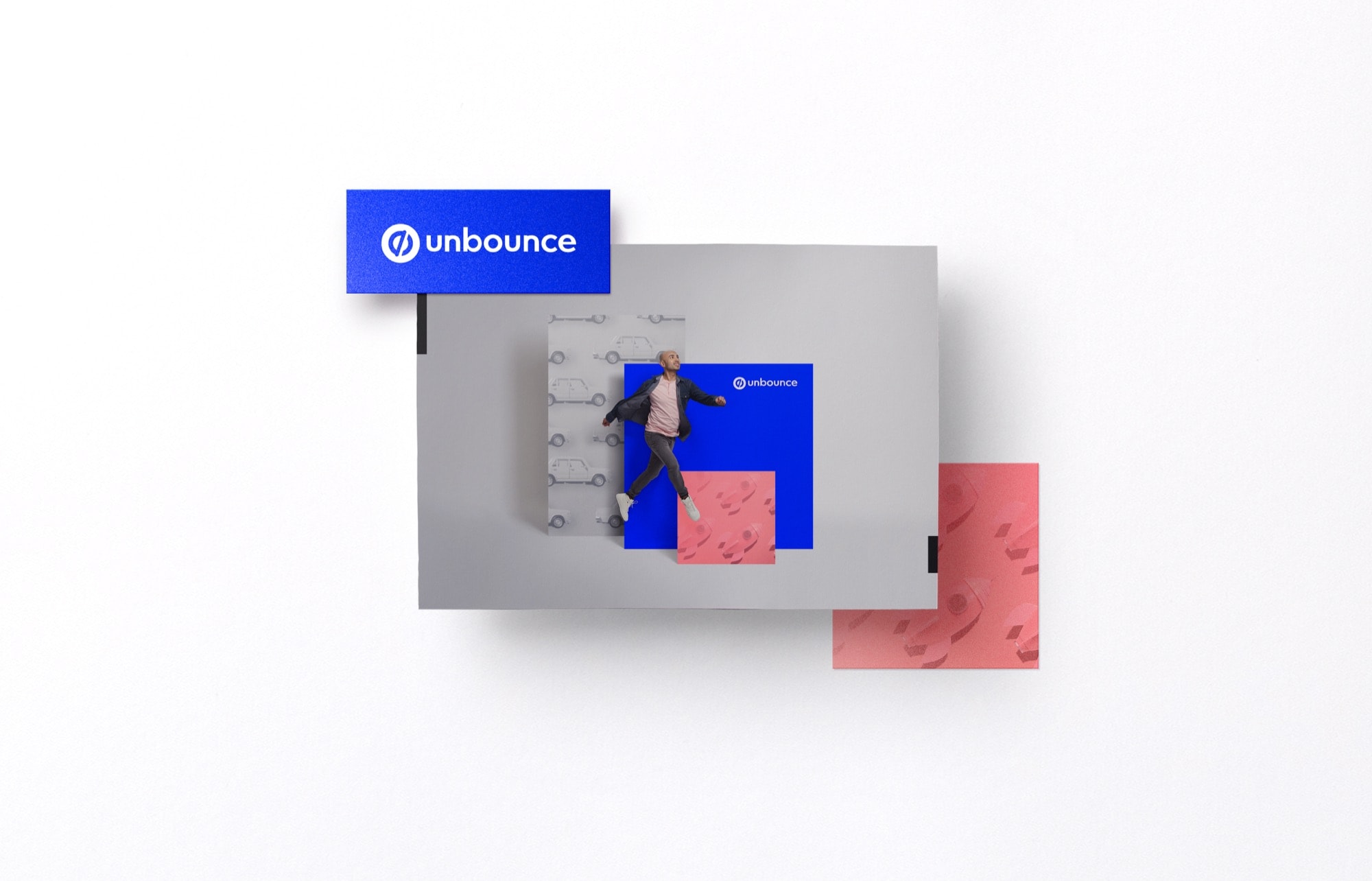
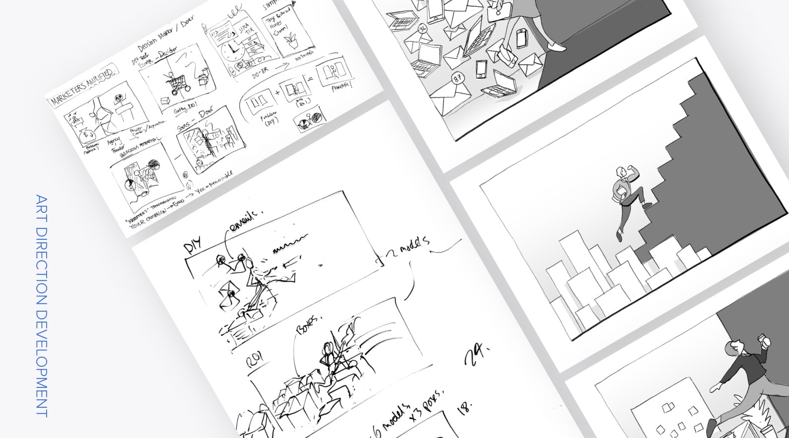
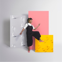
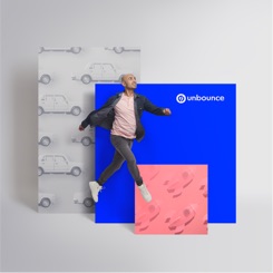
Based on the finalized campaign key messaging, the core team met and brainstormed the visual direction of the campaign. Again, we bounced ideas off of each other and ideated three visual concepts. The first concept leaned towards a more on-brand approach, following our general brand composition—a portrait of a marketer front and center, while different layers with various patterns resembling “make extra your new normal” laid out behind the marketer. We had another idea of a marketer jumping from an old world to a new world, and that really resonated with us. We developed this into two visual approaches—one with patterns representing the two worlds, and the other with real-life props to represent each world. The idea behind that was to show a marketer jumping away from a mundane or “stale” setting to a new world, where they would achieve crazy high results because they’ve chosen to go above and beyond in their work. I sketched out the three visual directions and found references to support each concept sketch. These were later pitched to stakeholders, and the visual approach with the jumping between worlds represented by patterns was the final chosen concept.
Photoshoot Prep
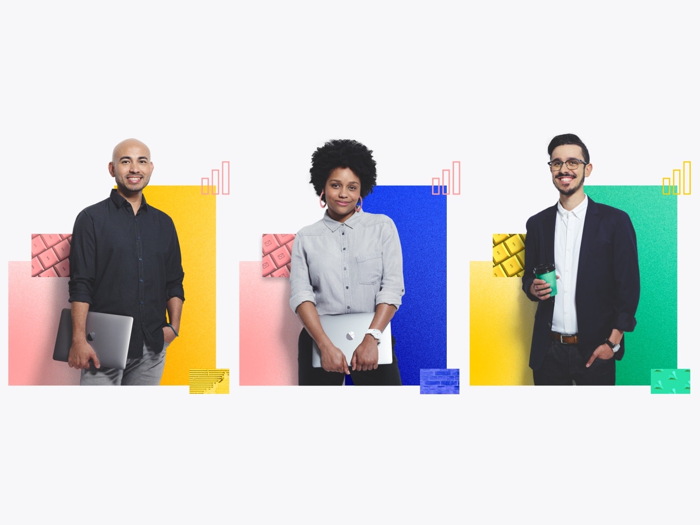
Our brand relied heavily on photography and people portraits. We didn’t want to depend on stock images, especially when showcasing people to represent our marketers (our customers); therefore, we got a photographer to shoot curated custom photography for us. We decided on producing two sets of photos for the launch—marketer portraits for general resources (mainly the website) and photos for the external campaign rollout, which also included people.
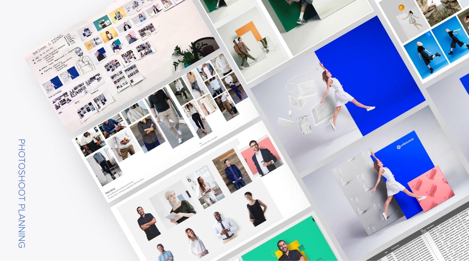
Since the subject of our shoot was primarily people, specifically marketers that represented our customers, we conducted some research on our customers baser on our three target segments: agency, SaaS, and e-commerce. Our team knew what our target demographic was (age ranging from mid-twenties to mid-forties), but we needed references of what our customers looked like and their attire so we could accurately represent them in our photographs. We got a list of customers from the three target segments that product marketing interviewed, and creeped analyzed their social media (or whatever images we find of them on the interweb). We added their images onto an Invision board, where they were separated into different sections based on their segment. Based on our findings, we created a mood board for outfits for both men and women in each segment. The team then looked for portraits of people to develop various archetypes. Diversity played a major role when considering our archetypes, as it’s one of our business’ core values. We printed all of our research on the wall for visibility, as well as more collaborations and discussions.
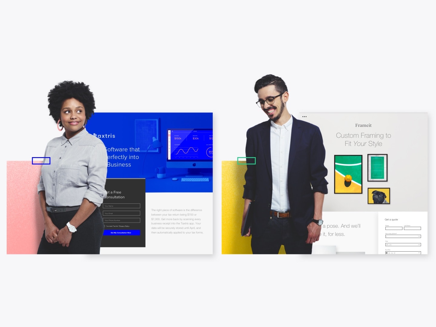
While we were conducting our research, we found multiple potential photographers to work with, and we decided to work with Lindsay Siu. We sent her a brief that included references from the research we did and met with her a couple of times to plan the shoot. The team developed a shot list that included specifically what each image was in detail (i.e. Shot #1 | Name: Front-on Marketer Portrait Pose | Type: Full Body | Environment: Neutral light grey background with neutral shadow | No. of Models in Shot: 1 | Description: ¾ pose – looking at camera – natural smile – holding laptop). We showed her compositions we created for our generic visual standards as reference for the marketer portraits, as well as sketches and a mood board for the campaign images. While the marketer portraits were straightforward, the campaign images needed more planning and discussion, as the composition required more complicated props. I mocked up several high-fidelity iterations of how the campaign image would look like to see which one would be the most appropriate and feasible. We sent the finalized mockup to Lindsay and her team and decided that we would have four campaign images with a different model in each. Concurrently, Lindsay searched for talents based on our archetypes and sent us photographs of a couple of models for each archetype to choose from. At that point, we felt like we were a model agency. Lindsay also worked with a wardrobe stylist to find the right set of attire based on our references. We scheduled one full day for a photoshoot for both marketer portraits and campaign images. In the end, we agreed to have a total of six talents for the shoot. All six of them were in the marketer portraits, and we shot four of the talents for the campaign photos.
The Photoshoot
We did a full-day photoshoot at Lindsay’s studio. She worked with a team of people, including a retoucher, two assistants, a stylist, and a makeup artist. A few of us from Unbounce was there as well to give directions and make decisions when necessary. The stylist brought an entire wardrobe based on our references, and we helped pick out the outfit for each talent. Each model was scheduled at a different time so we had to be efficient with each shoot, especially for the ones with both marketer portrait and campaign shots. We also had props, such as notebooks, mugs, pens, and laptops for the talents to hold while we were shooting the front-on marketer portraits.
The campaign shots required the model to be in front of panels; however, we shot the models and the panels separately and composed them together during post-production. That way, it would be more scalable, as they could be in separate layers. We shot the models first, asking them to pose as if they were moving from one side towards another. Some models were leaping, while others were walking. As Lindsay photographed the models, the retoucher mocked up the campaign photos in real-time, placing the models in front of blocks of colours, which were mocks of the panels. The retoucher showed us the mockups for us to give him directions for the composition (colours to use, size of the panels, and positioning). The panels were shot last that day. The team used v-flats for the panels and shot them independently. It was mainly to capture the real shadows so that it would be realistic in the final composition.
Scoping
Every project needs to be scoped, this one was no exception, obviously. Our core brand team scoped out the project and made sure it was a full-funnel experience. The marketing team worked with the customer marketing team to make sure we produce the appropriate collaterals for each part of the customer journey. With the handy Miroboard, we created a campaign flow for the brand rollout. Even though we had quite a large team, we still had a deadline with limited resources, so we decided to launch in phases. But of course, we prioritized the things that would contribute the most to a big splash in our brand awareness. The biggest part of the campaign was actually a sub-campaign, the ChooseExtra campaign, which is too much to include on this one portfolio page. Feel free to check that out too.
Outcome:


Result & Performance Metrics
Metrics measured from June 2019 – July 2019 (30-day post-launch)
BLOGPOST VISITORS
2121
SOCIAL ENGAGEMENT
4.5%
NEW TRIAL START
17.6% Increase
PRESS
UnderConsideration
Martech Advisor
B2B News Network
Transform Magazine
Intrado
Key takeaways:
Having a strong foundation to ground your work is vital in its success.
I said it once (or maybe a couple of times), and I will say it again. Without a clear base from the beginning, things could easily get outta hand. Been there, done that. Having a brand strategy and positioning with a simple brand pyramid was honestly the best thing we could’ve asked for. From that, we were able to come up with a brand key messaging and concept for our campaign. Concepts are great and all, but a concept that comes out of thin air is not always great. Inconsistencies would eventually arise. During the brainstorm, everyone was on board with what our brand strategy and product positioning were and contributed to the sessions with those guidelines in mind. Great ideas came out of the sessions, which was how we were able to ideate concepts that were justifiable. Inconsistency was no longer an issue for us, as all of the assets we created were well-aligned with the concept with a strong rationale behind them.
Make people feel involved and part of the process.
In addition to setting a solid foundation, we also made sure people felt included in the process, especially when it came to decision making. Not only did that bring in more diverse perspectives, but also positive vibes. Let’s be honest, people love to give opinions and feel like they’re heard. But we also gotta balance it a little so it won’t become chaotic, where a buncha people brainstorm in the room for hours getting nowhere. Yeah, that ain’t great. Been there, done that too.
We needed structure. We call it “the golden three pitch” (well, I call it that… there isn’t an actual name for it.) This was something we implemented in our process, where we pitched three concepts to the team and stakeholders for them to choose from. It was for everything we needed approval on, and we tried to bring them along the process throughout the project. In the beginning, we got a larger group, including stakeholders, to brainstorm ideas based on the given brand strategy. The core team took the ideas and developed three concepts based on the brainstorm along with a rationale for each, and presented them to the group. Each person then voted for their favourite concept. Once we locked down the concept, the core group brainstormed a visual direction for the campaign. I took the ideas and came up with three different directions and roughly sketched out a master graphic for each, along with a mood board to reference the sketch. And of course, each visual concept was supported by a rationale. They were put into a slide deck and presented to stakeholders. We had time for discussion and feedback afterwards, and finally, we decided on what the final direction should be for the campaign.
This process has been working well for our team. While executors are empowered to have more creative freedom in and autonomy over their work, stakeholders are able to be involved throughout the journey and have all of the contexts on the executors’ decisions. It’s no longer a “yes” or “no” from stakeholders on that one polished product that you spent days on. They got options, which makes decision making much smoother.
Credits:
Art Director: James Thomson
Lead Copywriter: Garrett Hughes
Lead Campaign Strategists: Ashley Luk (marketing), Pablo Penades (customer marketing)
Project Lead: Rachel Scott
Project Manager: Leslie Ty
Social Media Strategist: Jennifer Chin
PR: Sarah Gooding
Head of Content: Jennifer Pepper
Internal Communication: Erika Finlay, Lauren Becker
Other Designers: Cecilia Martinez (lead designer for website, photoshoot), Gustavo Barta (some swag items, social media posts)