WORK
Integrations Section
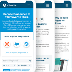
Unbounce.com

MEDIUM
Website
DELIVERABLES
UX, UI
PROJECT ROLE
Lead Designer
Project overview:
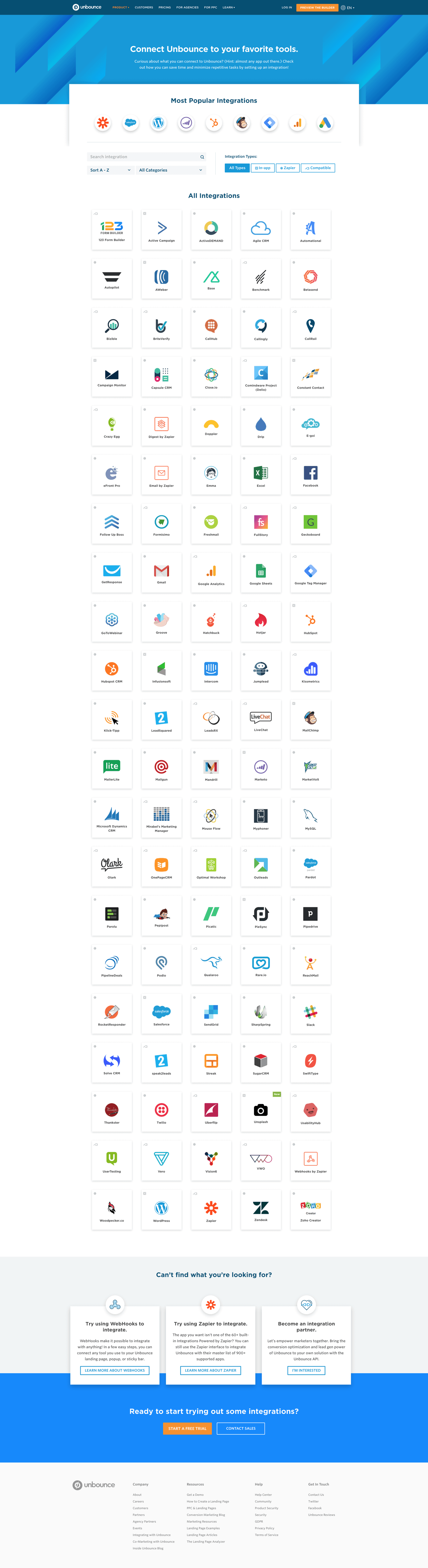
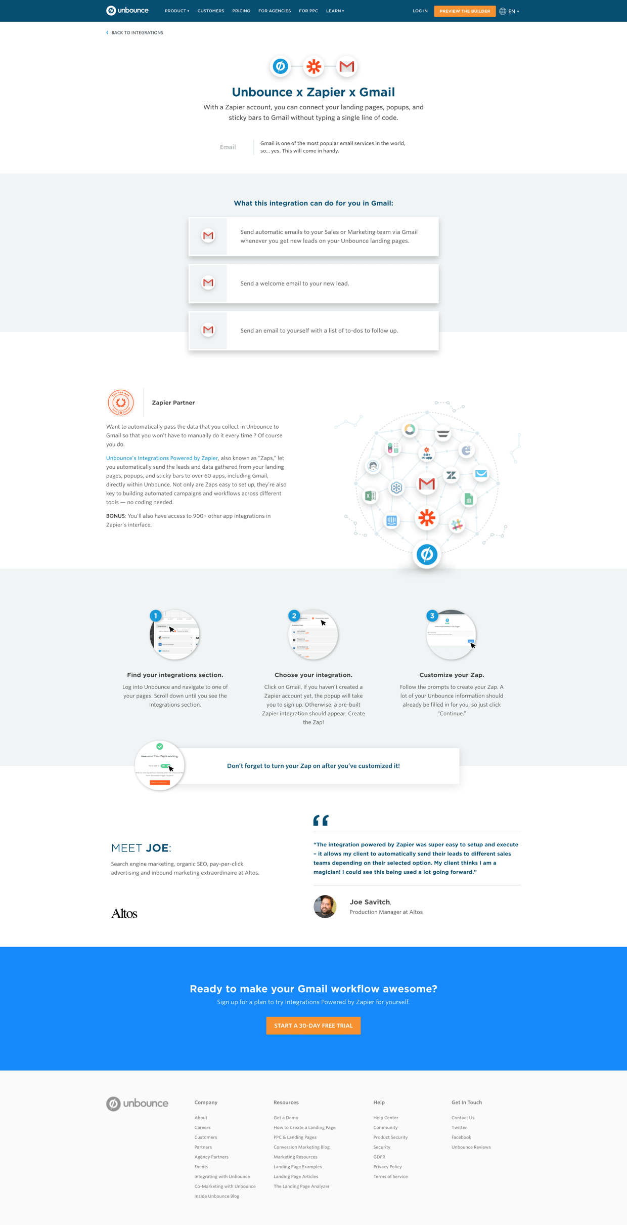
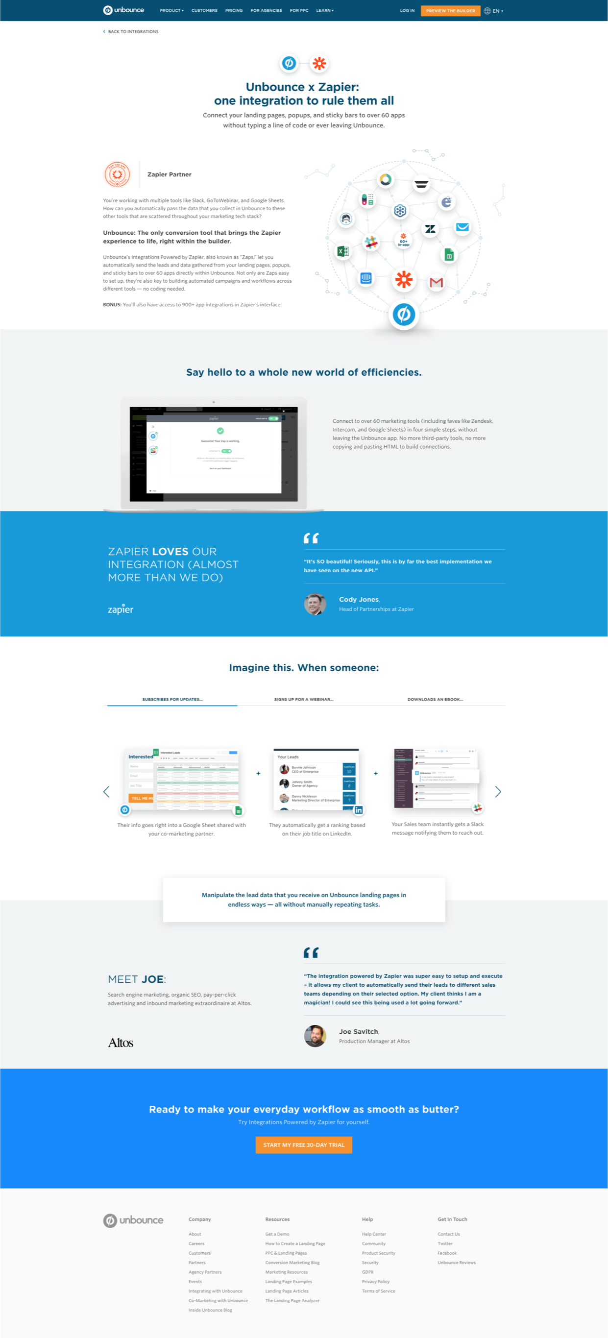
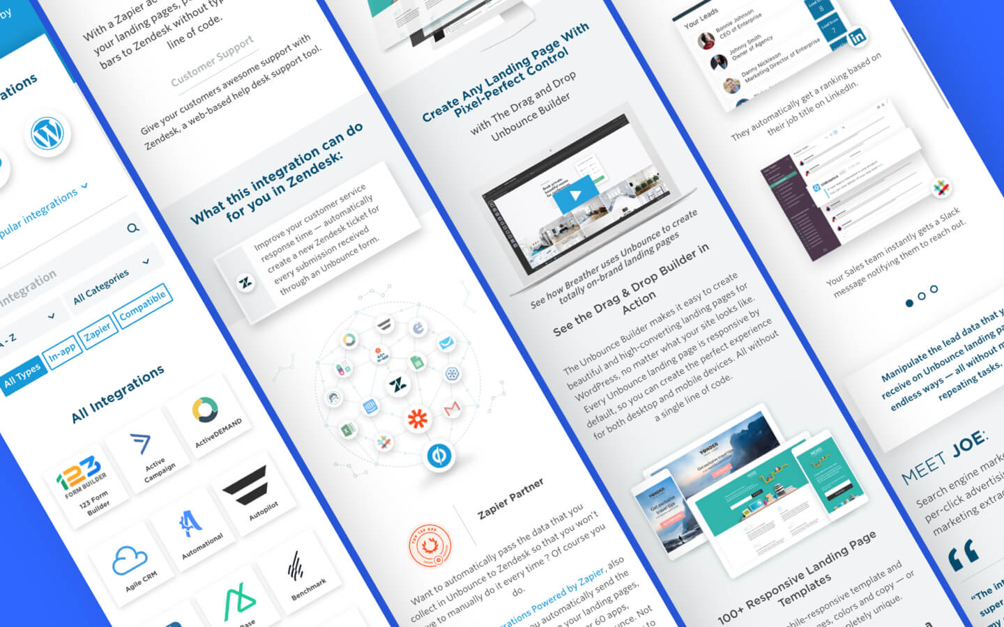
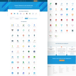
The Unbounce Integrations page was a new section on unbounce.com. I designed the visual layout and experience of the section, which includes the main directory page and child pages. This was a fairly large scope, as it was related to a product launch, Zapier in-app integrations, so it was also depedent on other departments as well.
Project Goals
- Generate NTS (new trial start) for Unbounce
- Better showcase Unbounce’s 100+ integrations, which is prompted by the in-app Zapier integrations product launch, to provide a better experience for evaluators that are looking for what tools Unbounce integrate with, and whether Unbounce integrate with the tools they use.
Design process:
The project started because Unbounce was launching a new large-scale feature, in-app Zapier integrations. To support this new feature launch, marketing had a few initiatives, and the integrations section on the website was part of them, as it was the biggest initiative in support of the launch. The project started off with a kick-off meeting with key stakeholders, and of course, the team lead and executors (designer and copywriter). We defined the brief and the RACI (responsible, accountable, consulted, informed), and I was appointed to lead the project, as well as be the lead designer of everything that involves Unbounce integrations.
Secondary Research
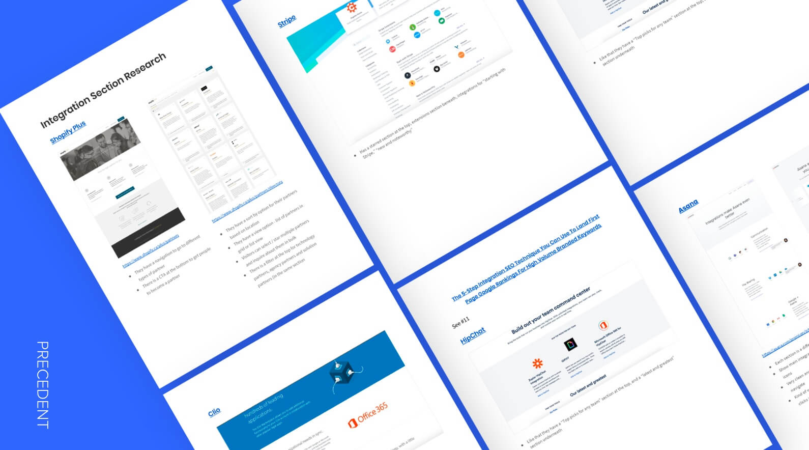
Precedent Research & Competitive Analysis
First, contributors gathered a few precedents to see what are some of the things other companies do well, as well as can be improved, to acquire inspiration and insights.
We also did competitive analysis to see how our competitors showcasing their integrations, as well as doing a SWOT analysis on their integration section, which was really useful for our strategy and design decision.
Wireframe
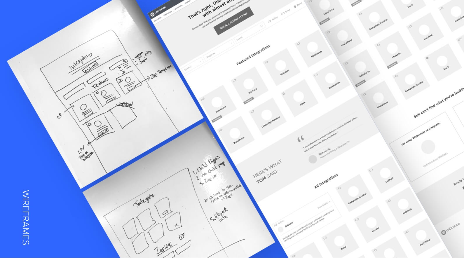
I set up a meeting with the copywriter, and outlined the structure of the page. I then drew out a low fidelity wireframe on the whiteboard for both of us to have a clear understanding of the direction, and could move forward with the project simultaneously, so that I did not have to wait for copy to start designing, or vice versa.
After drawing the low-fidelity wireframe, I created the high-fidelity wireframe using Sketch.
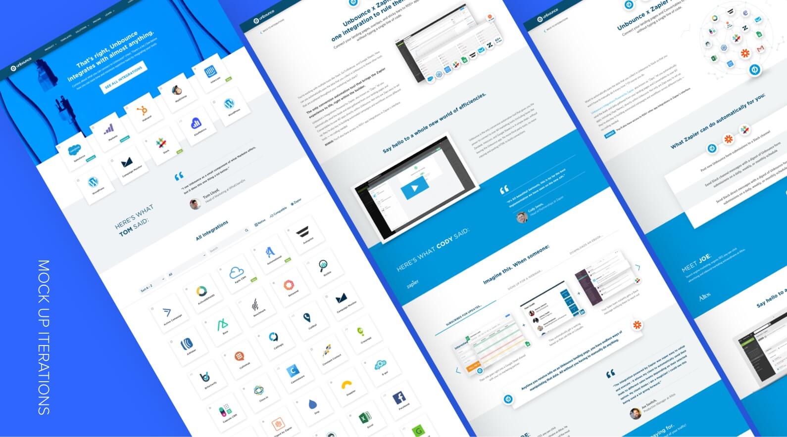
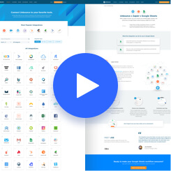
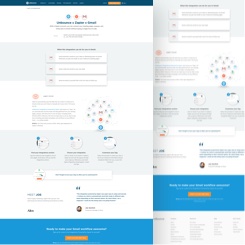
Mock Up & Prototyping
After the wireframe was approved, I worked on the mock ups and explored various visual approaches to discover what was the best way to depict the content. I received many constructive feedback internally from different stakeholders and the design team along the way, and gathered all the valuable critiques to create the final mock up for prototyping.
I used Invision to create the prototype and ensured all functionalities, such as filters and hover events, I wanted to test were implemented.
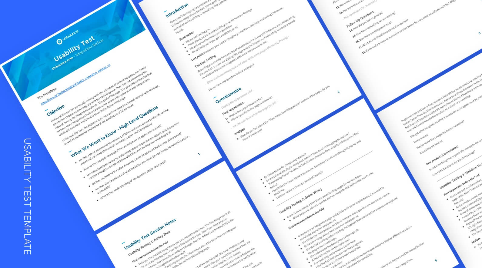
Usability Test
I contacted external marketers, including both Unbounce customers and potential prospects, to participate in a usability test. I prepared a questionnaire for the sessions to observe the participants interaction with the prototype, as well as to gather their feedback.
Not only did we want to test the functionality of the section, but also the clarity of content, as well as the placement and flow of elements. I’ve acquired many valuable insights from the sessions that I later implemented into the final design.
Web Development
After the mock up was finalized, it was sent to the developers. In the process of web development, I contributed in some technical problem solving. Because of the Zapier integrations launch, we had to add 60+ Zapier integrations, and each integration needed a dedicated child page, which would take forever to produce content for and be added to the site one by one. The team working on the project decided to create a dynamic child page, where the content is the same, but it will be customized to the specific integration by changing a few elements on the page dynamically. This is something we’ve never done on Unbounce.com before, so I helped the dev team to find a solution together. We input all the dynamic content onto a Google spreadsheet and exported the sheet to a JSON file. In the WordPress CMS, everytime it needed dynamic content, there will be a custom field or span class to call it out, which will pull the text or image from the JSON file to the page with the URL parameter of the integration. This probably sounds pretty complex, but it definitely made our lives less complicated by saving us time and from being bored to death from copying and pasting. #thankgodfortechnology


Key takeaways:
Let the user’s behaviour guide you, not your bias.
In the beginning, we faced a challenge about how to position the in-app Zapier integrations to prospects. We spent a lot of time discussing what its messaging should be for prospects to understand what an in-app Zapier integration was. Through the usability tests, we found that the content we want to highlight was not always what our prospects care about. They just wanted to accomplish their task, they weren’t gonna stay to learn about some complicated thing we thought was relevant. #truthhurts
Getting a head start doesn’t always speed up the process.
I sent my mockups and prototype to the devs before usability test so that they could get a head start on the development. There were a few changes to the design after the usability test, which was a pain point for the developers because they had to change what they had already completed. We established a better process between design and web development after that. We agreed that designers would have to send the final mockup along with the design specs via Zeplin for every project that requires dev work.
Credits:
Copywriting: Grace Lau
Web Development: Sam Shen (Directory Page), Alex Tjokro (Child Pages)
Overall Support (Team Lead): Megan Sakakibara
Support (Integration Partnership): Tyrone Lingley