Disclaimer: Numerous people worked on the brand evolution of Unbounce. This is more or so an overview of the entire process, where I’ve put more focus on the parts that I was involved in. Since this is more of an overview, there isn’t much on the branding process on specifically the Unbounce product.
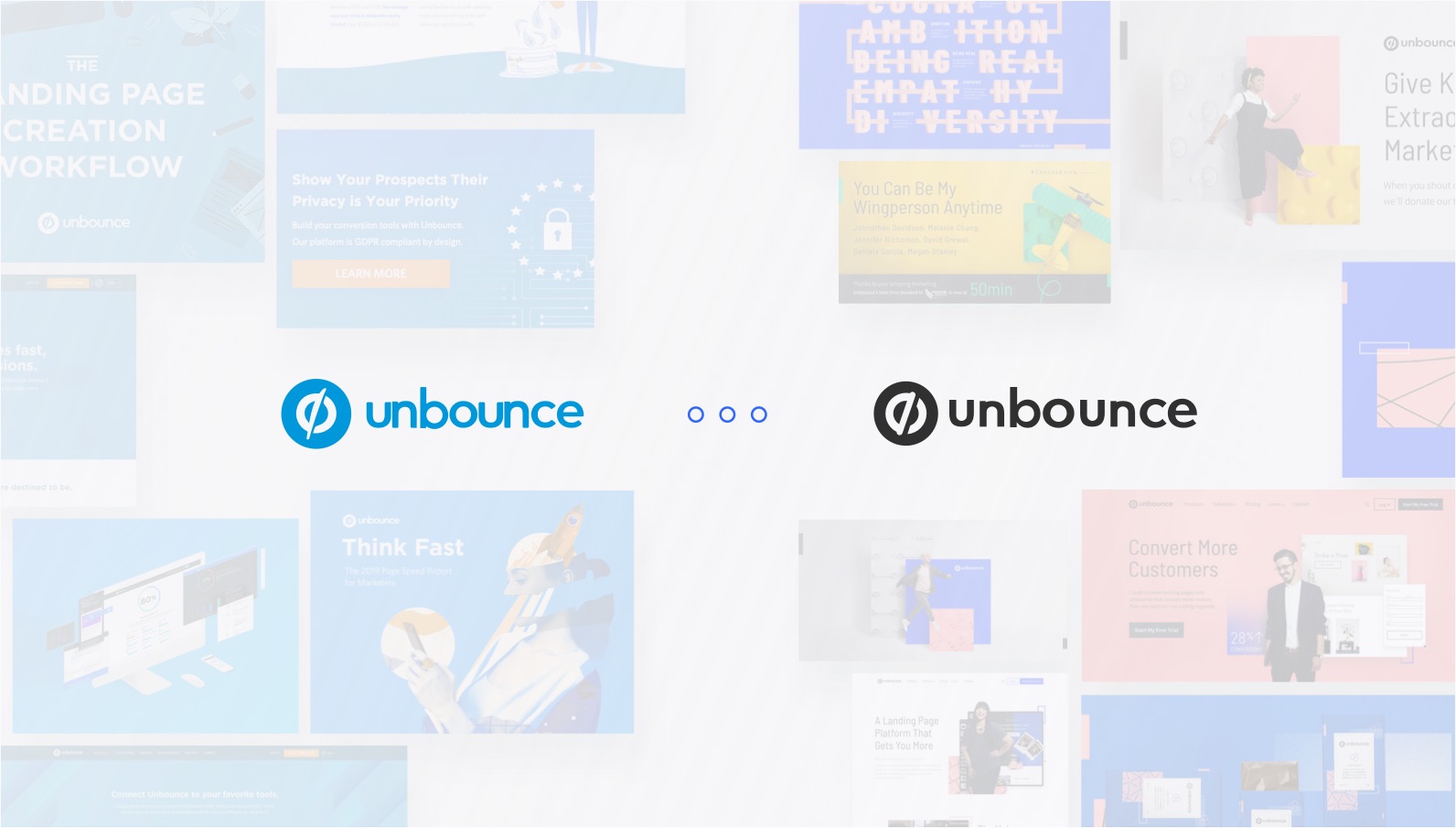
On June 18, 2019, the company I work for as an Interactive Designer, Unbounce, finally revealed its new brand, or as we like to call it, newly evolved brand. And yes, 2018 and 2019 were the years of rebranding, especially in the saas space. But that wasn’t why we decided to do this. We’ve actually started dipping our toes into the brand evolution since 2017; however, we didn’t make it an organizational focus until around October 2018. As you know, these things take time. But before you think, “WHOA, HOL’ UP” and question life, read on and maybe you’d understand… hopefully?
There are so many things that go into a brand, a successful brand at least. A great brand identity is not only about visuals, or simply voice and tone. Those are only parts of it. A great brand identity works hand-in-hand with proper positioning. They act as a core foundation for all your decisions and things you produce. It’s no rocket science, and it’s what every search result would probably tell you if you were to Google, “what makes a successful brand”. But hey, I am not here to write about that, there’s Google for this kind of thing. What I AM here to do is highlight the core parts of the process behind the new Unbounce brand from the perspective of a designer, ‘cause y’know, that’s my role.
As I said, brand and positioning are the foundations for everything you do. We recognized there were many problems to solve in the organization, and putting bandaids to fix our issues was not going to work forever. We knew we had to dig deeper and create a proper framework to really solve ongoing problems. For a while, it felt like there was no spark or much “wow-factor” to the collaterals we were putting out there. We had nothing really substantial to base off of, at least from a design perspective, which led to inconsistencies of a lot of our collaterals. That was the most noticeable and one of the main problems. It’s nothing new really, this happens over time when there is no foundational framework to follow, and people start re-inventing the wheel. That’s also the major issue that arises in every other rebrand case study.
Table of contents
- Brand Audit
- Proposal to the CEO
- Creative Team Explorations
- Impression Testing
- Defining the Brand Strategy
- Determining the Visual Standards
- Documenting the Standards
- Main Roles
Brand Audit
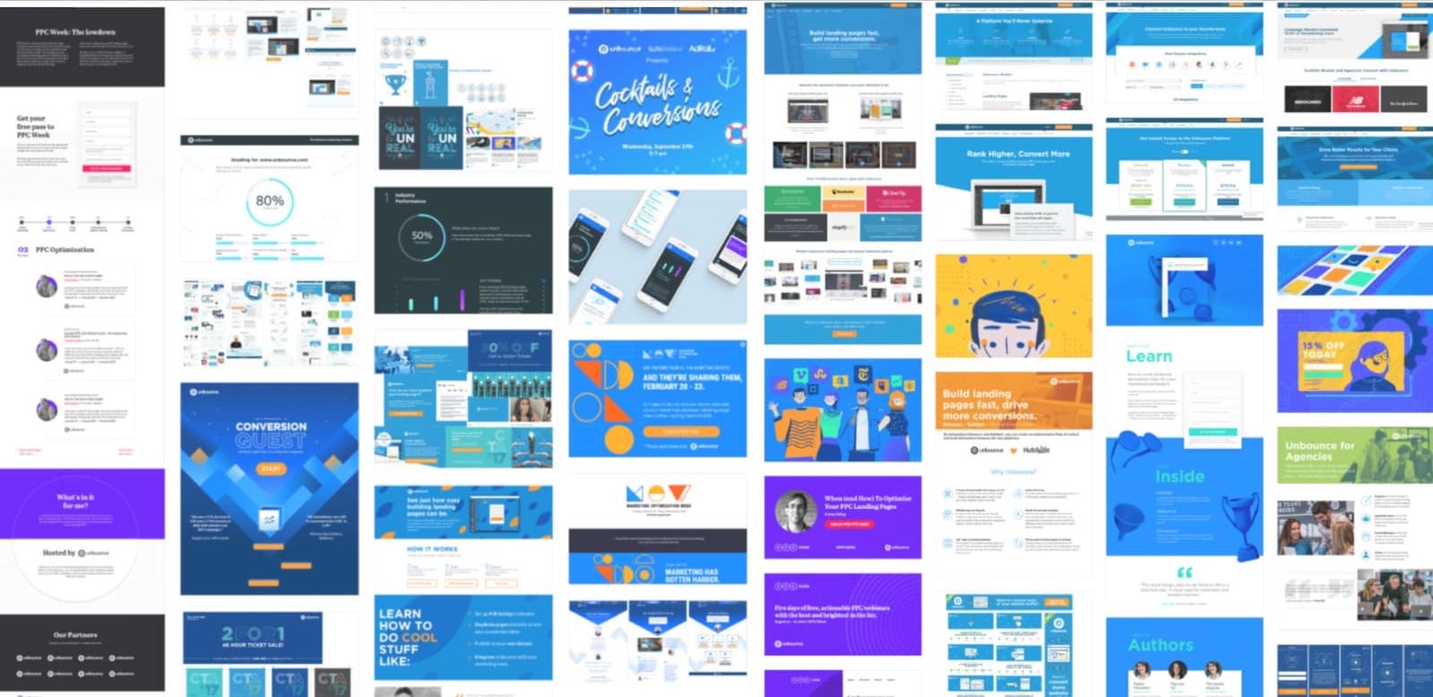
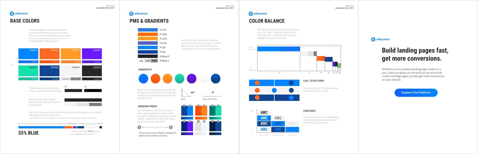
The first step was to audit our brand. As a creative team, we recognized there were inconsistencies in our collaterals, but we needed to physically see where they were. We printed out all the collaterals we’ve produced in the last 3 years and pasted them on the wall. We saw how the brand has evolved right away. New colours, typography, illustrations, icons, and various other design elements were introduced throughout the years. The only element that tied most of them together was the primary colour, blue. The “Unbounce Blue” had to be in every branded asset for it to be considered “on-brand”. We clearly saw there was no well defined visual identity. Designers just produced work based on their own style because we didn’t have an elaborate guideline to follow. It was like playing a game of telephone, where one designer would design one thing, and the next designer will base off of the previous designer’s design, which is why the visual brand kept evolving.
Doing a brand audit was not only a great way for the creative team to gauge where the inconsistencies were, but also to make a point to the rest of the organization that something needs to be done. This was the first step into getting stakeholders’ buy-in and approval for us to continue working on evolving the brand.
Proposal to the CEO
Yes, we had our brand audit. Then what? Well, we needed to get the green light to be given dedicated time to work on this. Because why would we continue to work on something that wouldn’t be taken seriously at the end, right? The challenge was that we didn’t have metrics on how a rebrand would impact the revenue. At the end of the day, it’s all about ROI when it comes to business. But with branding, it’s very difficult to measure or forecast any hard metrics, especially when we haven’t even started.
What we did know was that there were inconsistencies throughout our entire brand experience, and all of our web properties and our competitors were surpassing us in their visual identity, making us appear comparably outdated and less relevant. We presented a proposal to our CEO, but he wanted to see explorations on the walls first to prompt people’s excitement and curiosity. That would then determine his decision to give us the green light or not. At that point, we were not given designated time to work on the brand, so we were mostly working on it on the side of our tables.
Creative Team Explorations
Interviewing Stakeholders and Experts
Before we started to do hands-on visual exploration, we wanted to gather some data beforehand to have some concrete materials as a foundation for our exploration. We interviewed the founders and senior managers from different departments to tell us their thoughts on Unbounce. We asked them the following questions:
- If Unbounce was a person, how would you describe them?
- As a product, why do you think Unbounce is unique?
- How do you want Unbounce to be perceived/represented in three words?
- What are some examples of companies you admire?
- How do you want to make people feel when they first land onto Unbounce?
- Where do you see Unbounce in 5 years?
We gathered all the answers and distributed them into sticky notes. We did a card sorting exercise to find patterns in the answers. This way, it would be easier to define what people think of and expected from our brand, and we could use these findings as groundwork for our exploration.
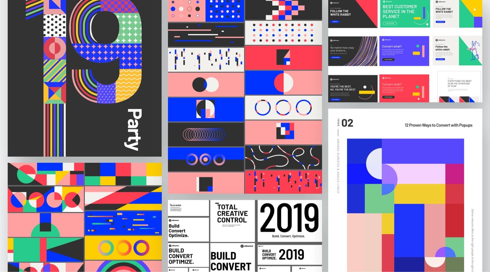
Creative Exercise 1
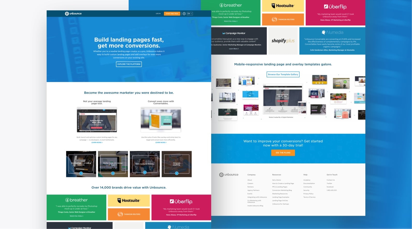
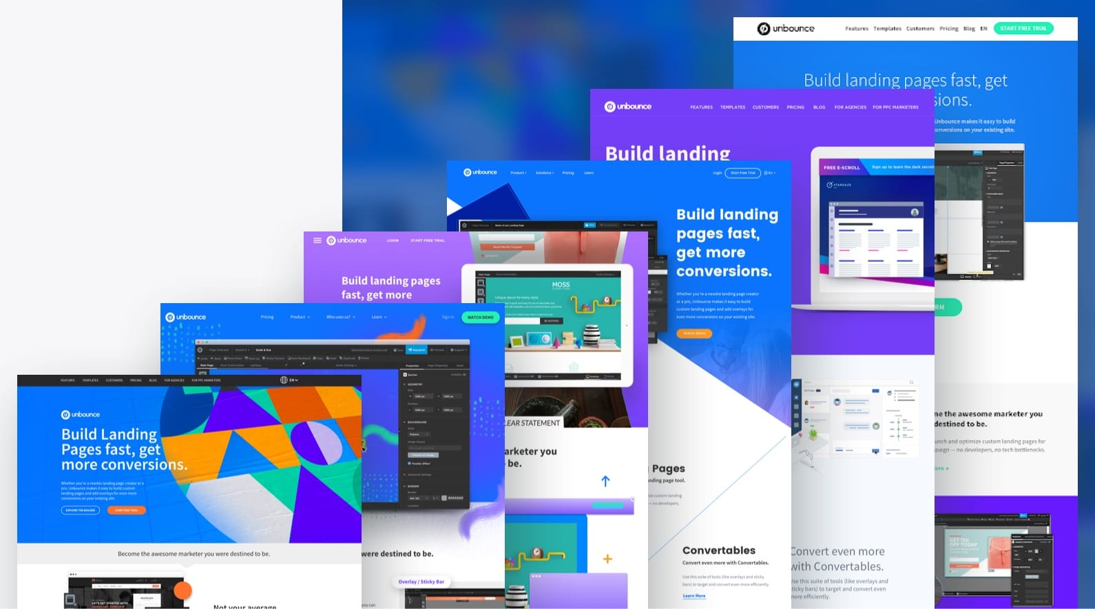
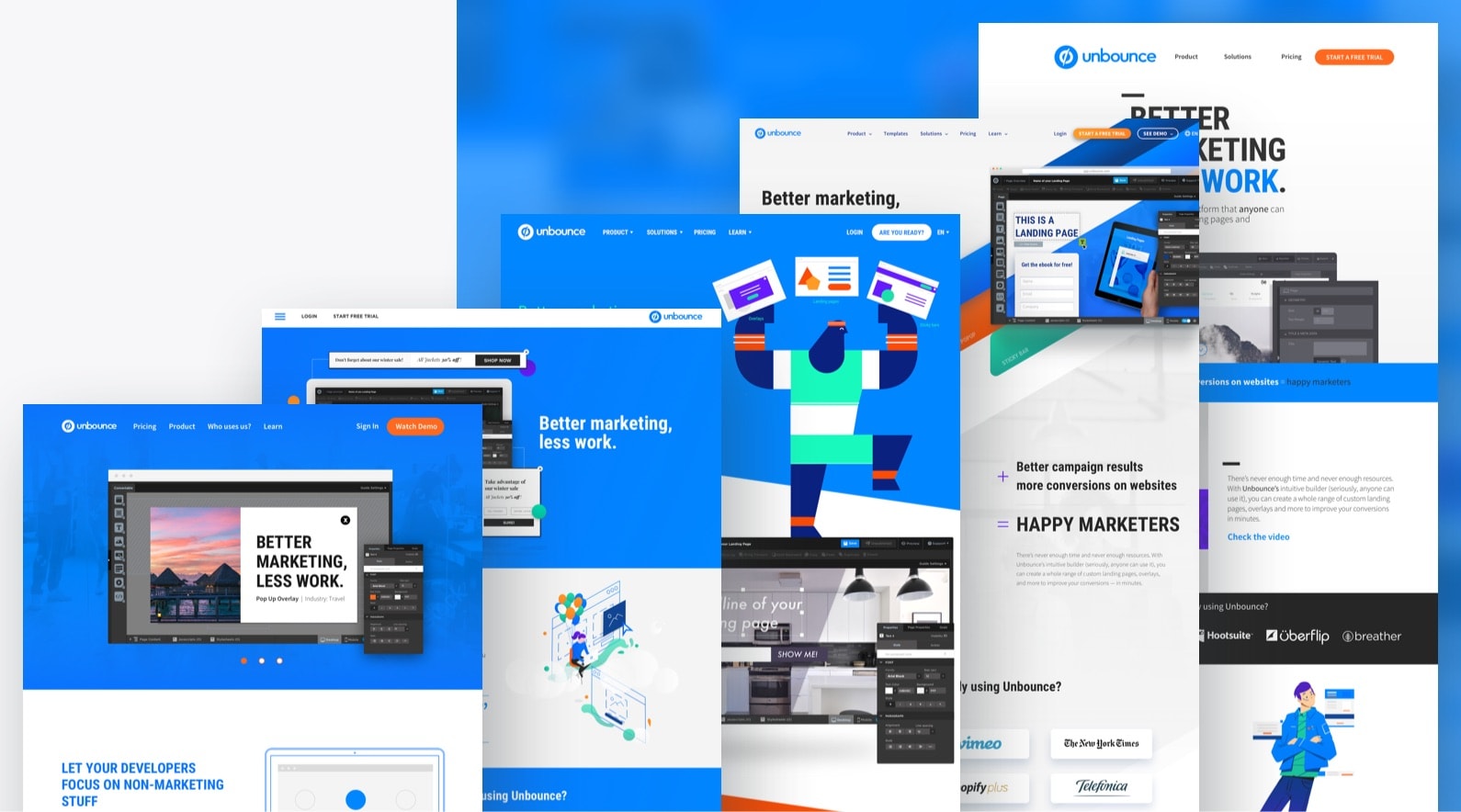
Old Unbounce homepage
For the first creative exercise, we decided to redesign Unbounce’s homepage at the time using the existing content because the homepage of a business is an embodiment of its brand. We were provided with a colour palette and a typeface by our art director, and those were the only visual guidelines to follow. It was quite a free exploration. This was a great exercise for the team to identify design elements that worked well and consider them for future explorations.
Colour palette provided
We printed all of our explorations on large pieces of paper and put them up on the wall to induce conversations and excitement with fresh visuals around the office. We then scheduled feedback sessions with stakeholders, who were either founders or senior leaders representing different departments, in which the sessions were led with the following questions:
- Could you mark your favourite section of each design?
- Do you feel these designs are scalable? Can they become part of the branding?
- Is this page the representation of what you envision Unbounce to become?
- Anything you want to add?
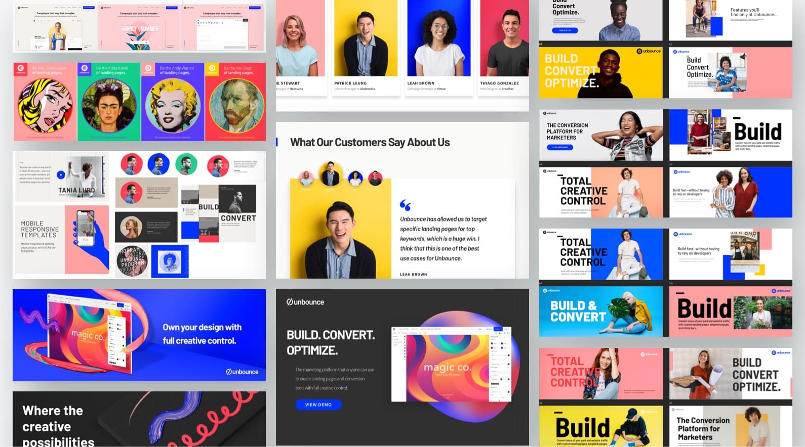
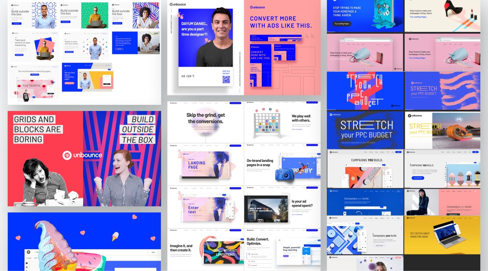
The explorations (one design per designer)
The design team split into teams of two, and each team led the sessions with a stakeholder, where one designer facilitated the session as the interviewer, and the other took notes. Each team was responsible for compiling the notes and documenting them as preparation for further discussion among the creative team of what elements worked and resonated with stakeholders, and which were either red flags or undesirable.
Creative Exercise 2
Based on the feedback and insights from the last exercise, our art director created a brief for us, where he provided some resources, guidelines, and criteria for us to follow, which included:
- Findings from the first exploration
- Specific content to include on our mockup
- Colour palette and usage
- Fonts and usage
- Each design requires a rationale and concept
Colour palette and fonts with rules around their usage
For this, we worked with a copywriter to write new copy so that we could further push the creative boundaries
The final mockup of each designer’s exploration
These are the designs each designer created. Each of these had a concept to support our design decisions.
Impression Testing
First of all, what is impression testing?
If you know, you know. If ya don’t, read on and hopefully, you will know. An impression test is different from a usability test. It’s kind of like meeting someone for the first time, where you will have a first impression of that person. You then get to know them a little better the more you interact with them. Similar(ish) to that, an impression test is to test your product through your participants’ impressions. It’s basically an exercise where you identify how your participants feel around your design, and discover their first impression of it. It’s also an effective way to validate whether you’re sending the right message and tone.
For these types of tests, a pattern is established after six to eight participants. The volume of participants after this makes no difference in the results. This number is enough to enable the collection of good qualitative data.
That being said, here’s our approach.
We recruited six participants, where half of them were customers and the other half were prospects.
Our Goals:
- Examine the impact of using a new colour palette and typography when presenting Unbounce to prospects.
- Understand people’s emotional response to each design
- Identify each exploration’s art direction’s potential to communicate
The Session:
In the session, we first introduce ourselves and the exercise, as well as getting to know our participant’s background.
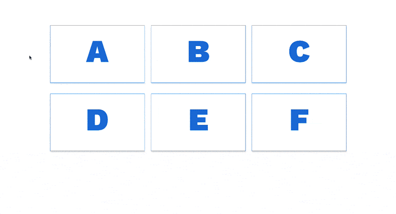
Invision prototype
We created a prototype on Invision, where we randomized all the designs into different letters.
We got the participant to click on a letter, which would then go to the homepage design corresponding to that letter. For the first part of the session, we would only show above the fold of the page for five seconds.
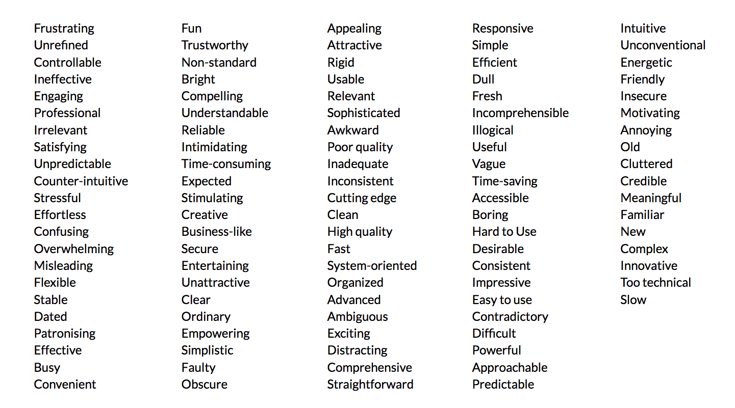
List of traits
After 5 seconds of showing the homepage, we switched the screen to display a list of adjectives for the participant to pick from and share their first impressions through their chosen traits, as well as explaining what they liked and what they didn’t.
For the second part of the session, we let them scroll and read through the design for 2-3 minutes and got them to express their thoughts aloud and tell us their feedback. Eventually, they would’ve gone through all of the homepage designs, where these steps would’ve been repeated for each variant.
Summarizing the Findings
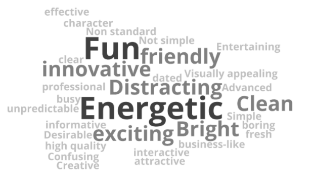
After we’ve conducted all of the tests, we summarized our insights. The 5-second impression responses were put into a word cloud, and the extended feedback was analyzed and summarized into objective recommendations for design guidelines.
Design guidelines can extend much further than just branding, as they are used as the foundation of marketing collaterals and the product. One valuable finding was that the majority of participants found abstract shapes and illustrations depicting the value of Unbounce or the product confusing; whereas, many understood Unbounce’s value when it was represented using realistic examples or UI. This finding is then translated into a design recommendation: “Avoid abstract characters and shapes, such as illustrations, when explaining the value of our product. Imagery referring to our platform should be Real Life UI.”
There were multiple UX discoveries as well for us to consider and apply in future explorations, and eventually, the real deal (the actual standards, that is).
Defining the Brand Strategy
Okay, so we’ve done all those initiatives within the creative team. We had test results and design discoveries to back up our proposal for a rebrand (or some kinda big brand update). How did we get this baby greenlit? We are a pretty large-ish team, so it’s hard to make things happen, especially such a big change, unless you have someone, y’know, high up there with the power to convince the founders and rest of the senior leaders. That “someone” was our CPO, who was the champion and accountable for the brand evolution project. From then on, the brand project was alive and had a dedicated team working on the development of the brand strategy.
Brand Pyramid
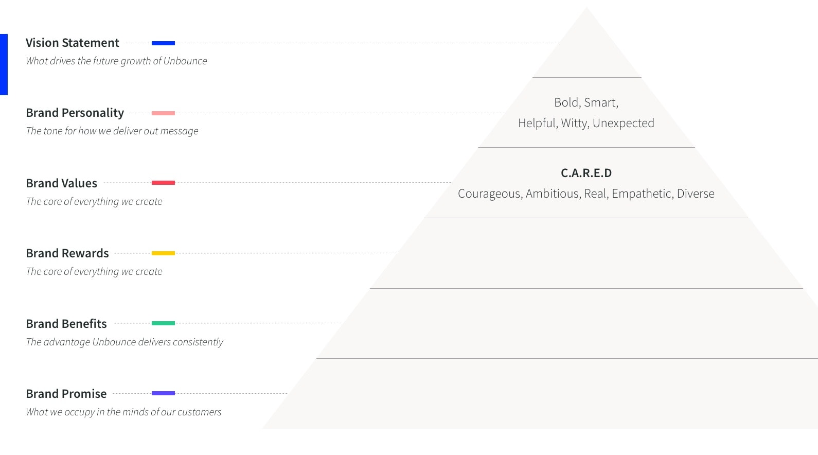
The CPO and the VP of Product Marketing collaborated on the overarching brand strategy, which was the brand pyramid. It’s basically the foundational framework of your brand strategy, the brand pyramid informs the decisions your organization makes from pretty much all perspectives (both internal and external), along with the positioning of course.
The brand pyramid includes (from bottom-up):
- Brand Promise
- What we occupy in the minds of our customers
- Brand Benefits
- The advantage Unbounce delivers consistently
- Brand Rewards
- What every customer has access to using Unbounce
- Brand Values
- The core of everything we create
- Brand Personality
- The tone for how we deliver our message
- Vision Statement
- What drives the future growth of Unbounce
Brand Personality & Voice and Tone
While our CPO and VP of Product Marketing were working on the overall strategy, our Interactive Design Lead and Content Manager started developing the brand personality. When you personify your brand, giving it personality and voice and tone, not only is your business differentiated from your competitors, but also able to emotionally connect with your audience on a different level, making your brand more relatable and memorable.
There was a ton of research conducted behind the development of the brand personality and voice and tone. Our design lead and content manager sent out a survey to customers and internal people. Like the impression test, the survey asked people to pick three adjectives from a list of traits with the question, “if Unbounce was a person, which three adjectives do you feel would best describe their personality and why?”. The adjectives were later put into separate word clouds based on internal people and customers.
To gather more qualitative information, the two had one-on-one interviews with stakeholders from different departments, as well as small samples of customers, who have been with Unbounce from only a few months to more than 3 years, and prospects that have consumed our content. They showed them content pieces form several Unbounce campaigns and asked them:
- How we sound now.
- How we shouldn’t sound like.
- How we can sound in the future.
We got our results, and they were rather harsh, especially the response from internal stakeholders. I mean, bored and awkward were the biggest takeaway based on how they perceived our brand through the shown content pieces; however, the results were very informative and really helped contribute to their direction to develop the real deal.
Okay, so there were all these findings. What’s next? The two knew what market perceptions Unbounce wanted to move away from, didn’t want, and strived for. Based on that, they developed the brand traits.
Our Finalized Brand Personality:
- Bold
- Witty
- Smart
- Helpful
- Unexpected
If Unbounce was a person…
Yeah… I’m not really supposed to reveal who they are to the world, hence the censorship.
With the defined traits, they did an exercise to determine what Unbounce would sound like if it was a person to establish our voice and tone. They were on a mission to discover which well-known person’s or fictional character’s personality matched our brand personality? They conducted further research and found traits from two individuals that perfectly embodied Unbounce’s characteristics. They wrote descriptions for each and developed the voice and tone.
Our Voice and Tone:
- Upbeat, but not phony
- We’re alert and personable, but never hyper, excessively eager, or too cool. We don’t have a phone voice.
- Empathetic, but not patronizing
- Like a close friend who nods knowingly at the memes you send them, marketers should feel like Unbounce really understands their job.
- Authentic, but not self-righteous
- We can write how we talk. It’s more fun like that anyway. Some may say it’s “colloquial”. Let’s say…conversational.
- Knowledgeable, but not know-it-all
- Every piece of copy should convey we’ve got a thorough grasp of the topic at hand.
- Cheeky, but never cocky
- For tone on this, think John Oliver. He’s cheeky, entertaining, and lighthearted — but never alienates his target audience.
Determining the Visual Standards
Explorations
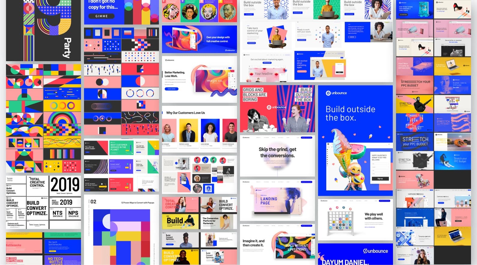
You’re probably thinking, “more explorations? What’s up with that?”, or you could be thinking, “more explorations, yay!” Whatever it is, this stage is vital to the creative process. It allows you to experiment with various ways to represent the brand based on your newly defined brand strategy. It really helps with the discovery of how tangible outputs, such as your homepage, ads, and print materials, could potentially look and sound like, and see what works and what doesn’t. Explorations are a little more casual and can be shown to stakeholders to see whether they are heading in the right direction and stir up conversations.
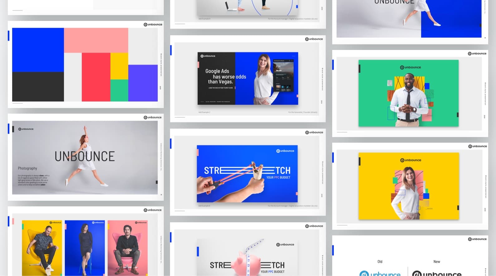
The given colour palette
Our Senior Art Director from the creative team and UX Principal from the product design team worked together to develop the colour palette, making sure the primary colours pass the accessibility standards, and that the colours could be used for our product UI. They also determined the brand typography. These were used as basic visual standards. The exploration was split into three different exercises: colour and typeface only, photographic elements and illustrations, and composition and layouts in collaboration with the content team.
Colour and Typeface Exploration
For the first part of the exploration, designers experimented with different approaches to treat colours and typography. We were given the colour palette and fonts, but we had to explore multiple options in their treatment; for example, how would the colours look like when they are all used at once in a composition versus using only a few colours. Despite the set typography, we still had to determine which weights to use for headlines and body. Should it be bold, light, or condensed regular? How do the styles align with our brand standards and represent our brand personality? We set a deadline for each exercise and printed our exploration on larger pieces of paper and put them up on the wall, which was a dedicated space we worked in for the project.
Photographic Elements and Illustrations Exploration
We applied our learnings from the previous exercise and explored with various ways we could treat photographic elements and illustrations. Again, designers took existing content and implemented their creative experimentations to their chosen content pieces. They ranged from sections of the home page, banners, to ads. Like the last exercise, we printed out our explorations and pasted them onto the wall.
Composition and Layouts Explorations with Content
For our last exercise, we collaborated with the content team to produce various assets. The deliverables for this were a series of ads ranging in multiple sizes and different sections of our homepage. The content team defined various themes that aligned with our brand rewards and vision statement. They explored different copy options, including headline and subhead, for each theme. They wrote for both ads and different homepage sections, playing with how the copy would embody our brand personality and voice and tone. Like, how could we sound bold and witty, along with articulating all the attributes of our voice and tone, while delivering our brand rewards and vision statement, as well as expressing the sentiment of our brand promise? It was tough but also fun in the sense that everyone could collaborate creatively and bounce ideas off of each other.
Once the document of copy options was completed, each designer partnered up with a writer, and the themes were divided evenly and assigned to each team. The designer and writer brainstormed how the different copy options for the ad could be visually communicated. The designer then took all the ideas and created the ad and played around with how it would visually align with our brand personality. This process was repeated when we worked on the website sections.
Just like every other exercise, we pasted them onto the walls. We then asked stakeholders to review all of our explorations and give their feedback. The feedback session allowed stakeholders to see what we’ve been working on and raise any concerns or red flags on our work, such as misrepresentation of our brand standards, or concerns on certain visual directions. We received valuable feedback from them so we knew what not to do when creating the real deal. A valuable lesson from this was that we could’ve done progress updates more frequently with stakeholders so that there would’ve been less misalignment. Overall, the exploration helped us gain a greater understanding of the brand standards and really got our creative juices flowing for the next step.
Pitching to Stakeholders
Moodboard
Okay, so we had gotten the feedback from stakeholders for our explorations and knew what we had to fix and solve. The core brand team, which included the senior art director, UX principal, content manager, and me, regrouped to discuss how to approach the pitch. While the content manager worked on redefining our content messaging based on the core attributes we missed in brand standards, the rest of us, designers, worked on developing the visual identity.
We began the design process by separately researching existing design references that correlate to every attribute of our brand pyramid. We added our references on an Invision board and came back together to review all of our inspirations, discussed them, and selected the ones we felt were most relevant.
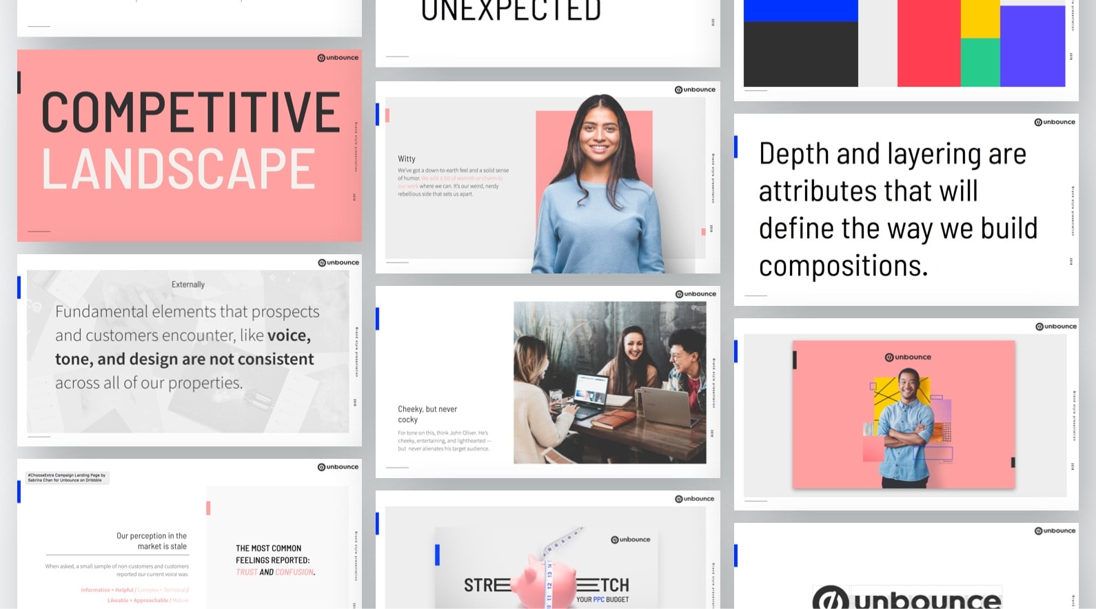
In the mood board, we looked at visual treatments, compositions, animations, and interactive elements. During the exploration, we all agreed that we would use photography as the core visual element. We knew that we wanted to showcase real people that represented our customers and target audience because we are a people-first company, which is highlighted in our brand attributes. Hence, we looked at design references with photographed people in compositions.
We had multiple references of models in sports brand ads on our mood board. Sports brands often depict the idea of high-performance and confidence in their subjects through their poses and bottom-up shot camera perspective. These are the qualities we wanted to visually represent in our people photography, as they are well-aligned with our brand strategy. We also looked at layering compositions since that was something we experimented with during our exploration. We wanted to apply this kind of composition as part of our design system and add meaning to the layers. For example, using textures and patterns representing an industry that matches our target market in the layers. Because we weren’t going with illustrations and were using photography instead, it would be difficult to depict different concepts in one graphic. But with the layering system, the layers could represent multiple ideas in one composition, which was a solution for non-illustrative design assets.
Defining the Visual Standards for the Pitch
Once we’ve established the styles based on our mood board, it was time to get our hands dirty. We scoped out different tasks to include in the pitch and assigned them to each member of the core brand team accordingly. We really just had one thing left to define and get stakeholder approval—the visual identity. We went away and worked on various assets: examples of photography and compositions, sample ads, the logo, and a master graphic.
Master Graphic? Whussat?
A master graphic is, exactly what it sounds like, a master that embodies all the brand standards, from a strategy, visual, and content perspective in graphic form. I worked with the content manager on the master graphic while the two design directors worked on the other stuff. We decided to create a webpage (not homepage or landing page) that communicated what Unbounce is and its value. We wireframed the page together to define the content hierarchy and layout. We then went away and started on the production. She wrote the copy and I started designing, as we both knew what each section was about. Once the copy was finalized, I put it all together and handed it to our Senior Art Director to animate. Animation was another big part of the master graphic because we wanted to define animation standards, as it’s also one of the core visual attributes of the unexpected trait in our brand personality.
Prepping for the Pitch
For the pitch, we decided to create a presentation slide deck that not only showed the proposed visual standards, but also stuff that influenced our decisions. We wanted to bring our audiences, the stakeholders, back to the beginning and remind them of our positioning and strategy. We included:
- A Disclaimer to set expectations at the beginning to avoid confusion by making clear:
- What’s in scope
- What’s not in scope
- The ask for the stakeholders
- Context to talk about the background before the actual pitch to build our story and justify our decisions.
- Who we are
- Target personas
- The competitive landscape (where we sit presently compared to our competitors based on business size and market perception)
- The problem to be solved
- Our desired, new spot in the landscape
- How we’ll evolve
- Personality and voice and tone to give further context. What we were pitching closely correlated with these things.
- Brand personality
- If Unbounce was a person
- Voice and tone
- Sample ads
- Visual competitive analysis
- Moodboard
- The actual proposal, which was the visual standards.
- Style description
- Colours
- Typography
- Photography
- Composition
- Illustration
- Animation
- Logo
- Master graphic
- A reminder of the disclaimer and next steps.
The Pitch
We had to present in a few rounds of pitches. The first one was to pass the CPO, VP of Product Marketing, and Senior Marketing Director. It was also to gather their feedback and apply them to prepare for the ultimate pitch, which was with the founders.
Overall, the first pitch was well-received. There were no major red flags, and we had gotten constructive feedback, where we just had to add and tweak a few assets. The structure of the presentation clearly communicated how we got to our decisions, and the different aspects of the proposed visual standards were enough for approval before we moved into the next step of defining the standards in depth.
And then of course, once we’ve updated the assets and deck, we presented to the founders to get the final approval. Obviously, there was some more feedback. But again, the pitch went well and received positive sentiments. We finalized the deck, polished everything that needed to be fixed, and presented to different departments. They weren’t pitches or anything, just informative knowledge for people to be in the loop, as the info directly influenced their work, especially in preparation for the rollout.
Documenting the Standards
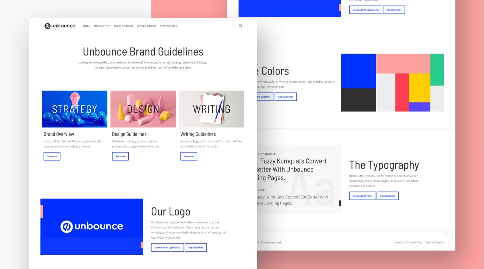
The Unbounce styleguide homepage
Aight, now that the green light has been blessed. What happens next? How do you move forward with the information you have? Well, ya document it. We didn’t go with the traditional way of having a PDF brand guideline. It’s cool, but, there’s somethin’ cooler out there. That “somethin'” is Frontify. We used it to document all of our brand standards so that everything would be in one accessible place. It’s pretty open to what you can add, from simple style guides, UI standards, to writing rules. The possibilities are endless, as long as they are standards of some kind. You can have users as editors within the app and send out a public link, as well as choose what information displays publicly and what is drafted. We had 3 main sections in our brand standards: overall brand strategy, design standards, and writing guidelines. While the content manager was responsible for documenting the writing guidelines, the designers wrote out the design standards, as well as adding examples for do’s and don’ts. It’s a great place to easily add rules and downloadable files. All of the content on there is super accessible.
Conclusion
If you read all the way down to this part, congratulations, you’ve literally read 4500+ words. The Canadian in me is urging to say, sorry, I talk too much, I didn’t mean to make you read such a long article. But honestly, this project was a beast, and a lot has gone into it. A little reminder, this project started in 2017 (not officially, but still), the standards were completed in January 2019, and launched externally in June 2019. Yeah, like I said, it’s a massive beast. Copious talents were involved, and we wouldn’t have gotten where we are right now without them. Despite the long process, it was all worth it in the end. Our business metrics have been a little stale for a while, but all these changes have given us many growth opportunities since the launch of our brand, as well as boosting our morale internally. We set a year’s time to do the housekeeping work, establishing the foundations of our organization. Not only has this strengthened our processes, which ultimately increased productivity, but also helped us justify everything we do from an individual to an entire business standpoint. Unbounce has been making bold decisions and moving forward quickly and in unity. Goodbye silos, hello growth. Everyone’s happy.
Check out the external brand rollout campaign case study here, and the sub-campaign here.
Main Roles
Creative Initiatives and Standards: Cesar Martinez (Senior Art Director)
Standards: Denis Suhopoljac (UX Principal)
Brand Strategy and Standards: Jennifer Pepper (Content Manager)
Creative Initiatives and Standards: Me (Interactive Designer)
Project Champion and Brand Strategy: Miles Nurse (CPO)
Brand Strategy: Ryan Engley (VP of Product Marketing)
Creative Initiatives and Brand Strategy: Cecilia Martinez (Interactive Design Lead)
Creative Initiatives and Impression Test: Ainara Sainz (Interactive Designer) & Rebecca Preston (Interactive Designer)
Thoughts? Questions? Comments?