WORK
Unbounce ChooseExtra Campaign
Unbounce External Brand Rollout Sub-campaign
MEDIUM
Campaign
DELIVERABLES
Landing Pages, Social Assets
PROJECT ROLE
Lead Designer
Project overview:
In 2019, Unbounce carried out a major rebranding project that resulted in a new identity based on the extraordinary marketers who always go above and beyond—the marketers who “choose extra.” That came with a fresh look, including confident, people-focused photography and bold, vibrant colours. All of this work was performed in-house.
The Unbounce team really zeroed in on the concept of “choosing extra,” which came out of the rebranding project. Digital marketing can be tough—difficult to measure, always evolving—and it’s easy to get stuck in the daily grind. With this campaign, we wanted to celebrate people who find a way to push past the status quo to do incredible, impactful marketing—the sort of work that would make Don Draper blush.
But it wouldn’t be much of a celebration if Unbounce were the only one cheering, so the team explored ways to get the digital marketing community involved. We were inspired by LinkedIn’s ‘Kudos’ feature, which lets people show appreciation for others in their professional network. We also believed that user-generated content could help increase engagement with the campaign (plus help us show off some of our new visuals).
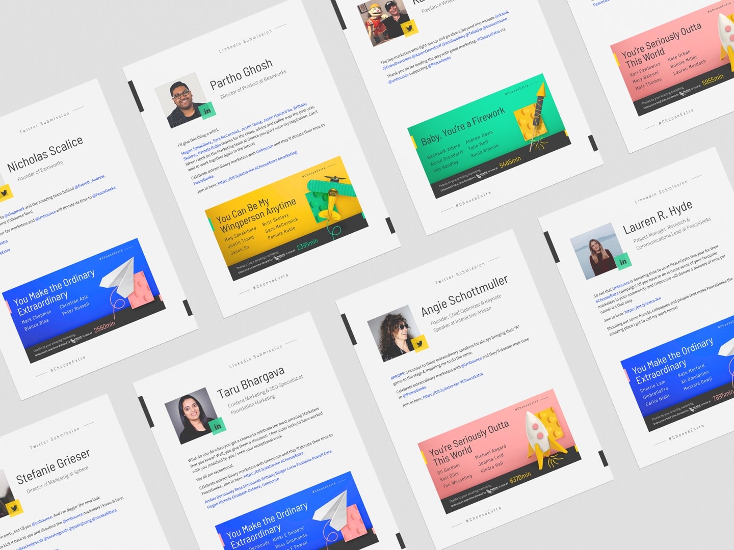
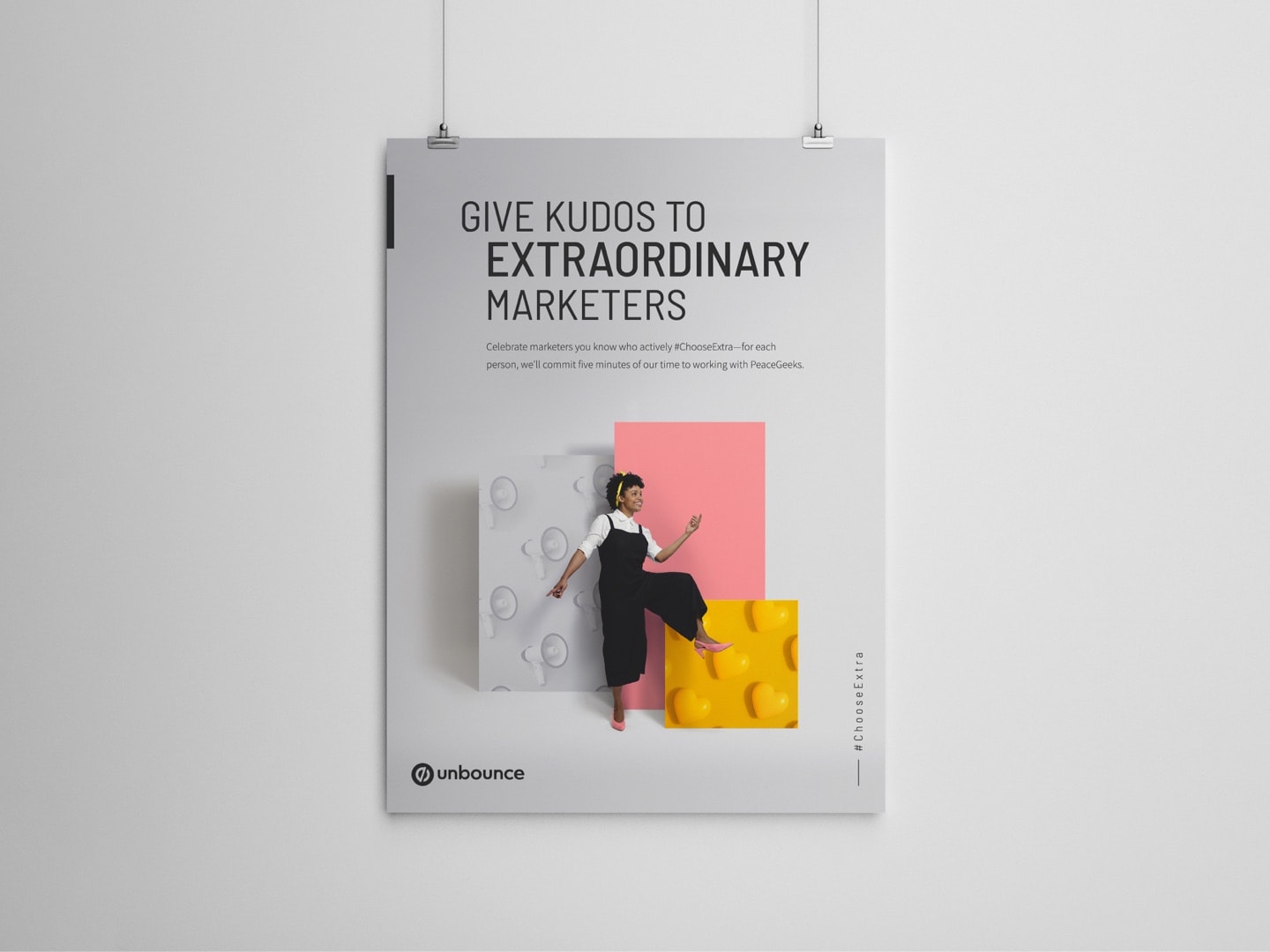
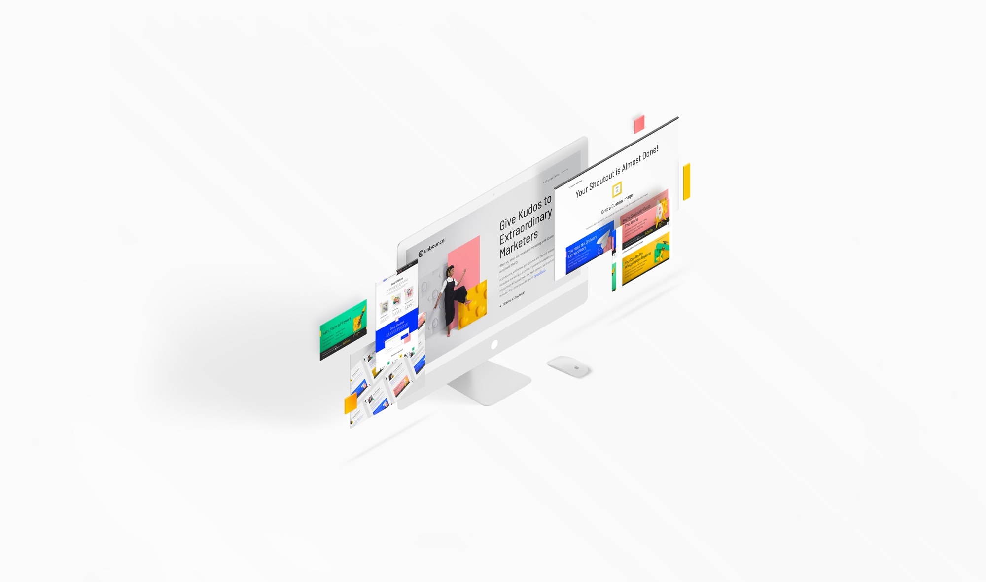
These considerations led us to the #ChooseExtra campaign. The idea was to encourage people to give social media “shoutouts” (short compliments with accompanying Unbounce-branded graphics) to the extraordinary marketers in their networks. For each person they acknowledged, we would donate five minutes of the Unbounce marketing team’s time to charity.
Project Goals
- Unbounce wanted to generate buzz for the new brand, particularly amongst digital marketers—our target audience.
- With a strong culture of community engagement, we also recognized there was an opportunity to leverage the brand announcement to do some good.
Design process:
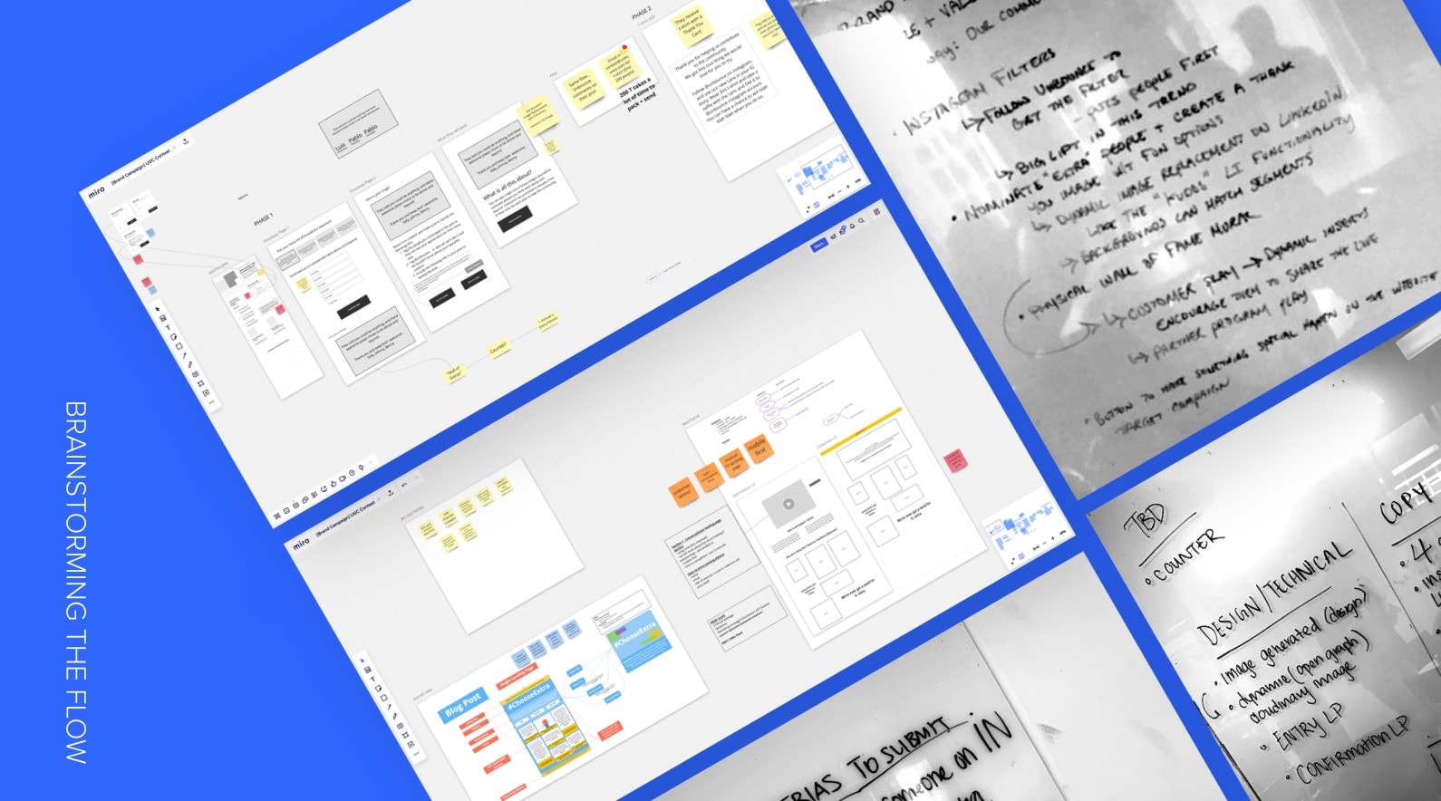
When scoping for the external brand rollout campaign, we wanted to create something big, something that would get people talking about us. We knew the main idea would be encouraging people to share something related to “choosing extra”, as that was the key messaging of the campaign. But there were still many unknowns. Should it’d be a contest or contributing to a cause? What was the ask for our audience? Brainstorms after brainstorms, this sub-campaign went through multiple evolutions before we were satisfied with our plan.
Brainstorming the Flow
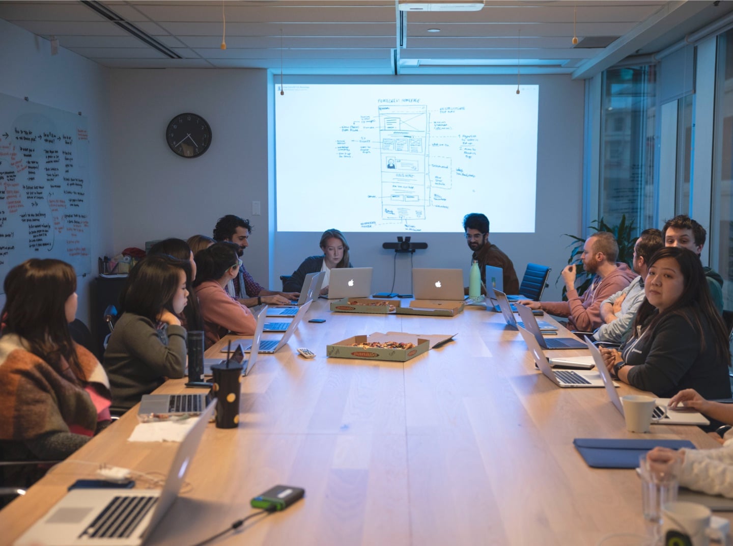
Each team member came to a brainstorm meeting with an idea of how to tackle this sub-campaign. We put our ideas in a Miroboard and discussed them. In the end, we voted for our favourite ones. The winning ideas were having it as a social media campaign, getting people to nominate other extraordinary marketers, and contributing to the community. Through these, a campaign flow was proposed—someone participating in the #ChooseExtra campaign would:
- Read Unbounce’s rebrand announcement post (or be tagged in someone else’s social shoutout)
- Click through to the #ChooseExtra campaign landing page (built with Unbounce, naturally)
- Enter the names of up to six marketers they wanted to shout out
- Receive custom-generated images with the names of their shoutout recipients on the next page
- Share a custom image (along with a templated message) on social, tagging their shoutout recipients and directing them to the #ChooseExtra landing page
Technical Research
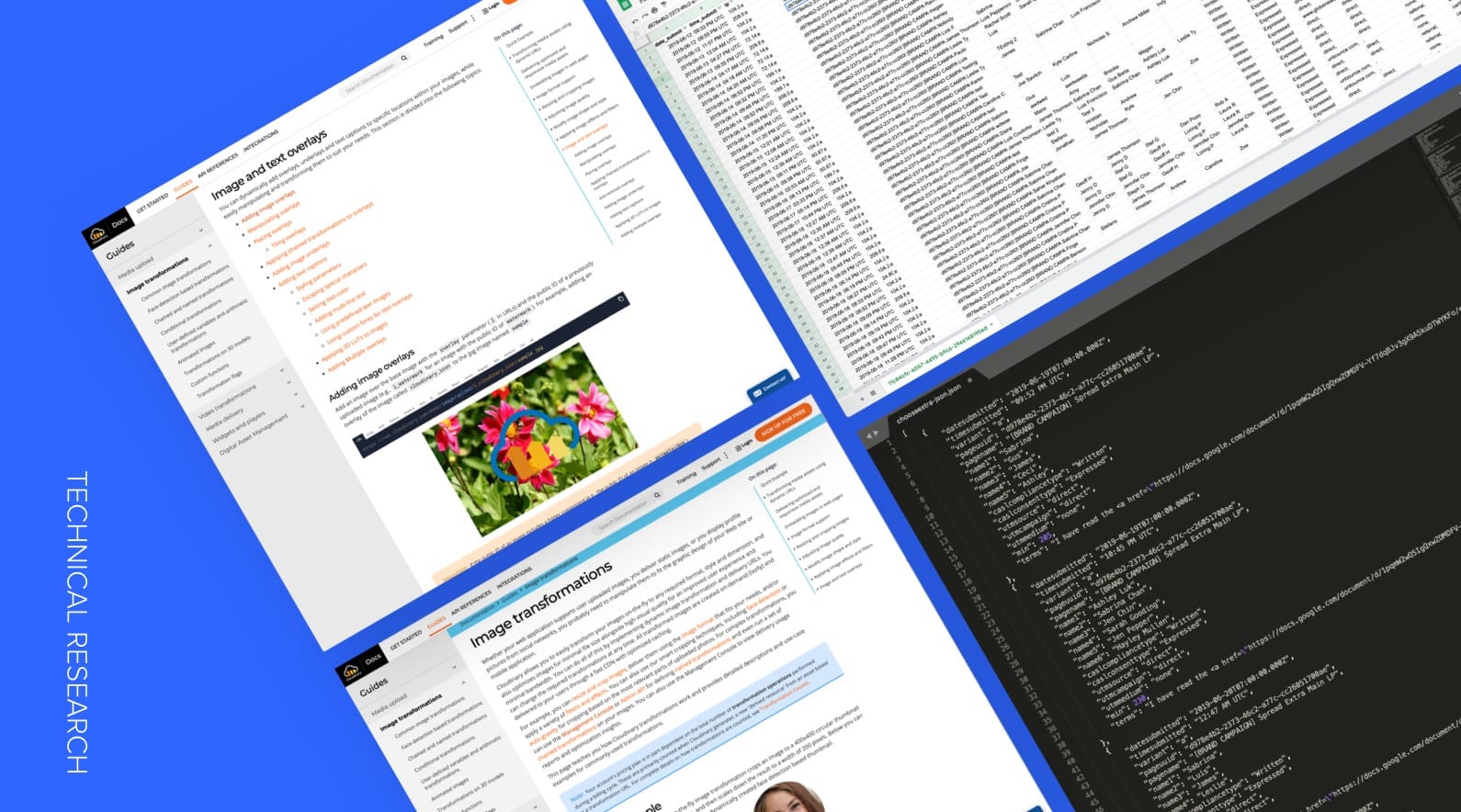
Still, this idea presented some technical challenges. We needed a tool for people to generate custom graphics with the names of their shoutout recipients, something we didn’t have. We also wanted to make the flow—from creating an image to sharing and tagging on social media—as easy as it could be. However, the limitations of platforms like Twitter and LinkedIn meant it would be a multi-step process that was difficult for us to track.
Working together, we developed solutions that would allow us to execute the #ChooseExtra campaign as we had envisioned it.
For the custom images, we used a tool called Cloudinary, which can create user-generated content using URL parameters. We built the #ChooseExtra landing page with a form that lets visitors enter the names of up to six marketers they wanted to shout out. Names entered in the form were translated into the UTM on the following page that could then be scraped.
Once the form had been submitted, a visitor would be redirected to a page with four custom images. Each image had a different design and message (incorporating our new brand visuals), plus the names of the shoutout recipients and the total amount of time Unbounce had donated (including the visitor’s contribution).
To add the up-to-date donation count to each image, we pulled the numbers from Google Sheets via JSON request using a JQuery script that would grab the current amount of submissions, add 5 more minutes per name submitted, then pass the information to Cloudinary via URL parameters.
Wireframing
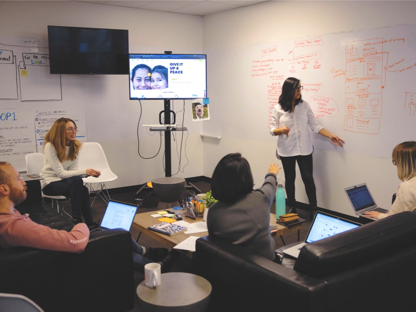
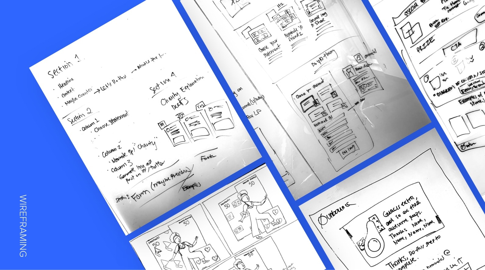
We had a solid strategy and we knew the technical possibilities, it was time to structure the landing pages. The team did a whiteboard low-fidelity wireframe session to plan the content hierarchy and layout of the pages. From that, the copywriter and designer went off to work on the content and design concurrently. While the copywriter was drafting the copy, I went straight to the mockup stage and sketched out some of the design assets on paper. Why didn’t I create a high-fidelity wireframe you may ask? Thanks to the handy-dandy landing page template I designed for internal use during the brand launch, all I needed was to follow whatever section layouts were on the template and simply plug content in. #Efficiency
Mock Up
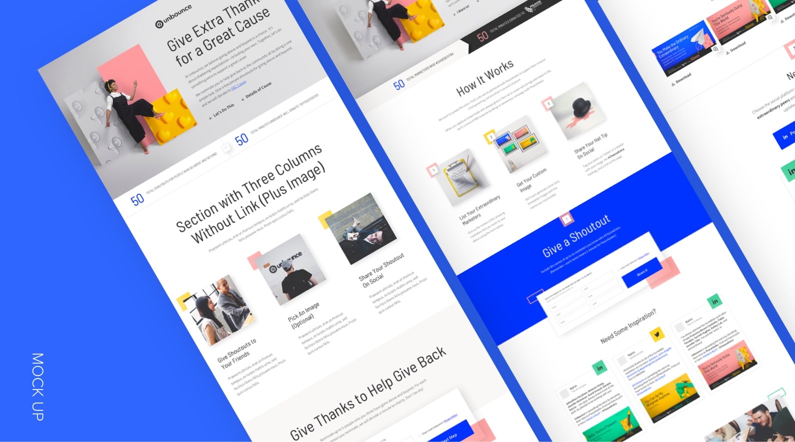
When it came to the mock-up stage, it was so easy. Again, thanks to the landing page template. But of course, a couple of iterations were made based on design feedback, but everything went smoothly.
Building the Landing Page
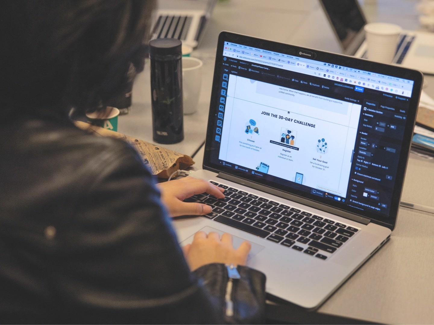
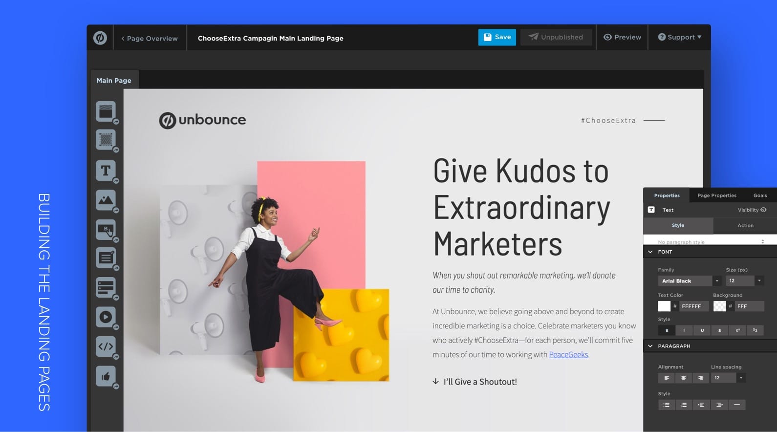
With the landing page template already built on the Unbounce builder, I just, again, had to plug in the content and design assets onto the pages. The tough part was all of the technical stuff.
We implemented a couple of code “hacks” onto the two pages: counter of the total of shoutouts and minutes donated to charity, the form submission to dynamic images, little interactions, and a copy to clipboard button for the pre-written social media messages.
Since this is a social media campaign, we wanted to make things easier for people. After a visitor had downloaded the image, they were prompted to share it on either LinkedIn or Twitter. We included a templated message for them to copy (through a “copy to clipboard” button) and paste into their social post. Whether they used the templated message or wrote their own, we made clear that they needed to tag Unbounce and use the #ChooseExtra hashtag—that way, we could keep track of the posts that had been submitted.
Outcome:
Result & Performance Metrics
Over the course of six months, the #ChooseExtra campaign generated a total of 1644 marketer shoutouts across 53 Twitter and 254 LinkedIn posts, which would be equivalent to 8220 volunteer minutes donated to PeaceGeeks. With Unbounce’s large marketing team, that turned out to be roughly one full day of work—hardly enough time to contribute meaningfully to PeaceGeeks’ marketing—so we donated an additional day as well.
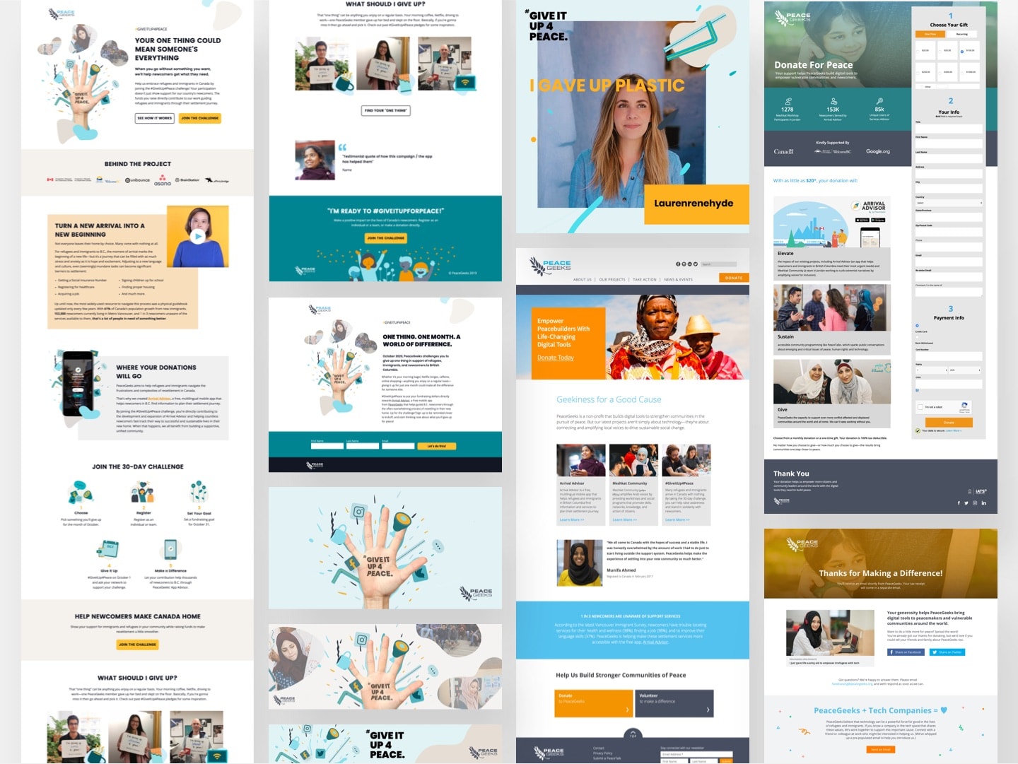
In February 2020, Unbounce and PeaceGeeks carried out a two-day “marketing slam,” during which we created new assets (or optimized existing ones) for PeaceGeeks to use in their future fundraising efforts. This included landing page, email, and social media templates for their #GiveItUp4Peace campaign, as well as a refreshed homepage, SEO upgrades, and improvements to their donation flow.
Although Unbounce’s rebranding project generated some excitement on its own (it really was long overdue), the #ChooseExtra campaign let us communicate our new identity in a way that felt authentic and started a conversation. We invited digital marketers to be part of the story—to recognize the extraordinary marketers in their lives—and do some good while they were at it. Ultimately, that helped us drive more engagement with the new brand than we could have expected with a less ambitious launch.
Metrics measured from June 2019 – November 2019
2
Days of Donated Time
15+
Unbounce Volunteers
1644
Marketers Celebrated
Key takeaways:
Teamwork (esp a team with diverse skillsets) makes the dream work.
Cliche, I know, but it’s true. And there’s a reason for why that is. This is one of the first projects where I worked with so many different talents. We had a bunch of members from the marketing team designer, copywriter, project lead, campaign strategist, and social media strategist. In addition to that, we had customer marketing supporting the campaign, which involved a growth marketer, and another campaign strategist. With all of these diverse talents, we applied many different skillsets onto the project. Many great ideas came out of our brainstorms, and we were able to do many more hacky cool thangz along with great content, which would normally only be one or the other. This project brought various expertise together, making it a successful campaign not just externally, but also internally. We learned a lot more about teamwork and this project had influenced our processes ever since.
Set realistic deadlines when scoping.
With great projects, comes great responsibilities, aannnd… overtime. Making your brand noticed and launching something big every so often is important, but doing it right and setting a realistic timeline for your project is just as critical, if not more. Deadlines getting extended isn’t anything new, but when it gets postponed more than a certain number of times, you know somethin’ ain’t right. As our brand campaign key message said, “make extra your new normal” because Unbounce is all about challenging the status quo and being extra, we went all out with this campaign. That had always been our nature. But being extra takes time, and our timeline didn’t exactly line up with that. So, we had to compromise. While we extended the launch deadline, a few of us also had to work overtime in order to get everything up and ready in a polished form. From this project, we all had a better idea of how long things could take and learned to push back when unrealistic timelines are set in the beginning.
Credits:
Lead Copywriter: Garrett Hughes
Technical Lead: Luis Francisco Baroni Coutinho
Lead Campaign Strategists: Pablo Penades (customer marketing), Ashley Luk (marketing)
Project Lead: Megan Sakakibara, Rachel Scott
Social Media Strategist: Jennifer Chin
Recap Video: Alana Thorburn-Watt

