WORK
Digitalks Campaign
Unbounce Brazil

MEDIUM
Campaign
DELIVERABLES
Landing Pages, Ad
PROJECT ROLE
Lead Designer
Project overview:
Digitalks is a Brazilian company that takes knowledge and business opportunities through over 50 annual activities, educating their audiences about digital marketing. Unbounce partnered up with Digitalks to support their mission, spreading the value of landing pages and conversions, which is what the Unbounce product is all about.
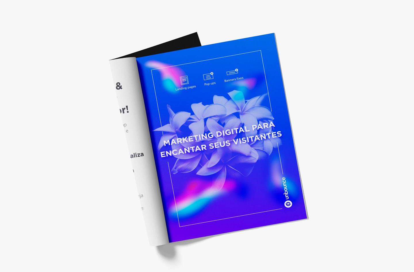
In this project, I worked with a strategist, Andrea Amaral, to develop a campaign, where a few promotional materials were produced, including a landing page to generate signups, a magazine ad, an existing landing page examples ebook, as well as a landing page that promotes the ebook.
Project Goals
- Increase brand awareness of Unbounce in the Brazilian market, and expand
- Get ambassadors in Brazil to recommend Unbounce
Design process:
The strategist and I had a project kickoff, where she presented the brief to me with the deliverables (a one-page advertorial on the Digitalks magazine and two landing pages) already set. While the strategist developed the overall marketing strategy, I was responsible for the design strategy and the art direction of the campaign. I developed a creative concept behind the campaign, which was the idea of marketing tools emerging together in the digital marketing world, working closely together and dependent on one another, while visually depicting modernness and digital technology.

Precedent Research
Moodboard
I compiled visuals that align with the create concept and created a moodboard for the art direction of the campaign. I looked at visuals that were consist of gradient mesh and blob elements, as they depicted the idea of digital and things forming together. I later presented it to the strategist and my art director, along with the creative concept.

Wireframe
The strategist and I had a wireframing session together, where we outlined the story we wanted to tell on the landing pages and developed a low fidelity wireframe for each page. I then took the sketch and created high fidelity wireframes in Sketch.

Mock Up
After the wireframe was approved, I proceeded to the mockup stage for the landing pages and explored multiple options through various iterations.

Building the Landing Page
Using Unbounce
Once the mockup for each landing page was finalized, I replicated it on the Unbounce app. To create a more interactive experience, I added some CSS customization, as well as javascript to several elements on the page. For example, I added a script that would make the blob in the middle of the hero section follow the cursor’s movement when the cursor is hovering on that element on the first landing page, and I added CSS animation to the hero image on the other landing page.
Outcome:
Key takeaways:
Communication during collaboration is key to an efficient process.
Although there were only two people working on the project, effective communication was still a challenge in the beginning. It was the first time I’ve worked with Andrea and worked on an Unbounce Brazil project, which meant I needed a lot of context and extensive briefing. There were some misalignment on the brief at the beginning, in which my understanding of the project was a bit different from Andrea’s. That was a time I’ve already started working on the project, and had to scrap some of the designs I’ve done. Luckily, we caught these issues at an early stage, so we were able to realign ourselves and kept each other updated more frequently. We made sure to be vocal about our concerns and observations as well. We were able to learn from our mistakes quickly and early on, so the process afterwards went much more smoothly.
Credits:
Overall Strategy & Copywriting: Andrea Amaral


