WORK
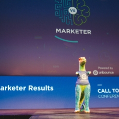
Machine vs Marketer
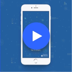
Unbounce Call to Action Conference Game App
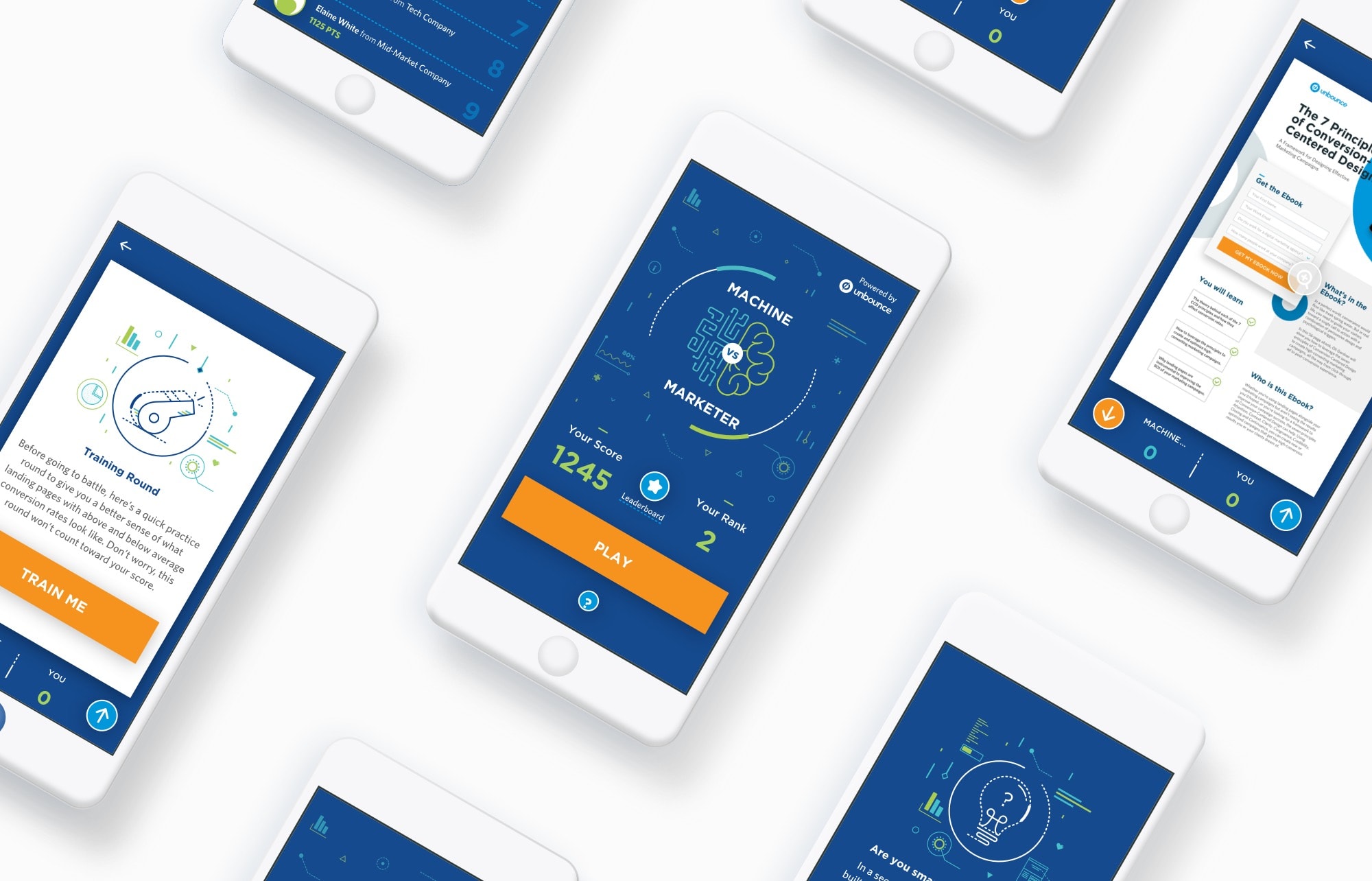
MEDIUM
Mobile Game App
DELIVERABLES
UX, UI
PROJECT ROLE
Lead Designer
Project overview:
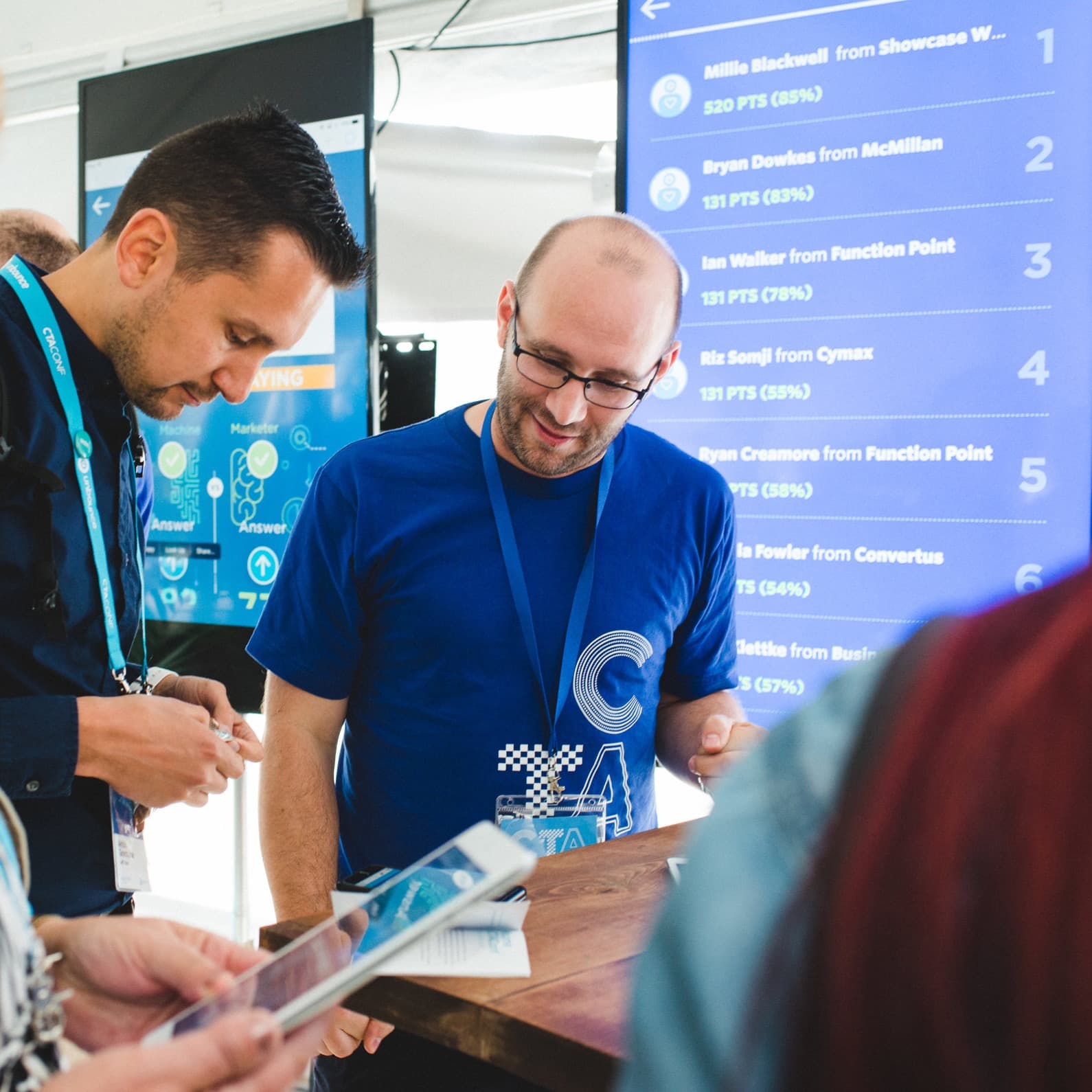
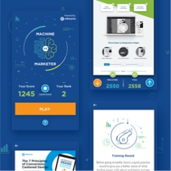
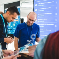
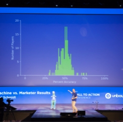
Machine vs Marketer was a mobile game application for the Unbounce Call to Action Conference 2017. Attendees of the event played the game to compete against the machine and each other to see who could analyze the landing pages displayed in the game most accurately (guessing whether the landing page had an above or below average conversion rate). Players would get one point every time they answer correctly and would appear in the leaderboard if they were in the top 20.
Project Goals
- To create a delightful experience for conference attendees
- To build excitement and awareness around machine learning and its possiblities with the Unbounce platform
- Too experiment and validate that our machine learning technology is more accurate in analyzing landing pages than the average marketer
Design process:
Unbounce has been building thought leadership around AI and machine learning, which our CTO, Carl Schmidt, has been representing for a few years. The Unbounce Call-to-Action Conference in 2017 was a great opportunity for the company to showcase that thought leadership to a wider audience, those being our customers and potential prospects. Carl proposed that we develop a mobile game application around machine learning and landing pages (the Unbounce platform is a landing page builder) using the data we’d gotten and the technology we’d been working on. The main logistics were already decided, which was having the player (attendee) play against the machine to guess whether the landing page shown had an above or below average conversion rate. In the end, the player would see whether they were “smarter” than the machine or not.
I was the assigned designer for this project. I was given a brief and met with Carl to discuss the context around the logistics and project scope. After the initial briefing, I went on and started the design process.
Brainstorming
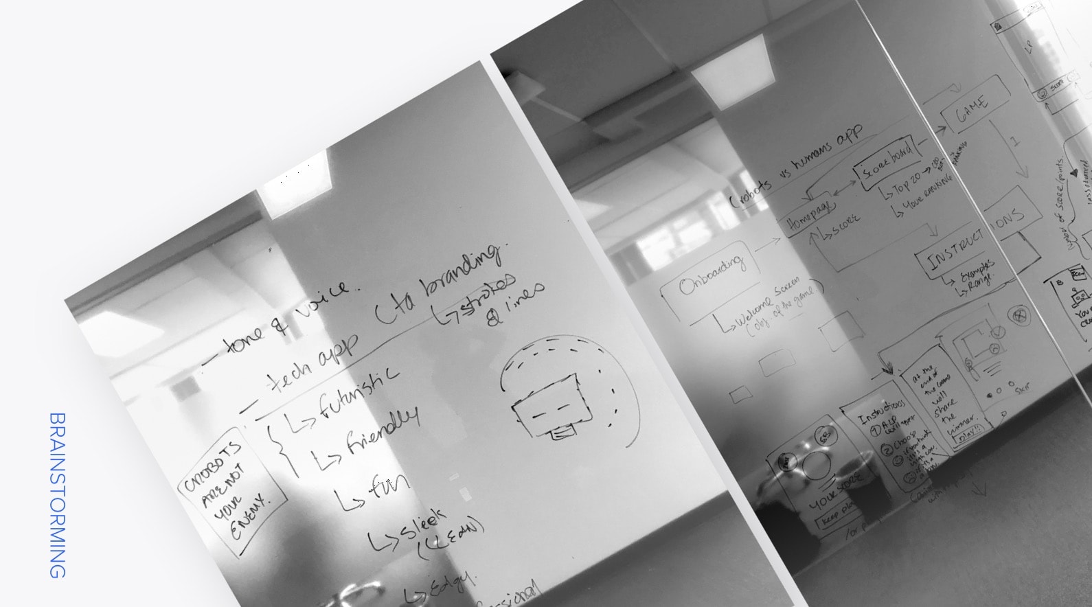
Before doing any production work, another designer and I brainstormed a few ideas on the drawing board (aka a glass wall). We ideated the voice and tone of the game, which would help us with the creative direction for design and copy. We also brainstormed on the user flow and gameplay, as we roughly sketched our ideas out.
Information Architecture
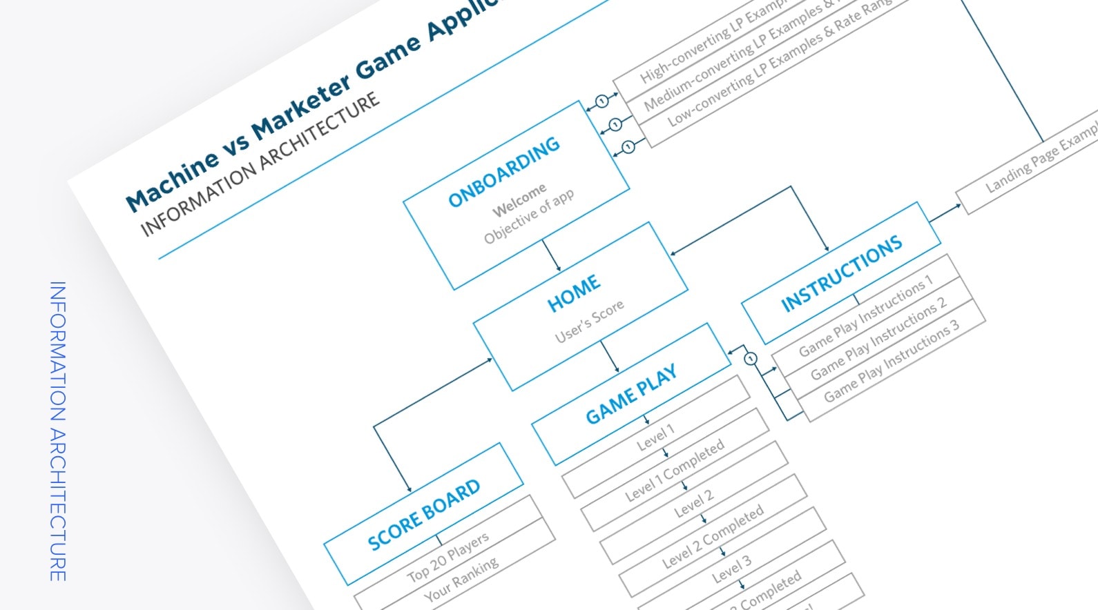
I complied all the ideas from the brainstorming session, and created a high fidelity user flow of the game.
Wireframes
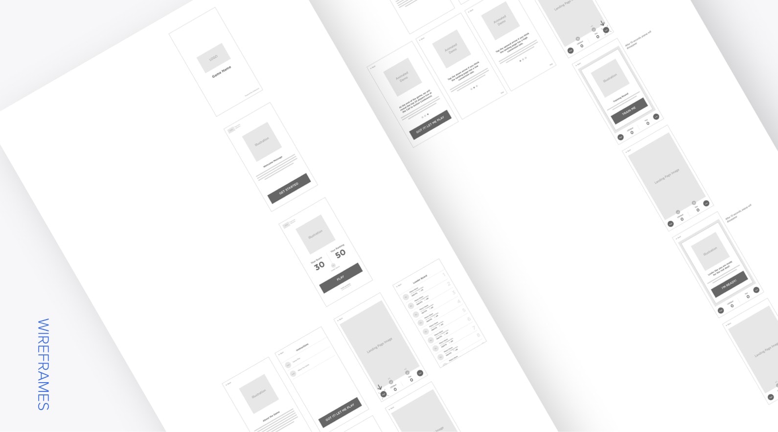
After defining the user flow, I created high fidelity wireframes and positioned them according to the flow.
Mock Ups
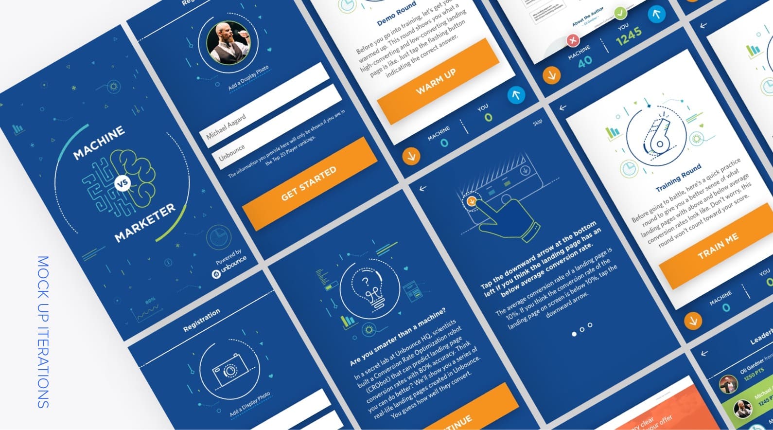
Once the wireframes were approved, I moved on to the mock up stage. I followed the CTA Conference brand guideline that another designer established as well as the Unbounce style guide, and the established voice and tone during the brainstorming session. These guided the art direction of the app. I worked with a copywriter to establish what each screen would communicate. I also created various iterations based on feedback given from the design team and stakeholders.
Usability Test
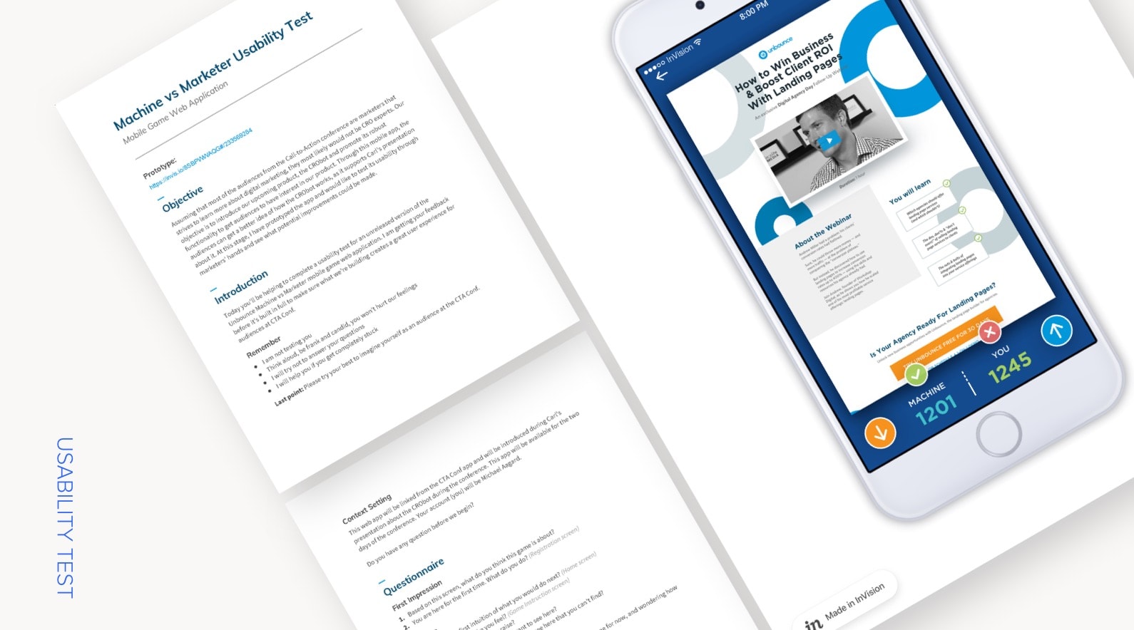
After the feedback was addressed, I created an Invision Prototype and a usability testing session guide. Because this game was a new concept and unfamiliar to most Unbounce employees, we decided to just test with internal people, as we were on a tight schedule. The goal was to see if people understood the gameplay overall and could navigate smoothly, such as where participants would get stuck, and what parts were helpful or confusing.
I tested with a handful of participants and later compiled my notes, and found patterns that let me know which screens to refine so I could finalize and export them to Zeplin to send to dev.
Outcome:
Result & Performance Metrics
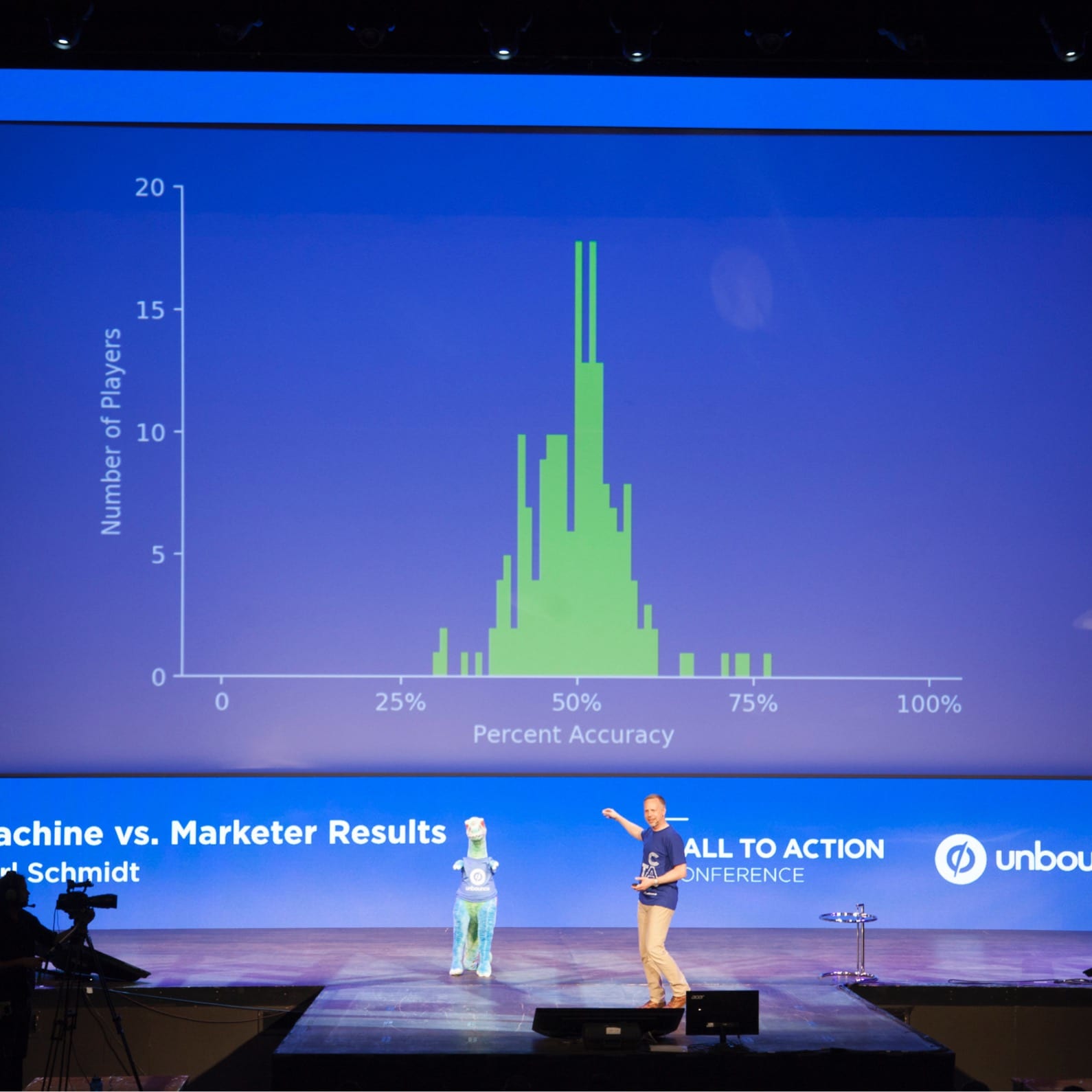
Metrics measured from June 26–27, 2017 (conference duration)
PLAYERS AVERAGE SCORE
50%
MACHINE SCORE
79.7%
TOP PLAYER SCORE
56.9%
Key takeaways:
Proper QA is crucial before launch despite a tight deadline, which can be done with better project management.
This project was not a priority for the entire company, so while I was able to commit full time on this, developer resources were limited. This was more of a side project for the developer, so the timeline was quite tight, which resulted in a lack of time for QA. We launched the app without really doing a proper QA beforehand, so there were a few bugs and glitches that we noticed while the attendees were playing the game. There were also a couple of elements in the final app that didn’t match the mockups.
These could be avoided if we had done more project management at the beginning with the developer and took the amount of dev time needed into account so we could scope enough time for a proper QA.
Credits:
Overall Strategy: Carl Schmidt
App Development: Matt Coady
Copywriting: Dan Levy
Game Play Animated Video: Rebecca Preston
