WORK
V-Lab Innovation Website
Vlabfood.com

MEDIUM
Website
DELIVERABLES
UX, UI
PROJECT ROLE
Web Designer
Project overview:
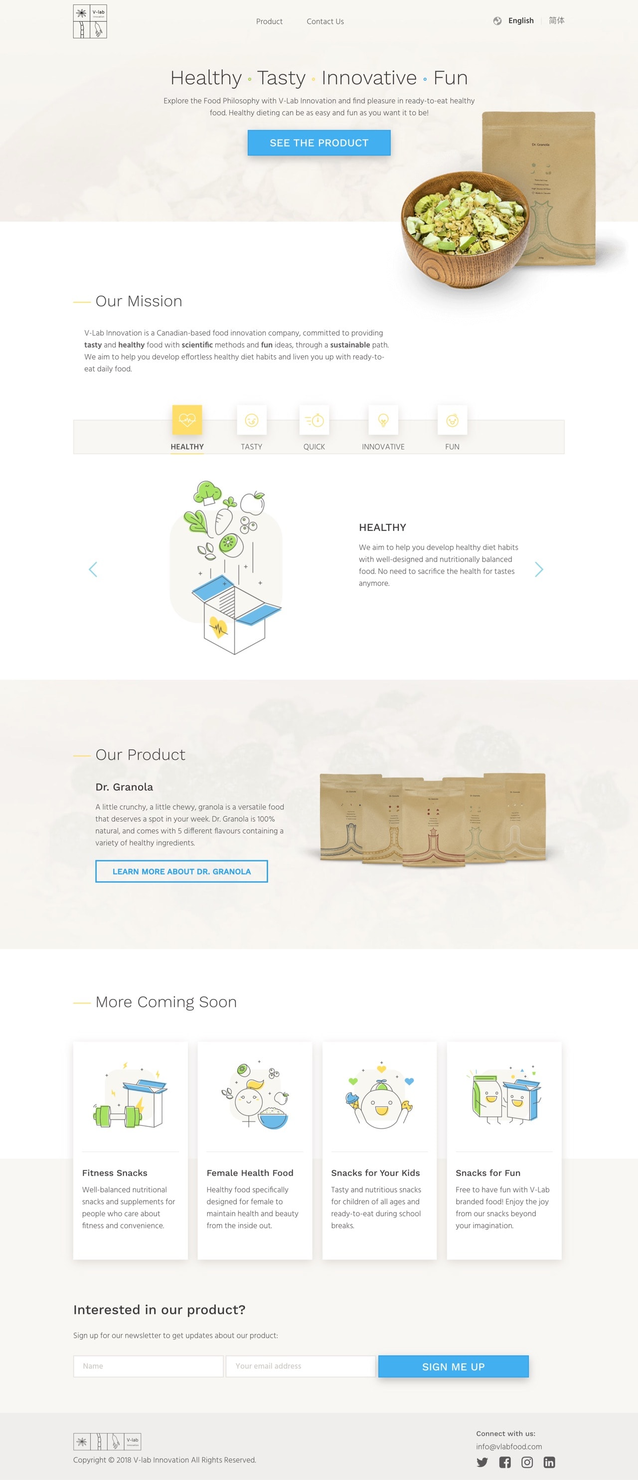
V-Lab Innovation is a Canadian-based natural foods business that combines scientific methods and traditional healthy Chinese ingredients to produce their products. Their mission is to sustainably provide healthy foods for millennials that are quick and delicious.
This was a freelance project, where I was mainly responsible for the design of the main pages of their website (homepage, product pages, and contact page). As V-Lab Innovation wasn’t a fully established business at the time, they didn’t have a brand guideline. I was provided with a logo and some packaging designs that were created by another designer. To work on the website, I needed some basic style guides, which I created for them before mocking up the website.
Project Goals
- Have a website design and developed for the official launch V-lab Innovation
- To showcase the website in their first trade show
Design process:
After providing my design proposal and terms and conditions, I needed to obtain all the context and background from the client. To start off the project, I met up with my clients and had a consultation session, where I provided recommendations and gathered all the information I needed and made sure I had a clear understanding of their business and product.
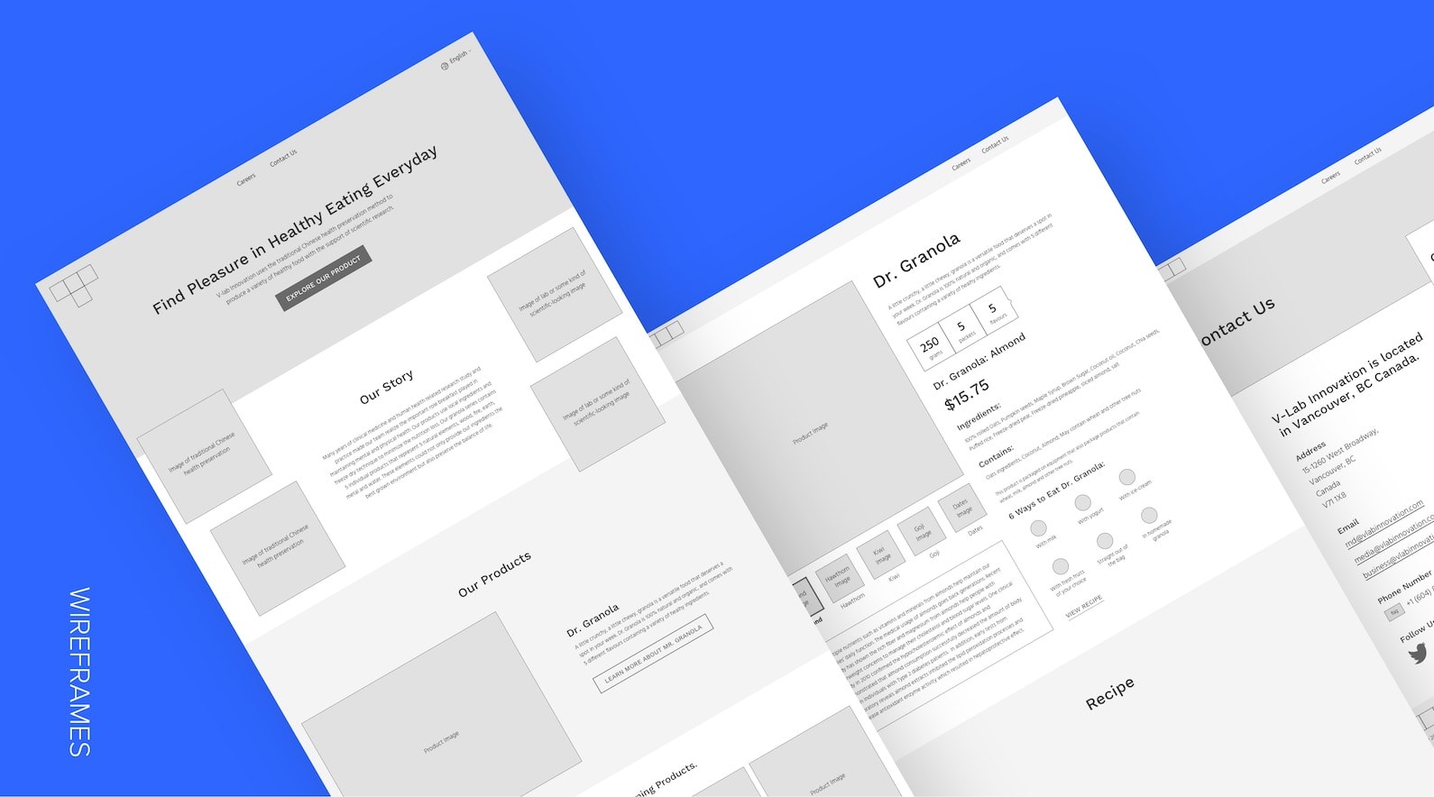
Wireframe
Based on the consultation and conversations with the client and the web developer, we agreed on having 3 web sections (home, products, and contact) as the deliverables for the launch. I sketched some low fidelity wireframes with the client during our consultation meeting so we could agree on the information hierarchy and the rough layout. The client wrote some copy for the pages, while I converted those sketches to high fidelity wireframes, and input the first draft of copy provided.
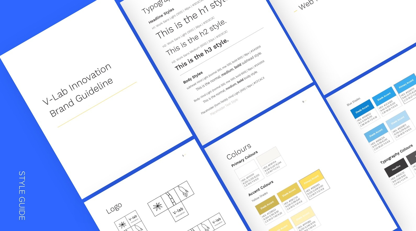
Style Guide
I was only given a logo and a few packaging design files, so I didn’t have a clear guideline to proceed with the mockup of the website. I offered to create a brand guideline template for the client to fill out the business strategy, such as their mission statement and vision, as well as giving recommendations on brand personality and voice and tone. I also created a basic style guide (logo, typography, and colour palette) and showed the client how the colours and font can be applied to the branding through on various mockup iterations.
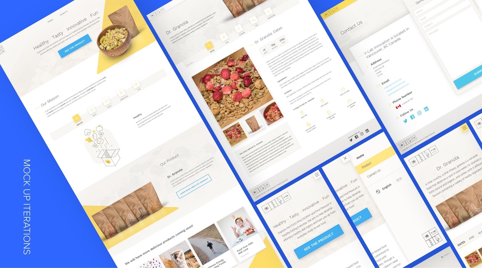
Mock Up
After finalizing the style guide, I did a few more iterations of the homepage to get client approval, and continued mocking up other pages, as well as mobile versions. I also did the illustrations and icons for the pages I designed.


Key takeaways:
Alignment on the brand messaging with client is key.
Because V-lab Innovation was still in the process of launching the business during the project, there were still quite a bit of missing pieces in the beginning. The deadline was quite tight, so there was limited time to go through the entire design process, which meant some steps, such as research and usability testing, were deprioritized. I was provided with very little resources, and most of the information I got was solely based on conversations with the client. I later realized our understanding of the messaging was misaligned. I spent time on multiple design iterations with illustrations depicting an idea that did not match the client’s expectation, in which the idea was not the main focus of their brand. This could be potentially avoided if:
-
I roughly sketched out the ideas during the wireframe stage to present the client before creating high fidelity iterations in the mockup stage.
-
There was a clearer communication between me and the client about what the sentiment of each section of the page would be during our consultation / wireframe session.
Credits:
Marketing (Client): Erika Chen
Web Development: Sam Shen