WORK
Infinite% App
Personal Project

MEDIUM
Mobile App
DELIVERABLES
UX, UI
PROJECT ROLE
Designer
Overview
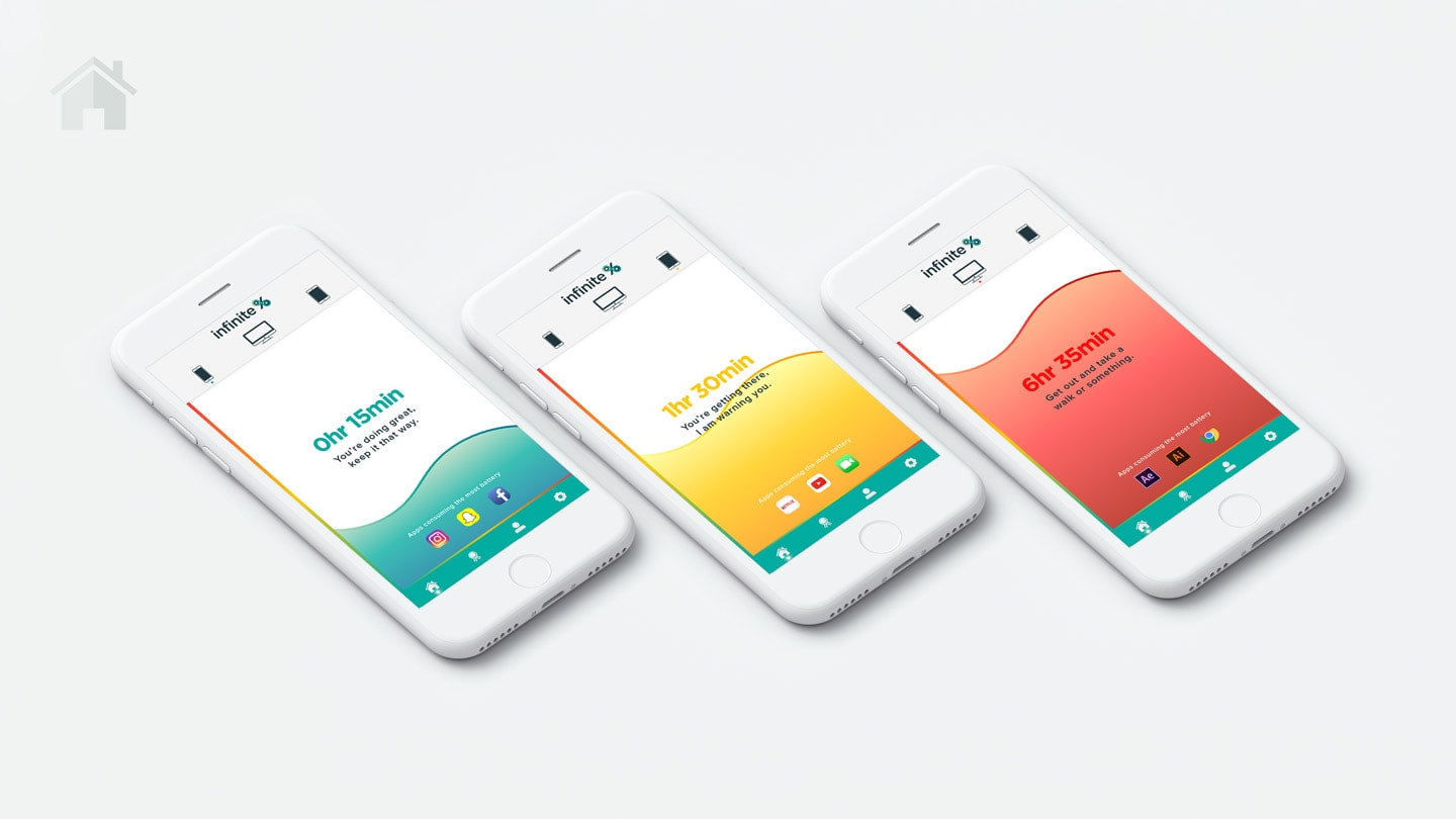
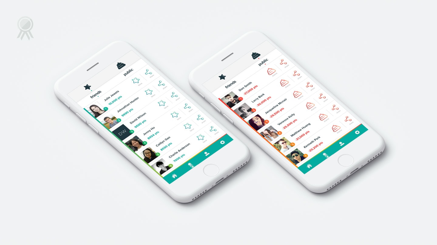
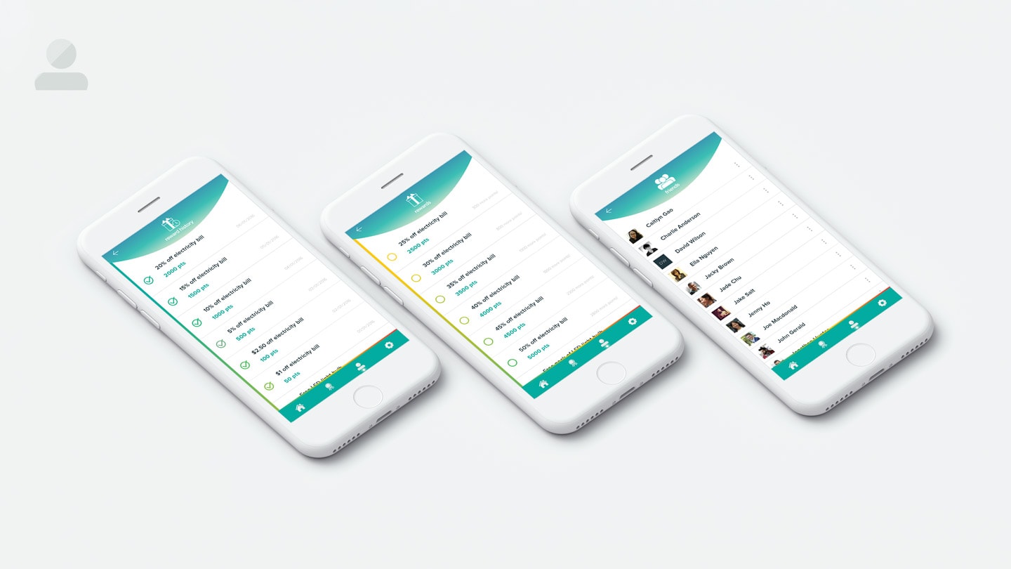
Infinite% is a native application that encourages users to reduce the use of their devices to save energy. The target audiences for this app are millennials, specifically students and early adopters, in other words, trendsetters who love new technologies. How is this app perfect for its target audiences? Infinite% does not only help users save battery on their device, but also the cost of their bills. Not only does the app save the user’s phone and electricity bills from the reduction of usage, but also from rewards. This is perfect for students that depends solely on their part-time jobs and student loan. The app has a point system, where the less time the user spends on their devices, the more points they acquire; the more points, the more awesome rewards they receive. This is also quite a fun app that encourages users to save battery in a quite a candid, yet fun, way through its language; however, it does not insult the user in a personal way since it only makes fun of their battery usage. Users are also able to make fun of or praise each other based on their points through the fame and shame buttons. To avoid cyberbullying, they cannot message or comment, but can only fame or shame with a tap of a button. If a user is embarrassed of gaining the shame button, that would act as a motivation to use less energy or his or her device to gain more points. This faming and shaming concept is great for early adopters because this type of stuff on the internet is the trend right now, specifically the shaming part; however, this type of shaming is quite harmless and should encourage the user to go on his or her devices less.
The app interface is created using Adobe Illustrator, and the video is produced with Adobe Aftereffects.


