Yes, this is pretty meta, I know. But where’s a better place to write about the process of your portfolio than in your portfolio, right? So here it is. To summarize this entire post, I redesigned and rebuilt this site from scratch on WordPress. Ta-dah! Bye now.
Just kidding. I mean, there were a couple of things that happened in between. And man, did it take long. Before I get into what went into the process, I just want to show y’all how I felt during it.
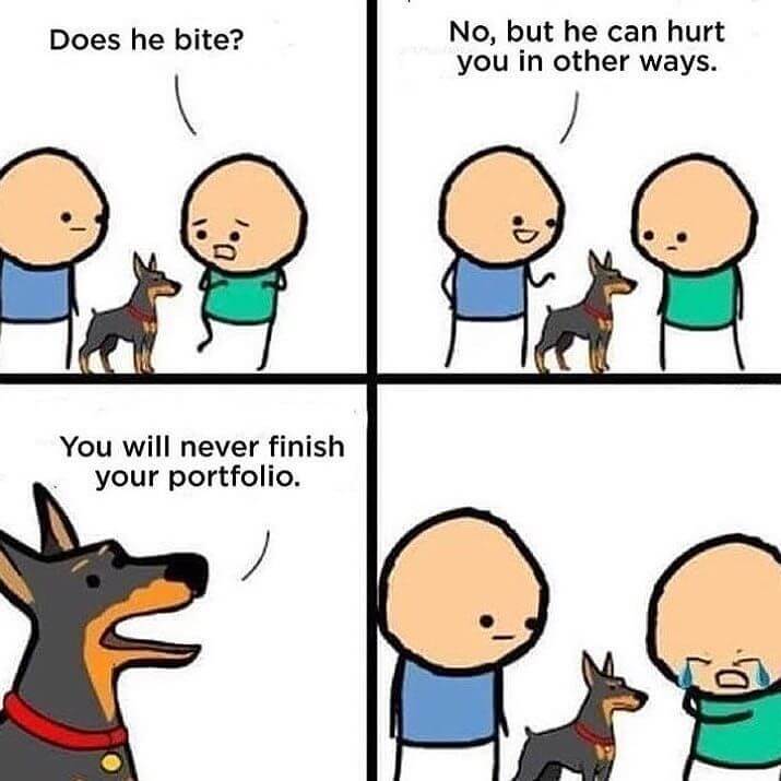
Source: Designers Humour
#TheStruggleIsReal #RelatableContent
I’m honestly too embarrassed to even tell you how long it actually took me to do this thing and launch it. But hey, the fact that you’re reading this, clearly means that it’s out in the world now, and that’s all that matters.
Now, let’s get to it.
Table of contents
Why the Revamp?
Just to be clear, this was an overhaul of my portfolio site. It’s always been on WordPress.
But why redo it?
Not only did I feel like it needed a new look, but also a restructuring of the backend, both code and CMS. In addition to that, I wanted to further grow my skills in web development. And what’s better than applying your learnings onto something you care about and need. It was a learn-as-I-go kind of situation, but I was also fortunate to have dev mentors at work that helped me understand best practices on WordPress development, as I worked closely with them on the company’s (Unbounce’s) website. From what I learned at work, I realized there were many opportunities to up my own website’s game.
Before
The way this site was built before didn’t follow a great process, and was also the first time I had developed on WordPress.org. I learned it through a web development class in university, and we were taught to use a WordPress child theme. It’s basically building on top of a parent theme, where you can overwrite its code. Instead of using a nicely styled theme like a normal person, I, for some reason, chose the default WordPress 2015 theme as my child theme, which looks like this:
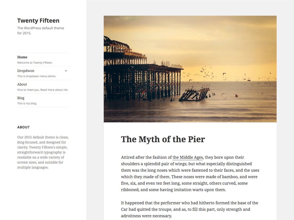
I mean, it’s… fine… It was basic. I tried to overhaul the entire thing to make it completely different, which was kind of like building it from scratch. Because there were already preexisting styles, I had to override everything, which added way more lines of codes, adding another level of complexity.
And you know what was worse? I designed it while I was coding it. *Facepalm* Talk about best practices and design process… Basically, it was a mess. Some styles of elements were all over the place. It felt like putting lipstick on a pig.
So yeah, it was time for a change.
After
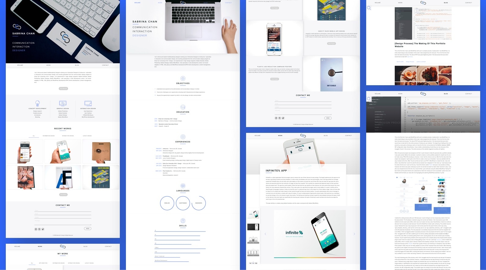
With all those issues and opportunities, I decided to go on a mission. It was called, “operation doin’ it right”. As you can see, this is how it looks like now.
Information Architecture / Flow
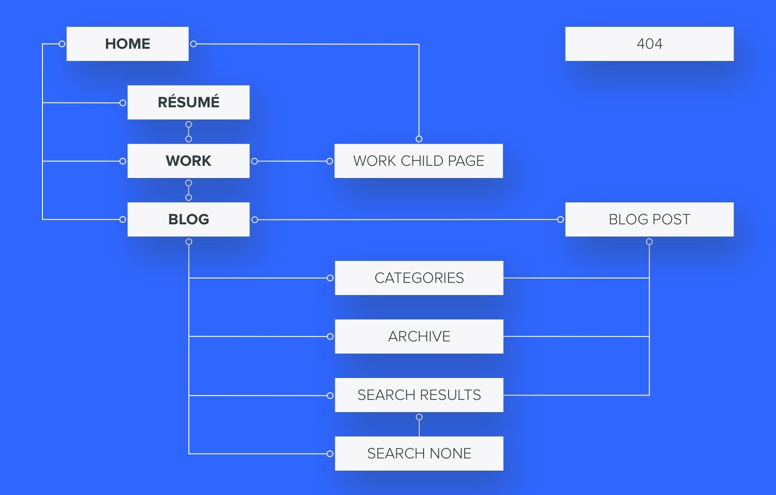
I planned the flow of the site and created a site map. This helped me to clearly examine the flow. Because I was building my portfolio using WordPress, there were several pages for the blog that had to be included (categories, archives, search results, and no search results). The site map allowed me to see all of the pages that required design.
Wireframing
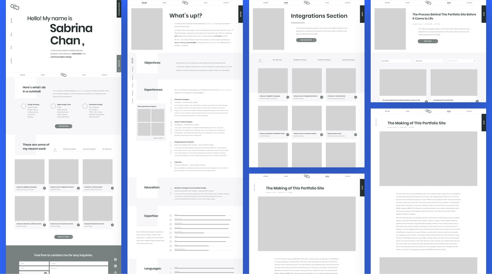
After planning the flow of the site, I created some wireframes using Sketch. I looked into what were and weren’t working from the original design. Obviously, I discarded the ones that weren’t and kept the ones that worked, as well as seeking opportunities in creating new components for the site. I made sure all elements were consistent as well, which was one of the main reasons I revamped my portfolio. ‘Cus you know, it was kind of a mix of styles before due to the child theme.
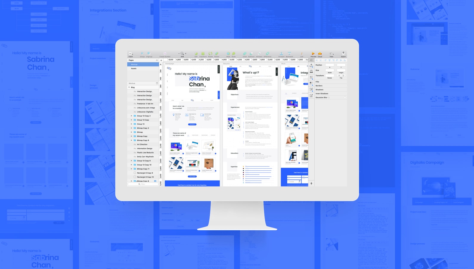
Mockups
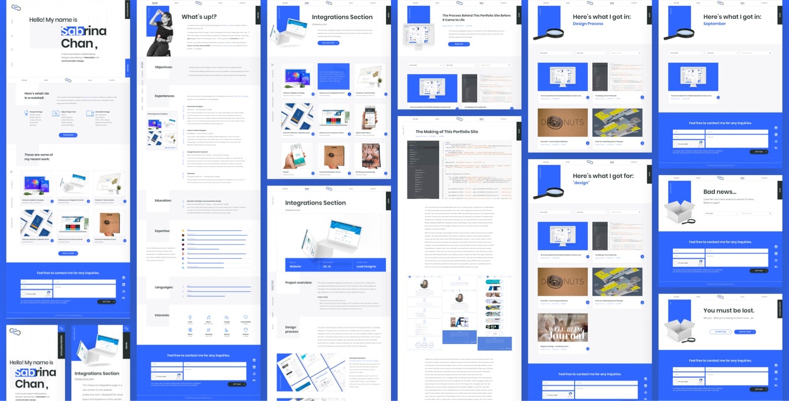
Based on the wireframes, I designed the mockups on Sketch as well. I kept the colour palette the same as the previous design but increased the vibrancy of the blue a little bit. The palette is simple and clean to put the content in the “spotlight”. I kept most of the visuals, mainly the covers of my work, in a white background so visitors wouldn’t be overwhelmed with colours and a bunch of elements. The covers of my work are all presented in context with a mockup to highlight the product itself, which also retains consistency.
I designed for both desktop and mobile to make sure people have a delightful experience viewing from any screen size. Once I completed all of the mockups, I had to start thinkin’ about the dev stuff.
Development
Child themes are cool and all, but I ain’t about that life no more. Like I said, there are too many overwriting of codes, making it more complicated and disorganized. And because I designed a unique layout and everything, I had to develop my own custom WordPress theme for it. But of course, it was not entirely from scratch. I downloaded a starter theme, Underscores.me, that was a package with all of the WordPress required files. It had the basics and was for developers to build on top of it. I installed it and connected with MAMP to host the site locally for the development process.
Building a CMS in the Backend
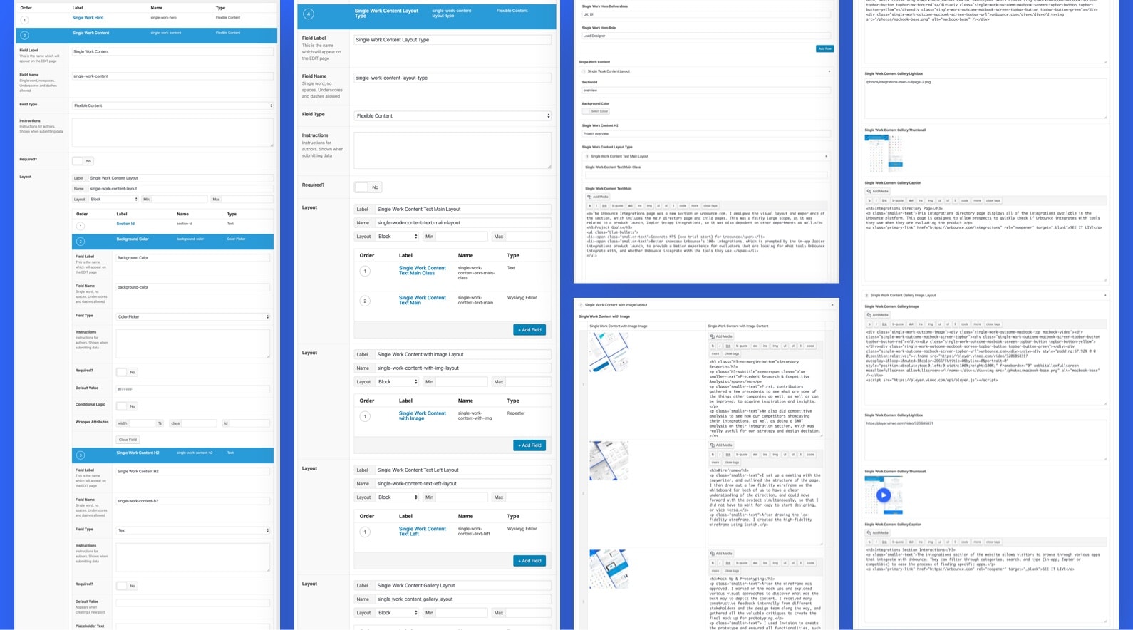
I used the original WordPress database and backend from the previous design and built supplementary functions to them. Most of the foundations were done, like the pages and custom post types. The main additional element was structuring the CMS for the pages so it was easier to input content without hardcoding everything. I used the ACF (Advanced Custom Fields) plugin to do that, where each layout template would have custom fields. This way, when the same component comes up, it could just be duplicated in the CMS without having to redo it in the code over and over again. While this was a challenge to build, I learned a lot throughout and it had made the process of entering content much faster and simpler.
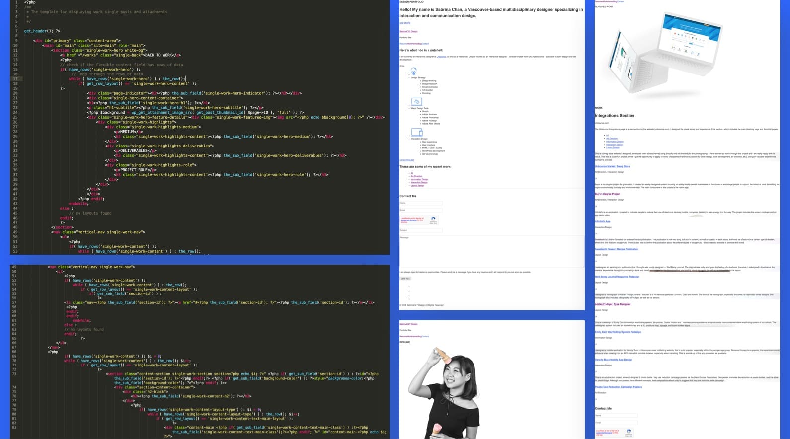
Structuring the pages in Code (PHP)
With advanced custom fields, came advanced backend coding. Yes, that was my attempt to do a Spiderman reference. Please don’t judge me. It makes things easier in the long run, where I wouldn’t have to update a bunch of code every time I update a page, but it was definitely a huge learning curve. Let’s just say, many documentations were read. Stackoverflow? Don’t even get me started with that one. I was Googling non-stop.
With ACF, it was a lot of PHP code weaving to build the structure of different page templates. The most challenging part was the loops, along with a filtering system based on taxonomies, and then connecting that to jquery plugins (Isotope, Slick). But I gotta say, while the struggle was real, it was super satisfying and rewarding every time I got something to work. As long as I saw the content I added in the CMS on the page, I was golden. Baby steps, amirite?
Implementing the Style (CSS)
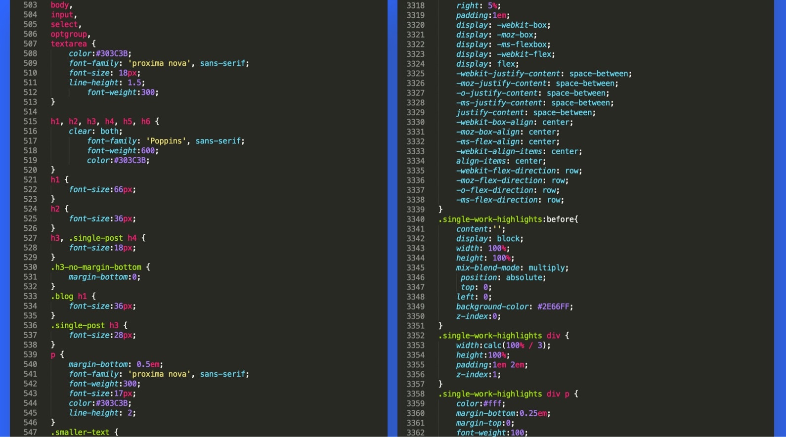
One step after another, I finally completed building all of the PHP pages (just content with Arial font on a white page), and it was time to style it. Because it was a custom theme with somewhat complex styles, it wasn’t all that simple. There was definitely quite a bit of problem-solving during the frontend development process. But it was extremely satisfying to see the content coming together, matching my mockup design one element at a time. Of course, I accounted for all screen sizes from mobile to tablet to desktop, making sure the layout was fluid and adapts to all window sizes. Many breakpoints, calculations, and percentages were in the mix.
Adding Interactions and Behaviours (Javascript, jQuery)
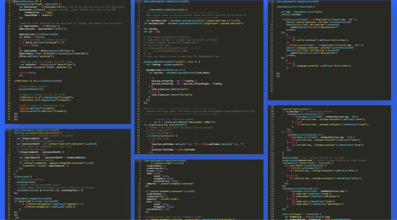
Last but not least in the code department was javascript. The content and styling were done, all it lacked were behaviours and interactivities. There were a couple of areas on the site that could be spiced up a lil’ to be more dynamic. While adding small interactions, such as sticky elements based on scroll position, I also implemented functional behaviours, such as a filtering system for my work, as well as a carousel and lightbox to display various products of each portfolio piece. Some were more challenging than others, and it was all trial and error, but they all came through. In the end, that was all that mattered.
Case Studies
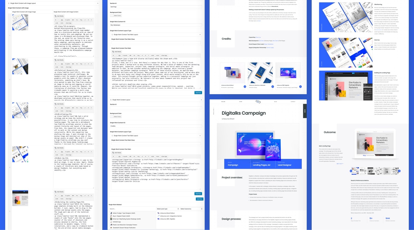
Now comes the fun part—adding all of the case studies. The last time I updated my portfolio was before I joined Unbounce, aka when I graduated from university, which was 4 years ago. The pieces in my portfolio were pretty much all school projects. One could only imagine the amount of work it was in updating that thing. I kept a few from before and re-entered the content onto the new CMS structure to match the layout. I added six more portfolio pieces from the last four years, most of which were Unbounce projects, and one from a freelance project. Each work is presented as a case study with an overview, its process, the outcome with results if the metrics were available, key learnings, and credits. Because, what would be the point of just showing the end product? So yeah, it was a lot of writing.
Conclusion
From design to development to production, I learned a lot throughout the entire process, especially in the dev part. For me, the best way to learn is to do it myself. And this was a great opportunity for me to do so, it was especially satisfying because it’s something I’m passionate about. This portfolio was a personal and passion project that I was able to plan, execute and make it all come to life all on my own. Despite the lengthy process, it was all worth it in the end because of the experience I got from it and the outcome.
The one big fat lesson that came outta this was: update your portfolio frequently! Clearly, I didn’t, so it took me forever to publish the finished product. Staying in your comfort zone is okay, but not too long, ‘cuz you’ll regret it after. Of course, I am not saying to quit or anything. It doesn’t matter if you are in a long-term full-time job or not, as a designer, it’s always great to frequently update your portfolio. Not only would this help you save an immense amount of time when you do need it, but you would also be able to easily recall all of the details and information from the project. It gives more exposure to your design work among your network and the design community when you post about them, which would unlock many more opportunities.
Thoughts? Questions? Comments?